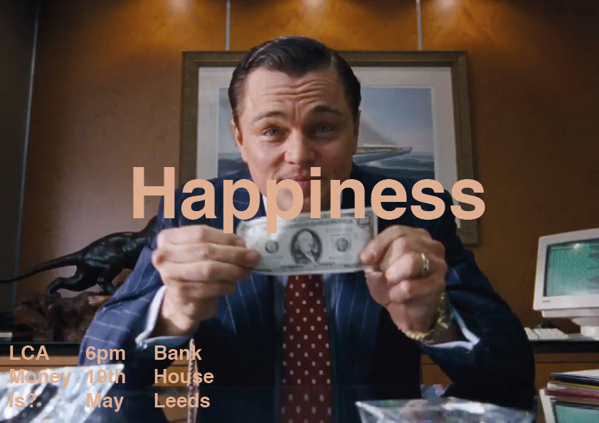
These are the adjustments that I have made to the poster to try and incorporate the wall street theme that is clear and fun in the video. It was suggested by members of the group to experiment with using a photograph in the background to continue the theme rather than using a block colour. I chose to use photographs that are similar to the ones in the video rather than using the same as this created a high quality finish. For the first three designs I experimented with different placement of the text. After deciding that with that image the text was best positioned to the bottom left, I then experimented with different images to see whether the template still worked.
Text placement experiments:


Imagery experiments:


Making the text bold :
Low opacity box behind text:

Adding the logo:

Changing the colour of the logo:

I worked through each of the design changes taking on board the comments from members of the group as I went. This has led to the final three designs which we all agree continue the Wall Street theme that we have taken on board for the exhibition.
Final three designs:


Changes were also made to the invitation and leaflet through the guidance of myself and the rest of the group.
Invitation Front:


Invitation Back:

Leaflet:


No comments:
Post a Comment