Monday 30 November 2015

Symbols

To begin my research on Olympic pictograms I wanted to look at the designs from the begging of the olympics to the current designs. On looking through the designs the set that stood out to me the most were those designed for Mexico City in 1968. This set of pictograms is different to the other designs as a 'person' is not used in the image and instead an object related to the sport is featured instead. This is something that I would like to experiment with in my sketches rather than going for the typical choice of a silhouette. The colour of the square is also specific to the sport which improves the recognisability of the pictogram.   


Taking into consideration the above designs I have sketched some ideas for a Badminton pictogram. I firstly focused on the shuttlecock as a pictograms main purpose is to remain simple and universal.

Research:


Sketches:


Illustrator Version:


To carry my designs on to the next stage I researched badminton further to gather a greater understanding of previous pictograms and the equipment used in the sport. 

Research:


Sketches:


From the nine drawings, the more successful are the first three as they have a main focus of the image rather than the eye being draw to the racket and then the shuttlecock. It is important to keep a pictogram simple as it will be displayed in a range of sizes and medias. This has led me to the design decision to continue with the design focused on the shuttlecock. Although the universal design needs to remain simple, I am going to experiment with colour for the background of the silhouette as this is something that I think was successful with the Mexico City designs as it gave the image a place as well as making it stand out in any setting. 

Court Colour (London 2012):


Final Design (Court Colour (London 2012):


Wayfinding Research

Vinyl:


It was highlighted from the responses to the questions that I wrote for the feedback on Friday, I wanted to gather further research on using vinyl for directing an audience. This would be an interesting aspect to experiment with in highlighting the specific departments.  From the examples it is evident that a sans serif font is a popular choice for this type of design. This would also relate to the vinyl cutting machine as intricate sections such as the serifs on type would be delicate to cut out therefore may not always be as successful. 

Floor:

Another way that vinyl could be incorporated into to LCA's wafinding rebrand would be to use the directions on the floor of the corridor. This would solve the issue of getting to one place of the college and not going where to go, as you could simply follow the correct line to your destination. This would be particularly useful for students however visitors may not understand the system. Another issue with this concept is that the corridors are split up with doors and various splits therefore it may become too complicated to follow.


Room Numbers:

Another aspect of LCA's wayfinding that was highlighted in the feedback was the small room numbers that didn't stand out and didn't always follow on from each other. The above image is an interesting way to display the room number as well as being practical in a way that the numbers can be changed if the building is ever redesigned. Map:

From experiencing the different areas of the building there are many white spaces that are unused and could be adapted into helping direct students and visitors around the building. This image has given me the idea to create a similar design for the Blenheim Walk building, having the layout of the individual floors separated and displayed in certain areas of the building.  


Alternative:


I decided to look a the contents pages of books as I thought that this had a relationship between the department name and the room which it is in. This has highlighted what layouts work well (having the number far enough away from the type so that it is easy to read as well as in line with each other) as well as areas to avoid when setting the layout of the type (not having the text too close together).

Friday 27 November 2015

Feedback Friday

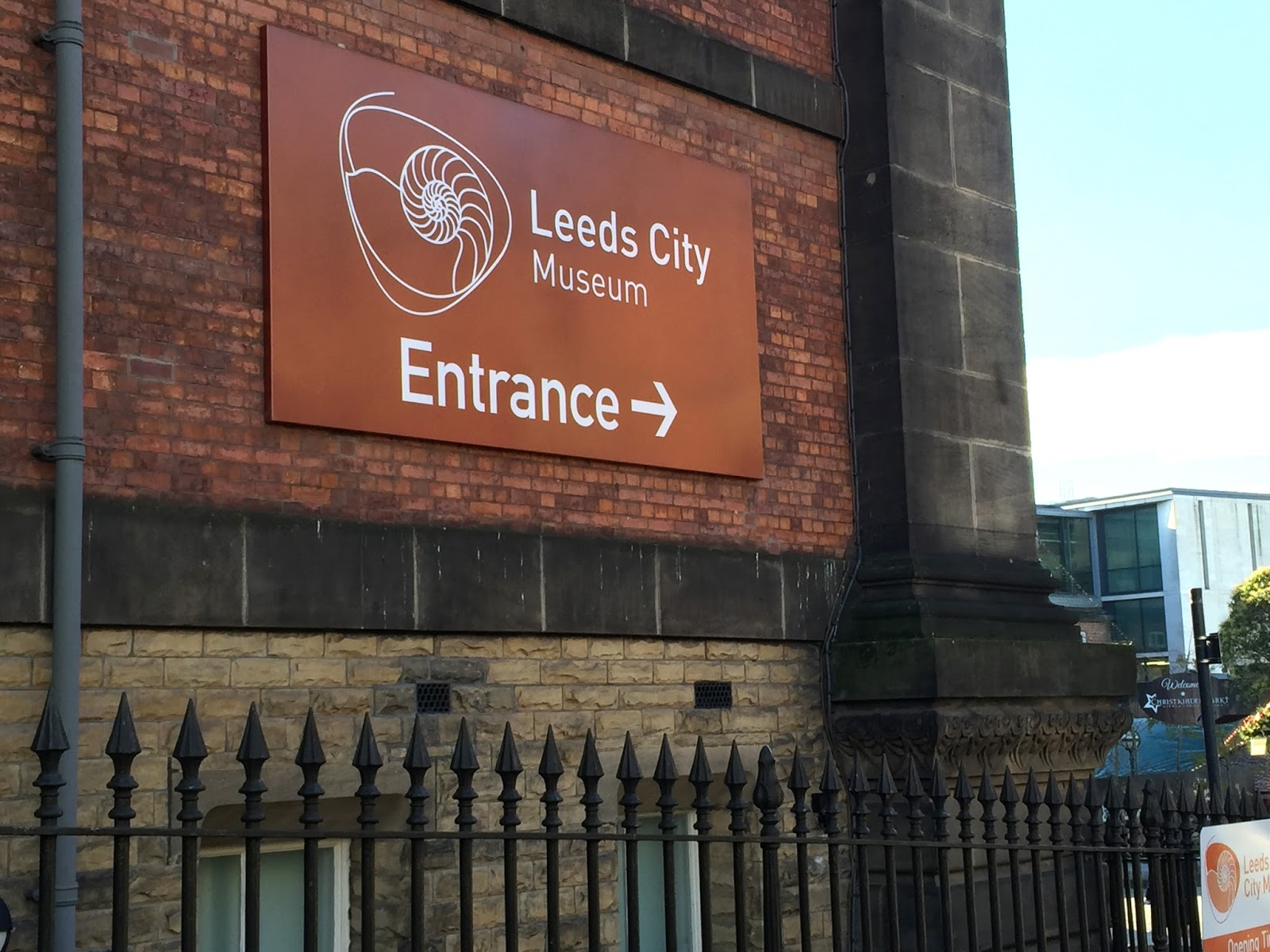
From the research that I conducted looking at various examples of wayfinding, I have decided to redesign the wayfinding for Leeds College of Art. This is because from my experience as a first year, I have found that I am only aware of where the different departments are through memory of previously being there or from being shown round by a tour guide. This highlights the problem that the wayfinding is not successful in it's job of informing and guiding the audience around the building. The concept of the redesign is to have something that is creatively present throughout a persons journey from one department to another, as well as having an easy to read wayfinding in the main areas of the building. This will provide a solution to the highlighted problem of the existing wayfinding.

As today was an unstructured crit group by the tutors, I decided to organise my own feedback. Before attending I wrote a range of questions that I wanted to gain answers to. I decided to base the questions on the existing wayfinding to find the strengths and weaknesses as well as asking questions based around some key areas that I highlighted as working well in the wayfinding that I researched. I did this by writing the questions out on a large piece of paper and taking it round the glass to gain a number of different responses.

Q: Did/do you find it easy to find your way around the LCA Blenheim Walk building?
A: 
- No, the building is hard to navigate relying on the signs alone. The signs around the college are vague and unclear, only using room numbers which are hard to understand 
- No, the numbers aren't in chronological order and too much information is presented on one sign for it to be quick and easy to read
- No, the room number system is difficult to understand as they do not always follow on from each other
- No, the board with the room numbers on are in unusual places, they also don't have arrows on to show the direction of the room - this is an inconsistency of the system as the other, more smaller signs give you a direction to follow
R: From this feedback it has been highlighted that the number system needs to be reorganised/made bigger, as well as the direction of the numbers being made more clear. 


Q: Are the different departments distinctive? E.g. do you know you're at graphic design when you read the corridor and why?
A:
- No, no colour coding for the individual departments
- No, some have large vinyl writing which tells you where you where you are and others don't. Some rooms have very small labelling that you can only read when you reach the door
- Only distinctive because of the work displayed on the wall 
- No, all sections are communicated through room numbers alone, which give you no suggestion of the subject areas
R: I think that having a distinct appearance to each department would be an interesting way to improve the locating of the areas. The basis of the design could be taken from something that is already distinctive about the departments appearance. Having vinyl wording on the lower part of the corridors to direct individuals would be beneficial because it would make it easier to find general areas, for example how it is used for Student Welfare. This is because it would be clear from a distance as well as when you reach the corridor which area you are in. 


Q: Do you think that a colour system would be more effective than the current design?
A: 
- Yes, it would individualise the different departments more clearly so you knew where you were without having to read the little signs
- Yes, would make the wayfinding easier to understand and distinguish where you are looking for 
- Yes/No, would only work if it wasn't overdone as it may be too complicated therefore reducing the legibility...would need to be simple colours that a subtly used
R: I would like to experiment with vinyl cutting and incorporating this into the redesign of the wayfinding. I think that it would improve the overall direction of the different areas of the building, rather than introducing arrows to the main wayfinding board. To do this I need to research into vinyl cutting further, as well as highlighting the appropriate typefaces to use with this type of method.


Wednesday 25 November 2015

Wayfinding Research

Leeds College of Art


Above is the standard way finding around the college. It is used to direct students and visitors around the building, informing them of which departments are on which floor, as well as using arrows to directly guide the audience. I think that these are successful examples as they have a minimalist colour schemes as well as being easy to follow. The use of the wall features to direct you to the different departments is an appropriate way to highlight the specific areas as the vinyl on the wall is unmissable and stands out on the corridor. This would benefit the everyday audience as well as the visitors as it is a universal design that is versatile and direct.
However, LCA also has another set of wayfinders that are more sparsely located around the building.


Unlike the previous images, this sinage doesn't follow the same design criteria, highlighting an inconsistency. However, they do provide the direction to specific departments in the building. This is something that would benefit from being standardised across the wayfinding of the college as it is more instructive therefore is clearer to the audience on where the department is. 


Trinity Centre


As Trinity accommodates for a wide target audience of shoppers in Leeds, the wayfinding must be suitable for all to read and navigate. Each floor has a designated colour which is used as the background colour of the wayfinding. This helps the audience create an association with the colour and the specific areas of the shopping hall. The simple use of arrows are also used to guide the customers in the direction in which the signage is addressing. This is effective as it is a clear instruction that is easy to follow through the use of a universal pictogram. 

Leeds City Museum 


A white and grey colour palette is also used for the wayfidning for the City Gallery. This represents a classic look that has a neutral appearance to the varied target audience. However, there is an inconsistency with the stroke size of the arrows, as well as having a complicated design for some of the sinage (image two). This could be solved by reducing the size of the arrows or changing the layout of the composition. 

The Henry Moore Institute


 Similar to the City Museum, a two colour scheme palette has been used throughout the different methods of wayfinding. The first image is a creative way of displaying the function of each floor as it is a simple yet artistic way of displaying the information, rather than just having the simple rectangle shapes. As this is a small gallery there is a limited amount of information about the layout of the building which is something that could be introduced to help direct the audience. This could be in the form of a small wayfinding map to highlight the exhibition areas which I have seen from other examples.

Leeds Art Gallery


Once again the above examples of wayfinding have used arrows to direct the audience around the building and through the different exhibition spaces. The colour from the floor map could be incorporated into the other designs of the wayfinding to have a more consistent design that is easier to navigate with. This would improve the audiences experience of the building as the exhibition areas would be clearly separated, rather than the different media areas merging into one which is something that I experienced when walking round the gallery.  
    

Photography Induction

In the photography induction today we were taught how to set up the Canon cameras and the main settings that we had to look out for when setting up for a shoot. This included setting the white balance, exposure meter, shutter speed, aperture and depth of field.

White Balance -  The process of removing unrealistic colour, so that objects which appear white in person are rendered white in your photograph.

Exposure Meter - This is a meter on the camera ranging from -3 to +3. The aim is to have the meter equal in the centre so that the amount of light that the camera lens is exposed to is appropriate for the surroundings you are in.

Shutter Speed - This is the length of time that the shutter is open. The longer (slower) the shutter speed, the more light enters the camera to record the image. 

Aperture - A large aperture has a shallow depth of field. This allows for more light to be let in. A smaller aperture will have a greater depth of field. This can be used to change the focus of the image.


Tuesday 24 November 2015

What is a book?

Publication Research:

A book is a written or printed piece of work, consisting of pages that are glued or sown together along one side and bound in covers. 


 I would like to experiment with a publication that has a equal contrast of imagery and typography. Something that I think works with both of the above examples is the set colour palette that is used throughout the publication. This adds consistency to the piece and improves the readability. 


Binding:


I would like to incorporate the bookbinding in the design on the publication. I think that this makes the piece more personal and detailed as it shows the audience the handmade process that the book has been through. 

Tuesday 17 November 2015

Canons

Rules of Graphic Design

Use of grids

- Consistency

- Structure

- Grids create a consistency throughout the piece of design that they are used in, for example publications

- Allows you to create a legible design that has a strong visual appeal

- Should be used to an extent but can be used to create a visual effect if not keeping 100% to the rules


White Space

- Allows the text to breathe and stand on its own so that it is legible

- Stops overcrowding of the page so that there isn't a difficulty in understanding the content (text and image)

- Depending on the content of where white space is used, it can either be used for creativity or to create simplicity within a page (examples below)


Alignment

- Allows the text to flow in a consistent design that improves the legibility of the text

- If it is not used in design then it is obvious, this is used to create a particular effect or mood

- I consider alignment in a way of thinking of the imagery and text as a physical object. Objects cannot float therefore this concept can be applied to design in the same way so that there are no 'floating' images or text

Saturday 14 November 2015

Typeface Design

The brief is to create a bespoke typeface, which should effectively communicate your given adjective, which is Powerful. As I am unsure on which of Müeller-Brockmanns 9 classic and lead typefaces to choose from, I am going to do some research into the nine typefaces as well as gaining a better understanding of the word 'powerful'. 


The nine typefaces are: Garamond, Caslon, Baskerville, Bodoni, Clarendon, Berthold, Times, Helvetica, Univers

Powerful Research

  • having great power, force, potency or effort
  • extremely effective or efficient in action
  • large or great
  • extremely


Powerful Definition

To me powerful is not just having great power or force, it is having an in influence and effect on something. This is why I want to design a font that is powerful in a sense that it can be used to guide and influence a person.


Garamond


  • Roman design published in 1530
  • Serif typeface
  • Known for it's readability, elegance and character
  • Used by authors, publishers and individuals for the printing of their work

Caslon
  • Serif typeface
  • Short ascenders and descenders
  • Six varieties of the typeface
  • Adobe Caslon was released in 1990
  • Used for body text in The New Yorker 

Baskerville
  • Serif typeface
  • Transitional typeface designed in 1757
  • Contrast between thick and thin strokes
  • Popular in book design 

Bodoni

  • Serif typeface
  • Title fonts, logos, magazine printing

Clarendon
  • Slab-serif typeface(thick block-like serifs)
  • Created by Robert Besley for Thorowgood and Besley (a letter foundry)
  • Published in 1845
  • Commonly associated with wanted posters and the American Old West

Berthold
  • Sans typeface
  • 1858

Times
  • Serif typeface
  • Released in 1931
  • Commissioned by The Times 
  • No longer used by the British newspaper but is alternatively used in book typography

Helvetica
  • Sans-serif typeface
  • Released in 1957 by Max Miedinger
  • A neutral typeface that is used in a wide variety of sinage, originating in America

Univers

  • Sans-serif typeface
  • Released in 1976 by Adrian Frutiger
  • The first typeface to fulfil the idea of a family of consistent similar designs


After researching the nine typefaces, I created an illustrator board so that I could have a visual understanding of the typefaces in upper and lower case, as well as in regular and bold.


From viewing the typefaces as a group, I am going to continue by taking the Times and Univers typefaces to begin sketching. I wanted to choose a serif and sans serif typeface to begin experimenting with as I didn't want to limit my ideas to one style. 


Univers


                                                               Times Roman


Before I begin sketching I wanted to gather more research on the specific typefaces as well as looking at examples where the typeface has influenced the audience. I have found some examples of where the typeface has been displayed so that I can better my understanding of the background to the designs.


From this I have been able to see the effect that the typefaces have on the audience and the composition of the piece. Each typeface has a clean design that have very different purposes. Times is popular for book typography where as Universe is more commonly seen in advertising as it is a clean design. 
I decided to look at Obama's campaign poster as well as a poster from WW2 as they are both examples of influential posters. Something that has been highlighted to me is that powerful compositions use uppercase lettering. This demonstrates the message of the poster in a clear way as well as being bold and eye catching.
Seeing the typefaces presented in uppercase has led me to the design decision that I am going to begin designing the individual letters of the alphabet in uppercase. I think that this is an important direction as it relates to how the typeface will be used as well as providing a focus for the brief.


To begin sketching ideas I created a grid system to follow so that I had precise designs. However, I struggled with this process as I found it difficult to freehand sketch as I am not a confident sketcher.


To overcome this I printed out the above pages of the alphabet in both typefaces and traced each individual letter. From this I experimented with changing each typeface to create a 'Powerful' alphabet. Below are the sketches that I completed to demonstrate my idea to gain feedback on.

 Univers


Times


3 lines down - Univers, lines 4&5 Times


The feedback that I received was:
- I like the simplicity of the sans serif but for a powerful font I think a bolder design would work better

- The thickness of the serif works well and looks classy, almost wealth looking which signifies power


- The sans feels more powerful as the edges are blocked and angular - this reminds me of power however I think it could be bolder


- Bolder would be more appropriate for 'powerful'


- I like the serif font because it looks more domination and commanding


- The sans serif would need to be bolder to stand out


- I think Universe works better for the overall 'powerful' theme, perhaps even more so if it were bolder


- I think times is outdated and doesn't give off a powerful feel 


- I feel like the serif font looks more playful and it reminds me of the ABC in primary school - this is due to the large serifs


From this feedback I am going to continue experimenting with the Times (serif) font although many of the more positive comments were made about the Universe design. This is because I think that Times has more room for experimentation rather than the simple design of Univers.

I am going to take the feedback I received and used this constructively towards the next stage of my development. I am going to experiment with making the serifs more square and prominent as this was something that made the sans serif font appear more powerful. 


I used the pen tool to trace the accurate sketches that I produced, however on doing this I didn't produce the accuracy that I had hoped therefore resulting in an inconsistent design. On finishing the alphabet I quickly decided that the letters didn't appear as a set therefore I had to go back to the original design for inspiration.  

As I had spend a good amount of time on this design I wanted to gain some feedback to see whether I was going in the right direction.

Some of the feedback I received was:


- Due to the slight inconsistencies with stoke weight I feel that this doesn’t convey the adjective powerful. I think they need to be consistent to show strength and power 

- I think that the letters ‘a, e,h, i, k, l, m, n’ maintain the correct stroke thickness and contrast perhaps try implementing this into other letters.

- The perfect shape of the 'O' doesn't suit the style that you are trying to achieve, maybe try reintroducing the contrast of stroke thickness


From receiving this feedback I have decided to go back to the individual letters and ensure that the serif sizes are consistent, as well as reintroducing the contrast of stroke thickness in some of the letters where I changed this. 


The above images are of the complete alphabet in the 'Powerful' typeface. To show the typeface in different forms I wanted to see whether the letters worked well in a sentence. 


Seeing the letters in a sentence has highlighted some areas where I have missed off the serif as well as in some cases having a slight inconsistency of the stroke thickness. 


As you can see above, I was able to fix these areas that stood out to me as being anomalies from the rest of the design. 

After completing the alphabet A-Z in the Powerful typeface I wanted to stretch my abilities further and look at numbers. To do this I started from the original Times typeface and adjusted the serifs as I did with the letters.


For the number design I followed the same technique that I performed for the letters. This involved removing the curves of the serifs and straightening the points so that they were all of the same angle. I also ensured that the thickness of the serifs were the same as those in the letters to ensure that the consistency of the design was maintained. 


I decided to create a type specimen poster to present my design. I chose the black and yellow colour scheme as this colour palette was highlighted to me in study task two as being a powerful colour composition. It is used for alerting the public either through police tape, bus stop road typography or fluorescent clothing, informing people of the location of something or simply a warning sign. This is something that I thought related to my typeface as it would mostly be used in a powerful form which is the message that this colour palette is used for. 

Final Crit Feedback:

Do you think that my typeface illustrates the word powerful? Why?

- The weight of the letterforms shows a powerful nature due to the thick stems and bowls

- Yes, the uppercase, strong serif and bold characteristics connote power

- Yes, bold weight is sticking and the use of uppercase letters make the typeface stand tall


Do you think there is a consistency throughout the design? If not, why/where?

- I don't feel it is consistent, the thickness of the strokes vary too much

- The heights and weights of the letterforms are all very well considered

- The serifs are all of equal height, it is clear you've created a set for the design


Do you think that I have fulfilled my aim and why?

- I can see the typeface being used in in a newspaper title or on screen, it is very diverse

- Yes I can see it standing out on posters as it is a unique design with a powerful appearance


Although some of the comments focus on inconsistencies throughout the design, I think that the varied stroke sizes makes the typeface unique without the individual letters standing out alone (there is a set size of strokes used throughout). The comments also make me confident that I have fulfilled my aim of designing a font that is powerful in a sense that it can be used to guide or influence a person on screen and in print.


Wikipedia, Garamond 28.10.15 
Wikipedia, Caslon 28.10.15
Wikipedia, Baskerville 28.10.15
Fonts.com Bodni, 28.10.15 http://www.fonts.com/font/linotype/bodoni 
Wikipedia, Clarendon (typeface) 28.10.15 https://en.wikipedia.org/wiki/Clarendon_(typeface)