Wednesday 17 May 2017

End of Module Self Evaluation

The idea process for each of the studio briefs was informed by varied and specific research as well as successfully gaining feedback to aid the progression of each response. The decision to focus on the Kirkgate Market fire was mainly informed by my own interest in the market, as well as wanting to celebrate and represent the level of community and pride that is shown through the people of Leeds. This decision was also informed by being able to engage with the stall holders and visitors to todays market as well as being able to experience the atmosphere and architecture of the market.
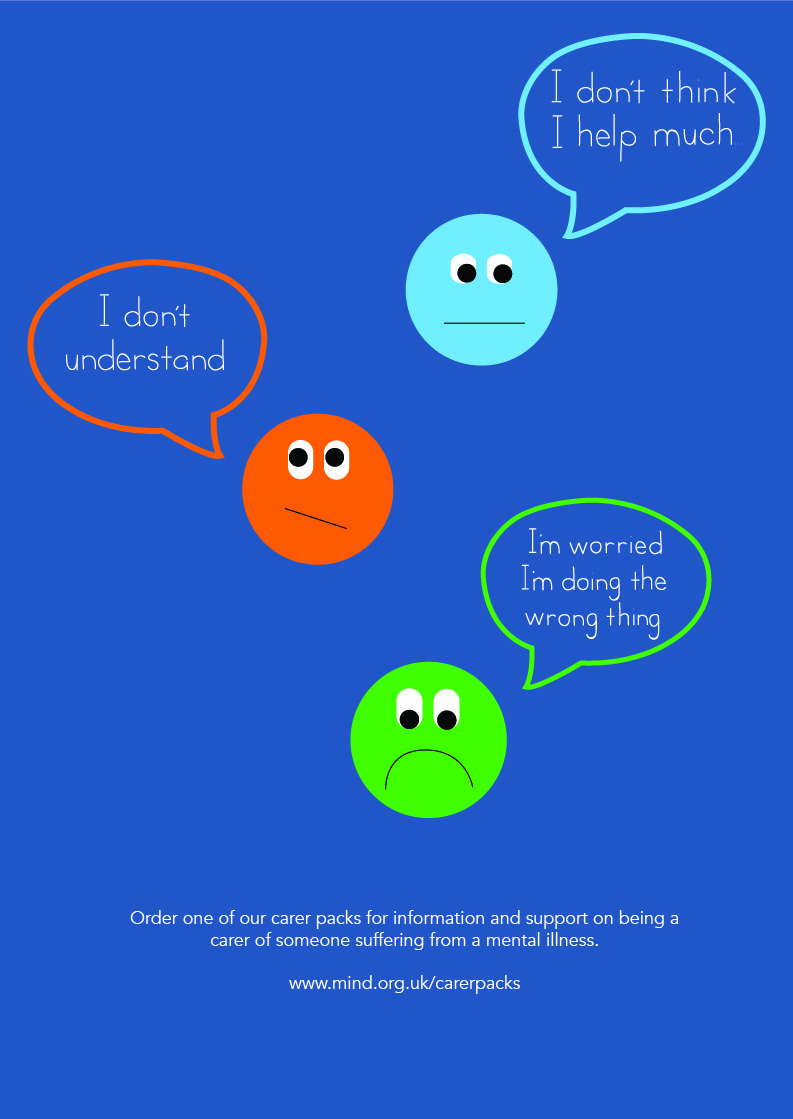
The decision to research and focus on the topic of mental illness was informed by my recent studies via the Future Learn course, Caring for people with Psychosis and Schizophrenia. This meant that I was able to apply my own knowledge of the mental illness to the response as well as be involved in a subject that I have an interest in. Due to having this interest I was able to extend the response produced and therefore enjoyed the completion of the self written brief.

This module has allowed me to explore my interest in traditional print design as well as organizing documents for digital print. Each of these methods allowed for experimentation in the print areas which was aided through the support of workshop staff and tutorial videos. This has taught me that using a range of information platforms is important to receive a rounded and informed understanding of design.  Ensuring that a design is appropriate for screen printing is essential in ensuring the print is successful. This meant that changes were made to the point size of the vector drawings and the type size of the text in studio brief 01. These were consideration made when producing the design and therefore did not affect the overall quality of the print.
Throughout the year I have been using the digital print facilities and therefore have devised an efficient way to printing. I ensured that all print slots were booked in advance of completion of the module. This ensured that test prints were possible and therefore suitable changes made. The documents were also checked thoroughly before printing to ensure that no print errors were made. This is a routine that I have been able to apply throughout my practice and has resulted in high quality prints being produced, digitally and traditionally. 

Carrying out primary and secondary research has not only helped with printing but it has also developed my understanding of social graphic design and how to design for a specific purpose/target audience. This was of particular importance in Studio Brief 02 as the response to the brief required an understanding of the audience and their needs. Speaking to members of the target audience is an important element of completing a design response to a problem. This is an identification that I have followed on with from the Responsive OUGD503 Studio Brief 01 module. Comments from the target audience led to the production and consideration of effective advertising of the information pack. This was informed by the identification that not all carers are aware of information platforms and they therefore need to be effectively advertised to ensure the large target audience is being informed. Through writing my own brief informed by the identification of the problem, it has meant that I have been able to articulate my writing in an effective way to ensure that clear aims and a direction were taken in the design response.


To finalize each studio brief I collaborated with a pair of photographers (Hilda Quick and Charlotte Igoe) to gain high quality images of the final outcomes. These are photographers I approached due to their skills with studio. I was able to experience and practice my professionalism through this collaboration as it involved communicating with the photographers to organize the day of shooting as well as the organization of the photograph compositions. As well as using the photographs for contextual and professionalism references in the submission I will also be able to use them to post each project on my social media pages. This is something that I have been completing for each module to ensure that my work is being seen as well as to engage with those artists who have influenced my practice.

Tuesday 16 May 2017

Range

Due to the large target audience that are carers of individuals suffering from mental illness and there being a number of mental illnesses, there would be variations of the information packs available. 


Specifications such as the size of the information book  would be able to be chosen. This would be something that would be chosen when the carer accesses the appropriate Mind webpage to order the pack. This would mean that if required, a smaller A5 booklet would be received rather than the standard A4. 


Product

Problem - there is a lack of diversity in the informative creative outlets that are available to those who are carers of individuals suffering from mental health.

Solution - An information pack by Mind containing information and advice on caring for an individual suffering from a mental illness. As there are a number of diagnostics in the mental health sector, a range of different information packs would be available. This pack would be received through the post, through the carer or a friend/family member ordering. The ordering process would be done online via the Mind website. Here you would be able to select the topic of information you wish to receive and the size of the information booklet. This would ensure that the individual is receiving the information they desire in the form that is best suited to them.  

 Leaflet - The leaflet acts as an introduction to the pack. This provides an overview of a carers roles and ensures them that the charity are there to help and support their needs. Recycle stock has been used to print the leaflet. This has been informed by the large scale print requirements and therefore ensures that the product is green. This is something that has been informed by my studies in CoP2. Using recycled stock can help reduce the effect that paper production has on climate change. 


Information Booklet:


The decision to saddle stitch the booklet was informed by the commercial scale that the paper would be printed. This form of binding is cost efficient and can be produced on a large scale. These are essential aspects to a design when producing for commercial print as it is important to be able to efficiently produce the product. This has been informed by my previous studies and research into commercial printing for OUGD504. 

Planner - The planner is an item in the package that acts as a small gift for the carer. Through my knowledge and understanding of being a carer, many individuals find it hard to have time to themselves. This planner would allow for the individual to manage their week effectively by having space to note down activities/day events as well as to do and shopping lists. This is a simple gesture in ensuring the carer feels cared for and will hopefully aid their own day to day living.
The simple front cover of the planner ensures that is appealing to the wide target audience as well as presenting a high quality product. These are elements that have been highlighted through research as well as personal experience of such products. 


Contact Cards - The contact cards allow for the carer to note down new or provided contacts. Due to the size of the card they are able to be easily transported in wallets/purses. This results in the information being available at a number of occasions. This also means that the carer does not have to search online each time they require a phone number/website/point of contact. Once this contact has been found they can make a note of the information and keep it with them.
Colouring Book - The aim of the colouring book is to give the carer something to help aid their own mental health. Through research it has been identified that individuals use art to express their own feelings as well as helping them relax. Colouring books are a popular current form of relaxation which has informed the inclusion of this in the information pack. Due to the pack being posted, the colouring book would be A4, allowing it to easily fit into an envelope as well as being easily transportable when used.   


Time Management

Throughout this module I have managed my time through monthly calendars. This meant that I was able to keep track of this module as well as other workloads at the same time. It also meant I was able to set myself deadlines to ensure designs were complete for organised print appointments.  


Monday 15 May 2017

Colouring Book - Mock Up

The colouring book would be part of the information pack sent out to carers. This would be a gift for the carer and aid their relaxation and encourage the individual to have some time to themselves. This would be reinforced by the nature of the drawings. The below examples have been completed with the theme being what the individuals do to relax. This not only creates unique drawings that are personal yet relatable but it adds a strong theme to the colouring book. This was identified as being an essential part of a successful colouring book. 
The colouring book would be appropriate for all ages and therefore suitable to be placed in the range of information packs. 


Thursday 11 May 2017

Contact Cards

Following the feedback comment made and the further discussions that were had focusing around the accessibility of the contacts presented in the leaflet and information booklet. Rather than have a single sheet printed out and added as part of the pack content, it would be more accessible for the carers to have the information on the standard business card size (3.5 x 2 inch). Rather than repeating the contacts that are presented in the other information creatives, the carers will be able to make note of the relevant contacts for them on the blank business cards. This means the information is accessible to them at any time and they can easily carry it in their wallet/purse. The blank cards also mean that the carers can note down other contacts that they may have through their research.

The design on the front of the card is kept minimal, with the use of the Mind charity colours being used. This gives the cards a discreet design which is something that the carers may wish for. It also presents a subtle consistency with the colours that are associated with the Mind charity. 


Further Feedback

In the second feedback session, I was able to outline the identified problem, solution, target audience and background context from the research carried out. One of the main comments from the previous feedback that I wanted to develop on was the appropriateness of the information booklet cover. One comment made was that the use of the blue reminded the individual too much of a clinical appearance and therefore lead to connotations of the NHS. Although the blue colour selected is the charity's main identity colour, this could be overcome by adding on of the other brand colours to the design. 
It was also highlighted that a design can be overdesigned and it is therefore important to consider the target audience and whether they will have such design thoughts. Although changing the colour of a variation of the speech bubbles, this is not necessarily a change that is going to be taken forward. This is due to the brand needing to be displayed consistently throughout the printed creative to maintain the trust that is held by individuals towards the charity.

Wednesday 10 May 2017

Colouring Book

Through responses to the first feedback questions, it was expressed that including a colouring book would be beneficial to the individual receiving the information pack. As a colouring book is a large project for an individual to complete themselves, I have sent out a request to see whether anyone has any completed line drawings that they see appropriate that they would like to be used in a mock up colouring book. 


Tuesday 9 May 2017

Feedback - Information book

Q1. Is the content presented in an engaging way? Please give a reason for you answer 

Q2. In the pack there will be an information booklet, introductory leaflet and a notebook (planner). Is there anything else you would want to recieve? (e.g a small colouring book/puzzle book to help you relax)

Q3. Any suggestions to improve design? (colours & typeface cannot be changed) 


In response to the first question, positive comments were received. This has reassured me that the content is engaging and therefore responds to the brief in a positive and therefore effective way. A suggestion was made to put the contacts list on the back of the information book so that they do not have to hold the pages open when calling. This was further discussed with the individual who wrote the comment in terms of alternative ways that the contacts information could be displayed. One suggestion was to have a single sheet that would present each of the contacts that is also in the information booklet so that the information is more accessible and transportable. When considering this further, I have considered how contact details are given out. One way in which this is done is through the use of a business card. Due to the size of the card they are able to fit in wallets/purses and therefore can easily be transported and therefore available to use at any time. In relation to the response to the problem this could be made in the form of a contact card. This would allow for the contact information to be accessible and therefore more likely to be used by the carer. 

In response to the second question, encouragement was made in response to producing a colouring/puzzle book to accompany the information. Due to there now being time restrictions, a way in which this could be achieved is through the use of collaboration. This is something that I am going to investigate further in response to the brief. 


Sunday 7 May 2017

Advertising - Distribution

As highlighted in the research initially carried out to gather an understanding of the information available to those suffering from mental health, it was difficult to know where to receive this information from. It is therefore essential that the creative pack is advertised in an efficient and effective way. This will ensure that the appropriate audience are aware of where the information can be found. 


The following designs have been influenced by the poster research that was carried out for Studio Brief 01. This research influenced the creative more so than the creative produced by Mind and the NHS as it provides an alternative look to the advertising piece. This will allow the design to stand out in the various locations that it will be displayed, as well as reducing the clinical appearance that may typically be associated with design that has such purpose.

To reach as wide an audience as possible, there would need to be a large scale distribution of the posters. They would therefore be advertised in locations such as train stations, hospital/doctor waiting rooms, bus stops and on the interior bus displays. These are all placements where people will be sat waiting for a short or long period of time and therefore are more likely to take it their surroundings and make note of what they see. The location of the advertising would differ depending on the target audience that the care pack is aimed at. For example, other packs that provide information for young carers would require advertising on school noticeboards and University student unions. 


Considering the wide target audience that the packs are aimed at, it would also be appropriate to produce a short video to advertise the information pack. This demonstrates an alternative method of advertising that would be seen by those who are active users of social media. Through analysing the current media that is used by the charity, they already have an animated illustration style that is used in short videos posted on YouTube. To maintain their brand appearance, a similar style could be used in this approach. The videos would be short and therefore the most important information received in the first few sections of the viewer watching the video. This reflects the fast pace speed of social media. 


Saturday 6 May 2017

Front Cover Experimentations - Notebook

Reflecting on the research completed into notebook front cover designs, experimentations were completed with marble inks. This is a process that I have previously experimented with and have found that it is easier to experiment with colour adjustments through the use of photoshop, rather than completing a number of different prints. 


From printing and scanning the above print, adjustments were made to the saturation of the document to achieve variations in colour. The chosen colours have been influenced by the colour scheme that has been identified for the charity. This will maintain consistency throughout the printed creative recieved in the pack. 


When a test print was complete using the above design, it became evident that the quality of the design was not of a high enough standard to use as a front cover design. This is due to the overall shapes produced by the ink, as well as not working effectively with the text on the front of the planner.  

Thursday 4 May 2017

Planner Feedback

After completing the experiments of the planner pages, feedback was gained to identify the most appropriate colour scheme and titling to the pages. This feedback was gained through presenting individuals with the 5 designs and asking them to write a response to the two feedback questions.

1. Which colour scheme do you prefer and why? (The aim is for the colours to be gender neutral)

In the responses gained, there was a clear favourite with the design presented below. This was mainly due to the hierarchy of each colour being clear and therefore separating each section of the double page. This separation is also said to add vibrancy and therefore interest/attraction to the page. These are comments that I would agree with as well as the design fulfilling the desired appearance.  

2. Which title do you prefer and why?

This question received a greater variety of responses. Many preferred the title 'GET STUFF DONE' due to it being straight to the point and encouraging. The suggestion to add an exclamation mark was suggested and is something that I am going to experiment with. In terms of the size of the text, there were mixed responses. Some favourited the large size of the 'GET STUFF DONE' title, however it was also said that this made the text more aggressive. After seeing the designs printed I would also agree with this comment. The title 'Week 1' was said to 'keeps time moving forward' and 'motivates' the audience to keep track of their activities weekly. When considering this title more and through knowledge of using planner notebooks, at first it can be difficult to maintain the use of a planner weekly. If this were to occur and the title to differ between week numbers then this may discourage the user to continue using the notebook as they would feel the need to miss a page. This is not what is desired by gifting the audience with the planner

In reflection of the comments made, further adjustments are going to be made to the above design. The title that will accompany the design is 'GET STUFF DONE' in the smaller type size. This is due to the larger text possibly being received as being aggressive rather than encouraging. 

Monday 1 May 2017

Information Book - Content

Following the original plan written in terms of the content of the information book, the most relevant material has been taken from the Mind website. This ensures that the charity's tone of voice is used throughout the creative and therefore maintains the trust the individual has with the charity. The tone of voice of the text is essential in engaging the audience and ensuring that they 
Through reading the information on the website it is clear that the organised system of separating each section in to categories is effective in terms of gathering the information you require in a quick and direct way. This is something that I hope to be able to achieve in the printed booklet through the use of a contents page. 
As this is a starting information pack for information for carers on schizophrenia/psychosis, the information is going to be kept minimal yet informative. The information has been taken from the Mind website to ensure that the content is authentic. 


The design of the booklet has been informed by the Palm Oil Challenge, Chester Zoo information booklet. The use of a brush stroke of colour emphasises the headings and therefore creates a clear separation to the sections of information. This technique has further been used to highlight small areas of text. Simple vector illustrations provide visual symbols that relate to the text that is presented alongside the shape. This is a common technique used to reduce the amount of text read by the audience and therefore maintaining their attention. This is a technique that is rarely used by the charity and therefore would benefit their user interaction with the charity by introducing this approach.