SHADE Studio define themselves as being 'truly passionate motion graphics and VFX company' who are based in Riga, Latvia. Their work ranges from using real life video content or vector illustrations. The below video is an example of their work. The flow of the content from one scene to the next ensures that the attention of the audience is kept. The simple vector images allow for the content of the video to be key, with minimal detail to ensure the eye flows from one area to the next. This is a style of motion graphics that can work on a range of different format sizes due to being largely image based, accompanied by large sections of text.
Libby Vander Ploeg is an illustrator/designer who's creative process is focused around simple yet meaningful design. Her motion graphic design ranges from the use of handwritten text to animated illustrations. The relationship that both text and imagery have allow for their to be no sound. It could be argued that this may result in the audience not viewing the full video, however with the succinct content of the design flowing from one scene to the next, attention is typically kept. This is shown in the example below.
#OptionBthere For the Holidays from Libby V on Vimeo.
Thursday, 30 November 2017
Thursday, 23 November 2017

Friday, 10 November 2017
Research: Target Audience
Through reading the brief, the target audience stated are all university students. This audience will be accessed through university media and online, in autumn 2018. As stated in the brief, there is a limited media budget and the campaign therefore needs to stand out against the other freshers' content that is online and in the public.
'Their smartphone is often the last thing they look at before going to sleep and
'Their smartphone is often the last thing they look at before going to sleep and
the first thing they look at the next morning. The average student will scroll
through over 300ft of content each day.' - This is an important recognition by Art Pass.
In a research study by Alex Chalk MP, YoungMinds and The Children's Society, it has been found that from the 1,089 respondents, 93% of the over 18s reported to be using Facebook however on a whole the most popular platform is YouTube, with 85% of the respondents engaging with content on this form of social media. The use of video is the main function of YouTube, with the ability to post and share video more frequent on Facebook also.
Video is a direction to explore in response to this brief. It is a form that would allow for the information to be quickly received on a range of different online and offline platforms.
Through a discussion with university peers, the importance of student discounts was made by each individual. The discounts that are offered through companies such as NUS Extra and UniDays are known by all students. Many said they became aware of these discounts from the advertisements on social media as well as word of mouth in education. However, as NUS Extra is a paid for 'service', many students expressed their lack of support to this due to other free alternatives being available. This is important to consider when responding to the brief as the payment for the card will affect the level of interest of students.
Middlesex University, London. Student Communications Survey, June 2016. Social Media sub-report.
2121 Students surveyed:
- 71% of students admitted to using social media at least once a day
- WhatsApp and Facebook are the more commonly used channels ( 83% and 77%)
- Instagram and YouTube are both also used by over 50% of students
- 67% of students say that social media is a preferred channel of communication for community information (e.g. events and University news)
- Facebook, YouTube, Twitter, WhatsApp and Instagram are all channels that students would be happy to use to engage with the University
- 59% of students follow University Facebook pages for information
Thursday, 9 November 2017
Research: Competitors/Similar Idea
When appealing to such a large audience it is key to understand their motivations. One way in which this can be analysed is through recognising and researching existing competitors of the Art Fund as well as other student orientated discount companies.


UNiDays - This is a popular platform used by students to receive FREE discount at a range of popular retailers
- Mostly used online through the use of discount codes
- You simply sign up using a verified university email address


- Website + app
- Social media presence that tailors to the interests of the student market (memes)
- Bold colours and patterns are used subtly to add a unique image to the brand
- Line vector illustrations are used to add visuals to information


NUS Extra - Another popular form of receiving discount
- In the form of a card
- £12 a year or £32 for 3 years
- Impressions from the website and social media: it is what it is. The brand is not as engaging as competitor UNiDays, there is a lack of engagement with the audience


Student Beans - 'youth media brand'
- offer discount across a range of retailers
- hub for articles, offers, jobs etc
- You sign up and receive discount codes through website/app
- Engaging content for the student audience

16-25 Railcard -
- Save 1/3 on rail prices
- £30 a year or free with a Santander Student 123 account
- For anyone aged 16 to 25, or over 25 and in full-time study
- Card needed to verify discount when travelling
Amazon Prime Student
- FREE prime service for 6months
Through researching each of the above companies, it is evident that there are a number of common themes that run through the visuals and mannerisms of the brand.
- Content must be engaging and appeal to the student audience (animation, bold colours/patterns, humour)
- Tone of voice must be persuasive but engaging
- Videos are engaging and can be a quick way to get a message across
Wednesday, 8 November 2017
Art Fund
Their Proposition is 'you can go somewhere else with art'. This is a statement that is adjusted to each of their specific audiences and aiming to meet their individual needs.In terms of the university audience, they want to connect the next generation of artists, curators and proffessionals to their national collections and museums.
- Our personality guides the voice we use to write and speak to the world. Their tone of voice must be reflected in the campaign
Logotype:

Colours: The brand colour palette is inspired by the different types of art that the brand supports

Sponsored advertising:


This is advertising that has appeared on web pages after visiting the Art Fund website. This is an indicator that they use sponsored advertising which can be an effective way to remind a consumer or a product or service.
YCN Art Fund 17/18
After completing a YCN brief in 16/17, I am able to recognise that this is a student competition organisation whose values and way of working reflects my own and therefore I am encouraged to submit to the 17/18 competition.
As the briefs that I am focusing on for this module must reflect my own interests, the brief that I have chosen is Art Fund.
The following information has taken from the brief document as being key aspects to the brief.
Brief: Create a campaign that can drive sales of the Student Art Pass amongst university students.
Background:
- Art Fund is a UK charity, founded in 1903
- Helps museums and galleries buy and display works of art
- Most of the funding comes from the sales of the National Art Pass
- The pass offers free entry into over 240 charging museums, galleries and historic houses in the UK + 50% off major exhibtions
- £5 for students, £65 other
- Limited passes available at £5 for students
Creative Challenge:
- Convince all students that visiting museums and galleries can help them step out of their daily lives and get a new perspective on the world
- Inspiration for studies
- Relax and reset
- The campaign will appear in university media and online in autumn 2018
Key Insights:
- Technology is a large part of a students daily life
- 'Most students feel slightly uncomfortable about the prevalence of technology in their lives. They wish they could switch off more'
Key Messages:
- Student National Art Pass can help you switch off, relax and find inspiration
- A whole year of art for just £5
The Channels:
- Posters, on-campus stunts, university intranets, digital screens in lecture halls, university magazines/papers
- Social media (paid-media formats)
- Who could Art Fund partner with to raise awareness of the offer on campuses? (unidays?)
Monday, 6 November 2017
Development
Experiments, obvious responses:


Inclusion of element from story:


Feedback:
- Rose is effective as it reflects the romance/friendship of the story
- There is too much going on, the first design is the most visually eye catching as the simplicity allows for the eye to explore each part of the design
- Not inventive colour choices
Pattern:

Feedback:
- Main copy text is difficult to read
- Pattern is visually effective but isn't cohesive with the copy text
- Due to size of OX it appears to read as a word rather than the individual letters
Scene:

Feedback:
- Powerful text
- Vector design could be bolder in colour
- Strong use of imagery and text
- Design is not understood but reflects the tone of the copy text
The Power Of Colour - FutureLearn
This is a four week course which I completed through the FutureLearn website. The content of the course covered the basics of understanding how colour works and the physics behind how the eye functions. As the content developed, a range of topics were covered and has provided the foundations to the research project looking into colour.
Notes from Course:
People:
Sue Timney
- Interior and product designer
- Familiarizes use of two colours and then adds in more tones
Johannes Itten
- Researcher in the field of colour, colour principles and colour combinations/contrast
- Taught at the Bauhaus in 1919 to 1922
Joa Studholme
- Farrow & Ball's in house colour specialist
- Fashion trends have a major impact on setting colour trends
- Colours have become softer, reflecting the hardness of technology that we are surrounded by in our everyday life
Tom Chivers
- Colour psychologist
- A brief glimpse at the colour green prior to a creative task has been shown to enhance performance
- Colours carry different meanings depending on their context
- Colour symbolism, deriving from our conscious associations, is a conditional response
Julia Begbie
- Munsell colour system
- In the eye, prolonged exposure to light of a particular colour will temporarily reduce your sensitivity to that colour. This is called neutral adaptation
- Harmonious scheme is colours that are close to each other on the colour wheel
General:
What is colour?
- In order for a human to see colour the necessary components are:
1. A coloured object 2. Full spectrum light 3. The eye to reflect collected light 4. The brain to process the information from the eye
- The colour sensation received in your eye varies with the wavelength of life. Different colours = different wavelengths
- The colours that a human eye are able to see is called the visible spectrum.
- Optical or visual illusions are caused by information gathered by the eye being processed in the brain to cause a perception that does not tally with the actual physical measurement of the viewed object.
Opponent - Process Theory:
- The photoreceptors in the eye are linked together in opposite colour pairs. Blue & Yellow. Red & Green.
- Activation of one member of the pair inhibits activity in the other
- The photoreceptor cells in your eye respond to the primary colours of the additive system; red, green blue.
Hue and Saturation:
- Hue is the description of a full value of pigment
- Saturation describes the amount of pigment present within a colour
- Hue + saturation affect our visual hierarchy (the other in which we see things and their impact)
Colour Symbolism:
- The language that a person speaks can affect the way that a person perceives colour. This may be an interesting topic to explore further within this research brief. It would provide a direct focus to the brief.
- All languages recognise black and white
- If a third colour is recognised it is red, fourth yellow or green
- Climate can also affect our colour preferences
- Sunny climate = warm, bright colours
- Poorer light climate = cool, low saturation colours
The Impressionist (1870-1880's)
- Experimented with the idea that the shadow of an object can be made up with dashes of its complimentary colour
Where do my colour inspirations come from?
- Nature
- Travel
- Society
- Culture
- Fashion
Concept and Colour
- When working on a brief/project, extract colours from a photograph that conveys the mood in which you would like to take forward in the design outcome. This is a method of practice that would be interesting to experiment with in future projects.
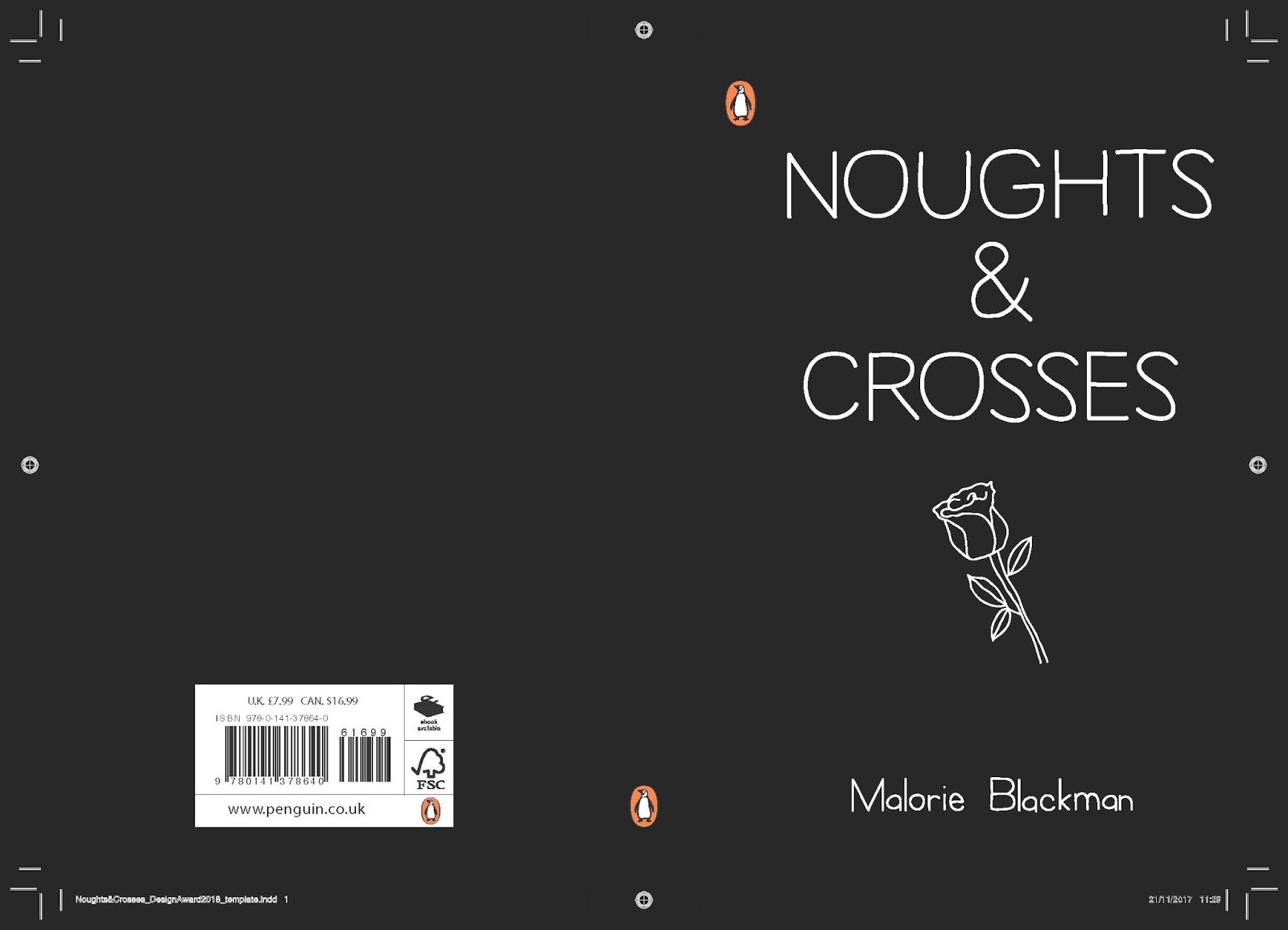
OX Understanding and Sketches
The book I chose to create a cover for is Noughts & Crosses by Malorie Blackman. Although this could be an obvious choice and therefore chosen by a number of other entries, it is a book that I have not read and can therefore add a fresh approach to the production.
From completing the competition last year I think that it is important to read the book and produce a response that is informed by the story. As a first time reader of this book, I will be able to identify key moments from the book that will stand out to the reader.
Initial Sketches:
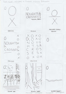
After completing the sketches, it was evident that there are a number of 'obvious' responses to be made. These are likely to be themes that are to be seen in large numbers in the submission of the competition and are therefore something I wish to avoid. It is also important to ensure that the design is unique and has not been seen before.
Friday, 3 November 2017
Noughts & Crosses - Background Understanding/Reading
First published in 2001 Noughts & Crosses deals with racism, terrorism, the class system and the artificial divides we always seem to put between ourselves and others. It is as relevant now as it was then.
Previous Covers:


Each of the designs has an element of the noughts and crosses shape. Although this works effectively with the typography, it is an overused design and does not reflect the greater meaning in the story.

The above front covers have been taken from the leading book seller Waterstones. Each book is categorised as being for teenage/young adult readers. Although each cover has it's individual appearance, they each have strong elements of illustration that work in unison with the typography. This corresponds with the requirements of the brief - 'be competently executed with strong use of typography'.
Subscribe to:
Posts (Atom)