Saturday 29 April 2017

Information Book

As informed by the research, the most appropriate way to present the majority of the information to those who have requested the information pack is through a booklet. This follows a similar media format to what is existingly available on the Mind website, through PDF download. The documents that can be downloaded from the website consist of a range and a lot of information. This makes finding the more specific information on subjects difficult and therefore may discourage the audience from using the information that is available. 

To overcome this, the information booklet will will focus on the specific topic of Schizophrenia/Psychosis as well as the carers individual needs/support. To ensure that the information is engaging and there is not bulk paragraphs of text, illustrations will accompany the information. The style of these illustrations has been informed by the existing style that the charity use. 


As the text has been handwritten, each letter is needed to put together a body of words. This has been a time consuming process however is effective in achieving a personal and engaging design. 


Adjustments to the point size of the text will be made when placed into the booklet file. This will ensure that it is appropriate for the page size that it is being printed on. 
The next stage of production has been creating vector illustrations to accompany the text. This was a technique identified through analysing the existing created produced by Mind. The illustrations add detail to the design, as well as creating a visual to enhance/explain the information. This breaks up the body of text and therefore increases the audience's engagement with the content. This has been something that has been expressed in discussions with peers.

The style of the illustrations has been kept minimal in order to appeal to the largest target audience possible. As the information may be requested by a range of age groups, this has been an important factor to consider throughout. To maintain consistency, the colours have been taken from the colour swatches made from the Mind website.  


Friday 28 April 2017

Planner Experiments

After determining the colour palette that is used by the charity, lower intensity colours have been chosen to produce the planner notebook. This decision was informed by the research carried out as well as through feedback comments during the experimentation stage. The colours separate each section of the double page as well as adding vibrance to the notebook. Due to the lower tone of the colours, the text can still be clearly read as well as any written text being seen clearly on top of the colour. The size of the notebook has also been informed by the research carried out and the distribution of the product.


Thursday 27 April 2017

QR Code - Research

A QR can be used to lead a user to information that is posted on other forms of media. Through researching into the functionality of QR codes, it is my understanding that they work by scanning the code through the use of a smartphone or other application devices. Once scanned, the code leads to the information that is linked to the code. Although this requires more effort by the consumer, it has been shown to increase interaction with the company due to the interested individuals taking the extra step to find out information. The information is typically presented on a website and therefore removes the element of the user having to manually enter the URL. 

Through researching into how QR codes can be used in education, it has been brought to my attention that they can be used to reduce the number of printed material that is in circulation. In education terms, QR codes can be used to give access to listening papers as well as worksheets that can help students complete homework without the presence of a number of paper sheets. Although this requires the technology to do so, it is introducing a more sustainable way of displaying information. 

In relation to this brief, the use of a QR code presents an alternative way to display information in a sustainable yet interactive way. The code can be linked to a website, video, social media and other information platforms. This is therefore something that is going to be experimented with in response to the identified problem. The use of a QR code on printed material could be used to link to relating videos/websites. This makes the information more engaging for the audience. Through research it has been identified that when information is presented in the form of video it increases the users engagement and therefore results in the information being remembered more than if it were to be simply read.  Sustainability is also something that I am exploring more in my practice through my studies in relation to Context of Practice. 


Charity Creative - Research

To inform the design process, research has been carried out looking specifically at creative produced for a charity. This is an important area of research as it will identify techniques used by charities to communicate information to their audience. 

Pj Hoyle - Oxfam Climate Resilience Appeal (Behance)


The design of the leaflet maintains a structured grid that is used throughout each page design. This is followed through by a set colour scheme and design, creating consistency throughout the design. The above leaflet engages its audience through the use of photography and medium length paragraphs of information. The photographs provide the audience with a visual to the information that can be read by the receiver. 


The infographic used in this design is another example of an engaging visual used to support the corresponding text. The change in layout also maintains the attention of the audience.  


Jennifer Bryant - Take Two (Behance)


This is another example of a leaflet produced in response to the identified problem of the number of individuals who are homeless in London. As shown in the previous example, photography has also been used in this leaflet to engage the audience and provide a visual alongside the text. The simple use of one colour against the black and white text reflects the importance of the information. 


Flying Kite, Mind


This is an example of an information leaflet produced by the design studio Flying Kite for Mind charity. The leaflet maintains the colour scheme used by the charity, as well as presenting the use of the same typeface. As seen in the other analysed, there is the use of photography and an infographic. These are therefore identified examples of common features of an information leaflet. 


Wednesday 26 April 2017

Research - Planner

This notebook was received as a free gift after purchasing items through Boden, a clothing company. The 24x16cm notebook is filled with 'My Week' pages as well as blank pages to make notes. This is an example of a simple organiser that includes some of the identified elements to include in a notebook. 
The double page is used to encourage the user to plan out their week by providing space for a 'To Do' and 'Shopping List'. This is further encouraged through having space to make notes on for each day of the week. The feminine colour scheme reflects the receiver of the notebook and is something to highly consider when following a similar format. 


Mossery

This planner is an example of more of a high-end product. The cover of the notebook has been created using a simple marble ink effect which has then been reprinted onto a hard cover. There is also an element of foiling on the cover with the brand name and logo being printed in gold foil. This is a common style seen on a number of notebooks.

The inside pages of the planner are bound together using a ring binder - a more expensive form of binding. The simple calendar layout of the pages allows for a full month to be seen on one double page. However, as a result of this there appears to be limit space to write notes and therefore implements the pages are more of a general calendar use. 


Old English Company

This is a simple example of a weekly calendar. What particularly drew my attention to this design was the handwritten text at the top of the page. This adds personality and character to the piece which makes it appear more inviting to view and therefore use. 


'Your Mental Health'

From identifying that that carers struggle to look after themselves and there being a range of information/support available to overcome this, this is one of the main areas that I would like to focus on within the information pack. On the Mind website the reader is presented with a list of challenges that they may face with being a carer. Each of the bullet points links to another webpage with a page of information on the topic.  


As previously identified, this information is presented in an unengaging form and a number of links need to be followed to receive the full information. One way in which this could be overcome is by presenting the individual with material that would help overcome the identified challenges. One way in which this could be achieved is through presenting contacts of support to the individual. Another may be through giving them a product that would help them manage their own time, plan days and keep track of simple tasks such as food shopping. This could be in the form of a phone application or notebook. 

Tuesday 25 April 2017

Handwritten Type

Through identifying the 'hand written' appearance of the heading type that is used on the Mind website this is an aspect of the charity that could be included in the outcome. Through having an understanding of handwritten type, it can be seen to add personality to a design as well as making it a more trustworthy and engaging piece. This style of type has been identified in the Wear Your Label products as well as the Mind advertising posted on social media. 

Rather than downloading an existing typeface that takes on the qualities of handwritten type, I have downloaded a handwriting practice sheet. These are sheets typically used to help children when they are learning to write however they have been used to assist my learning of how to write with a wacomb tablet. 

Following the outline of the practice sheet, the following letters and numbers have been produced as type. This is a detail that will be explored when putting the designs together.  


Plan

Through discussing the initial ideas I have then gone on to plan out a number of outcomes in response to the Information Pack. This has been informed by my knowledge gained through reading the material that is available on the Mind website as well as through completing the Future Learn course.

THe outcomes have been informed through the creative that I have interacted with through my physical research of mental health. The outcomes are not determined and require appropriateness once experimentation with the content begins. However, one important element to consider throughout the development stage is that the pack must be able to be easily posted. This means that the package must be able to easy posted through standard letter boxes and therefore be no bigger than A3. The thickness of the creative is also a requirement to take into consideration in the printing stages.   


Project Report

Through completing this module my communication, confidence and collaborating skills are the key areas that have been tested and have subsequently improved. This has been through primary research such as talking through ideas/designs with the target audience for the Greenall’s Gin brief as well as working cross-course in response to the Bear brief. 

Through completing studio brief 01 I was able to explore a more personal style that involved the inclusion of graphic design and illustration. This was an important aspect that was considered when selecting the briefs to ensure that the brief allowed for my design interests to be explored as well as experimenting with new methods such as collage (Penguin) and vector drawing (Papyrus).
Although the chosen briefs were open in their requirements it has meant that I have been able to explore my skills in brief interpretation, illustration and expanding the concept outside of what the brief states. This was particularly relevant in the collaboration response to the YCN Bear brief and was one of the main reasons why we selected the brief. 
Although including an illustration form in each response was not always relevant, it was a direction explored in each of the individual competition briefs. This has taught me to always explore alternative directions in response to a brief and to ensure that the most appropriate solution is identified through self analysis and peer/target audience feedback. The completion of the YCN Greenall’s Gin brief demonstrated the importance of gaining and understanding of the target audience and receiving their feedback on designs. This is something that I would like to bring in to my practice more as it not only produces a response that is relevant to the client but that appeals to the target audience too.

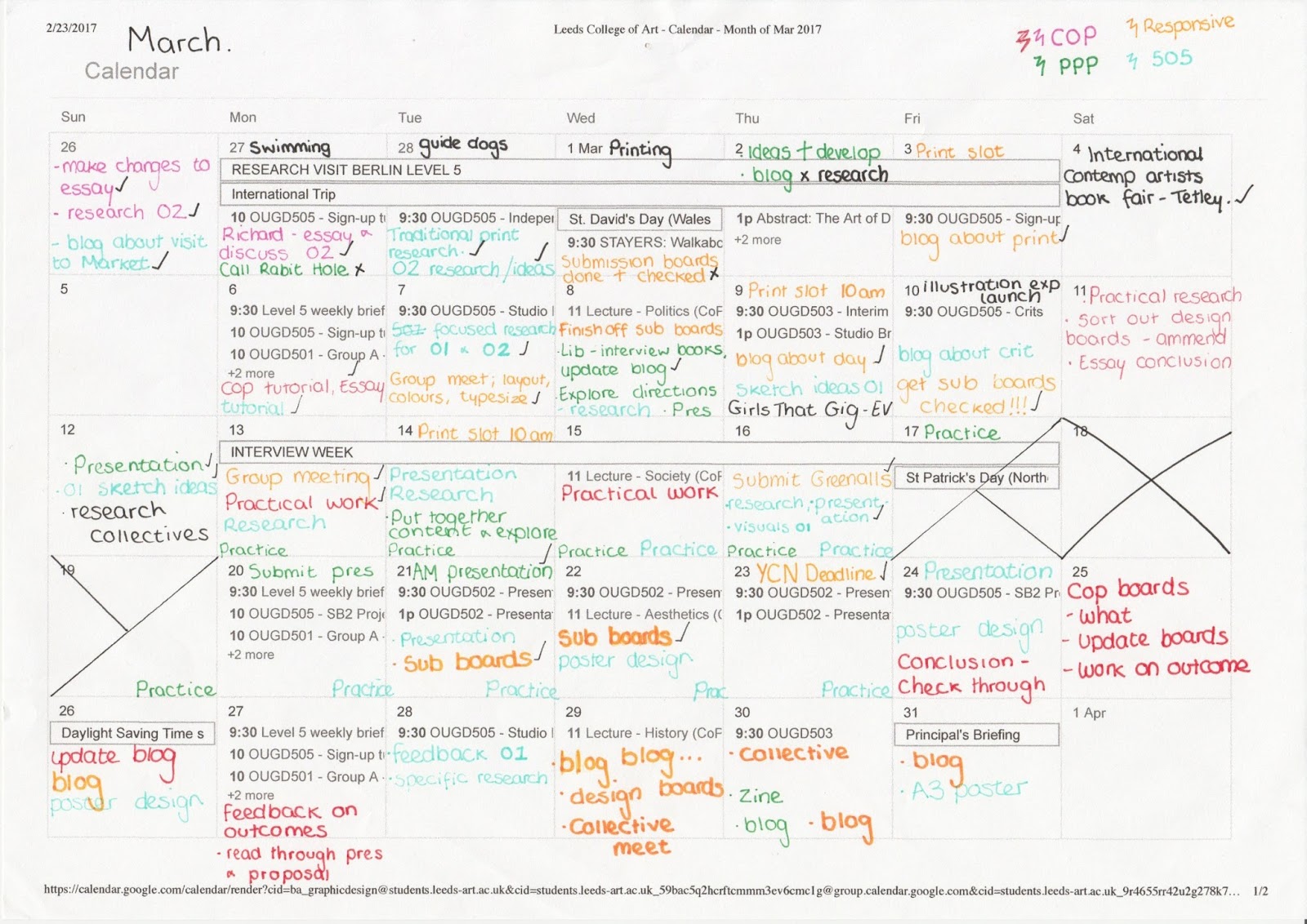
Through developing my confidence in my all round design,communication skills and my time management through completing short and long time frame time briefs in studio brief 01, I was able to transfer these skills through the completion of studio brief 02. Working in collaboration has taught me the importance of communicating with other creatives as well as learning how to take on the opinion of others when making design decisions. We managed our time through a group calendar which is a method I am already used to through completing other briefs. We also communicated through shared messaging conversation which meant questions were able to be asked/meet ups could be easily organised. This benefited my practice as I was able to stay on track on what the other creatives were doing as well as being able to receive feedback/pass on messages. On the other hand this does not reflect a more professional collaboration as this would involve more communication through email. This is different to the collaboration process for this brief as we mostly worked on the project in person and therefore were able to verbally communicate our ideas/design decisions with each other. As I have identified the differences between types of collaboration, it is an area I would like to explore more to develop my skills in working with various creatives on a project. 
When working in collaborative practice I have discovered that my role lends more to art direction rather than being an active designer in the competition of the work. This is a role that I would like to experience more through other collaboration briefs. 


Monday 24 April 2017

Time Management

Throughout this module I have managed my time through calendar time sheets. This has meant that I have been able to stay on track with studio brief 01 and 02. This has been particularly evident in the past two months of the module. This was a time where many of the competition briefs were being handed in and this was a date that was recorded and therefore worked towards. Self-set deadlines ensured that studio brief 01 was completed in sufficient time before the start of studio brief 02. This meant that I could have full focus of each module and ensure that the work was completed to a high and professional standard. This is a method of time management that I have found effective for all modules and therefore will continue to use throughout my practice. 


Tuesday 18 April 2017

Research

Palm Oil Challenge, Chester Zoo. 

This information leaflet is a an example of a booklet which uses illustration coupled with graphic design to communicate information through engaging the audience with the content. This adds personality to the leaflet and gives it a unique appearance. These are qualities to consider when producing the creative for this studio brief. To further engage the audience, the leaflet folds out into a poster which contains further information. The information is categorised through colour with the use of handwritten titles to each section.   


This is an example of the style being shown in a different form. The posters which are pinned to wooden fencing in the Zoo have the same visual aesthetics as the leaflet, creating a consistent look to the campaign.


Monday 17 April 2017

Mind Charity

Due to the outcome be produced for the Mind charity, certain aspects of the 'brand' of the charity should be included. This creates consistency with the information accessed on the website and therefore increases the users trust with the information presented. 

It is clear from accessing the Mind website that the charity use a set colour scheme throughout. They also use a thick sans serif typeface for the headings and subheading on the website with a similar yet more of a body copy typeface being used for the larger sections of text. 


A table of colour swatches has been created by taking swatches from the website. This will allow for the same/variations of the colours to be used in the creative produced.


The below image is an example of one of the PDF information documents that can be downloaded from the website. The wordy page coincides with the brand colour scheme however a different selection of typefaces are used. This creates an inconsistency with the website and therefore gives the brand a second appearance. 


NHS - Tone of Voice

To further develop my understanding of psychosis/schizophrenia, I searched the topic area on the NHS website. Through reading through the content that is available, there is an evident difference in tone of voice taken by the NHS compared to that used by the Mind charity. It is of the social knowledge that the tone of voice used by the NHS can sometimes mean that information is given out in a more hard hitting and less thoughtful way. Although this is done to ensure that the information is received in the correct way, it can sometimes put people off reading their material. 

When reading through this information, there was a lack of availability of information that would be relevant for a carer of an individual suffering from schizophrenia. This therefore led me to search the subject in the search engine where no exact results were found. This support the identified problem that the information is available is limited. 


On the 'Schizophrenia - Living with' page there are a number of drop down boxes at the bottom of the page. One of these is titled 'What can family, friends and partners do to help?'. As can be seen in the screenshot below, there is a brief overview of information covering this topic. At the bottom of this section there are links to the Mind website and other similar organisations. This gives the impression that the NHS are lacking in information that is available on this subject and feel that other organisations and charities are more suitable to look towards in terms of information.  


In reflection to the information that is available on the NHS website, the Mind charity offers a more friendly 'approachable' tone of voice, covering information on a range of different topic areas. Rather than the content being an overview, there are detailed and more general sections to the website. Although this requires navigation by the audience, it ensures that the correct and right amount of information is being received to suit the requirements of each individual. 

In reflection of this, it is has been identified that the tone of voice of the Mind charity could be perceived as being more 'approachable' and therefore more engaging than that of the NHS. The tone of voice of the charity will therefore be maintained throughout the response to the brief, ensuring that carer is the focus of the outcome and the way that it is presented.    


Mind - Information available to carers

Through accessing the Mind charity Information and Support page and then the Helping Someone Else webpage, there are a number of different pages of information focused on various types of mental health problems. There are also pages that offer support in terms of money and benefits, as well as advice on how to look after yourself. This information is also available to download in a PDF document as well ordering a print copy through their mailing system.

These pages of information will be the main source for gathering the content that will inform a piece of creative produced in response to the identified problem. This also allows for the opportunity to relate the creative to the charity. Although this would mean following a similar tone of voice/attitude that the charity brand themselves through there are a number of positives to explore.

Through completing the FutureLearn course, my knowledge and understanding of caring for individuals with psychosis and schizophrenia is more developed than my knowledge other mental health problems. This has informed the decision to focus on Schizophrenia as well as general care and advice for a carer.


Saturday 15 April 2017

Feedback

When discussing the ideas in general, a number of notable comments were made that encouraged me to consider the ideas in a more indepth way. One of these comments was that a carer does not always have the confidence to actively research information on the help that is available to them. This comment stemmed from the discussion around the information pack that would be sent out through the post. When discussing this with a carer of an individual suffering from mental health, they emphasised how this would be a useful and interactive form of receiving information however they would not know how to find this without already being aware of the charity. This made me consider the idea in a more indepth way and consider how this problem could be overcome. One way in which this could be achieved is through advertising the information pack through social media and public displays. 

Although the use of video is becoming a common way to communicate information to an audience, the audience have to be actively aware to know where to view this information. This approach would therefore not be suitable in response to the problem as there is already an existing issue of the platforms used for information being limited and unless known, difficult to source. 


Friday 14 April 2017

Idea Generation

Following the indepth research carried out and through developing an understanding of the information and the way that information is given out, a number of ideas were sketched with annotations to show the thinking behind the outcome/design. 

The first idea focuses around the concept of a colouring book. Through my studies of caring for people with psychosis and schizophrenia it is my understanding that a range of information is given out on how a carer must find time to look after their own health and relax. A popular method of relaxation is through Adult Colouring Books. This is a subject area that was researched through OUGD503 Studio Brief 01. 

The second approach that could be taken is through the production of interactive videos. this would display the appropriate content to carers through social media and other video platforms. This would therefore communicate information in an engaging and alternative way.

Postage Pack:


Stemming on from the idea that focuses on an information pack that carers can order this could take the form of a care package. This emphasises the importance that there is support for carers as well as making them feel positive about the role that they have taken on. Due to the nature of this idea, a range of different methods can be used to communicate the relevant information and therefore addressing the identified problem.  


Monday 10 April 2017

Final Design

The split fountain background to the design reflects the large scale blaze that caused a large proportion of the market to be destroyed. Following this event, the stall holders relocated which meant that the market was still open to the public. This shows the strength of the Leeds community and therefore deserves to be celebrated. 


Tuesday 4 April 2017

Screen Printing - Research

Following on from the discussion had with workshop staff around printing a block colour background, I have carried out further research into the process. Through watching various videos on the split fountain technique, it has bettered my understanding of the process and the technicalities that must be done to ensure effective printing. These are methods such as ensuring a clean exposure of the print is made, as well as ensuring the screen is fully bled before printing. These are methods that I will put into practice.  

Monday 3 April 2017

Screen Printing

The initial experiments with screen printing consisted of having the design separated into two colours. The corner detail of the design aimed to be printed in a maroon shade with the centre and text piece of the design being printed in a dark green. Both of these colours can be seen in the paint work of Kirkgate Market and therefore influenced the decision to use these paint colours in print. However, due to having to perfectly align the corners with the corners of the page, this raised a number of issues when printing. On the more successfully positioned prints, there were imperfections in the print. This meant that the prints weren't printed to the highest quality. 


To overcome this issue, the decision was made to experiment with printing white ink onto coloured paper. 


Although this outcome was successful, it does not reflect my screen printing capabilities and therefore would like to experiment with creating a gradient background to the print. Through speaking to the print room technicians, I have been made aware that this is a difficult task to complete due to the sheer scale of ink that would be going through the screen.