SHADE Studio define themselves as being 'truly passionate motion graphics and VFX company' who are based in Riga, Latvia. Their work ranges from using real life video content or vector illustrations. The below video is an example of their work. The flow of the content from one scene to the next ensures that the attention of the audience is kept. The simple vector images allow for the content of the video to be key, with minimal detail to ensure the eye flows from one area to the next. This is a style of motion graphics that can work on a range of different format sizes due to being largely image based, accompanied by large sections of text.
Libby Vander Ploeg is an illustrator/designer who's creative process is focused around simple yet meaningful design. Her motion graphic design ranges from the use of handwritten text to animated illustrations. The relationship that both text and imagery have allow for their to be no sound. It could be argued that this may result in the audience not viewing the full video, however with the succinct content of the design flowing from one scene to the next, attention is typically kept. This is shown in the example below.
#OptionBthere For the Holidays from Libby V on Vimeo.
Thursday, 30 November 2017
Thursday, 23 November 2017

Friday, 10 November 2017
Research: Target Audience
Through reading the brief, the target audience stated are all university students. This audience will be accessed through university media and online, in autumn 2018. As stated in the brief, there is a limited media budget and the campaign therefore needs to stand out against the other freshers' content that is online and in the public.
'Their smartphone is often the last thing they look at before going to sleep and
'Their smartphone is often the last thing they look at before going to sleep and
the first thing they look at the next morning. The average student will scroll
through over 300ft of content each day.' - This is an important recognition by Art Pass.
In a research study by Alex Chalk MP, YoungMinds and The Children's Society, it has been found that from the 1,089 respondents, 93% of the over 18s reported to be using Facebook however on a whole the most popular platform is YouTube, with 85% of the respondents engaging with content on this form of social media. The use of video is the main function of YouTube, with the ability to post and share video more frequent on Facebook also.
Video is a direction to explore in response to this brief. It is a form that would allow for the information to be quickly received on a range of different online and offline platforms.
Through a discussion with university peers, the importance of student discounts was made by each individual. The discounts that are offered through companies such as NUS Extra and UniDays are known by all students. Many said they became aware of these discounts from the advertisements on social media as well as word of mouth in education. However, as NUS Extra is a paid for 'service', many students expressed their lack of support to this due to other free alternatives being available. This is important to consider when responding to the brief as the payment for the card will affect the level of interest of students.
Middlesex University, London. Student Communications Survey, June 2016. Social Media sub-report.
2121 Students surveyed:
- 71% of students admitted to using social media at least once a day
- WhatsApp and Facebook are the more commonly used channels ( 83% and 77%)
- Instagram and YouTube are both also used by over 50% of students
- 67% of students say that social media is a preferred channel of communication for community information (e.g. events and University news)
- Facebook, YouTube, Twitter, WhatsApp and Instagram are all channels that students would be happy to use to engage with the University
- 59% of students follow University Facebook pages for information
Thursday, 9 November 2017
Research: Competitors/Similar Idea
When appealing to such a large audience it is key to understand their motivations. One way in which this can be analysed is through recognising and researching existing competitors of the Art Fund as well as other student orientated discount companies.


UNiDays - This is a popular platform used by students to receive FREE discount at a range of popular retailers
- Mostly used online through the use of discount codes
- You simply sign up using a verified university email address


- Website + app
- Social media presence that tailors to the interests of the student market (memes)
- Bold colours and patterns are used subtly to add a unique image to the brand
- Line vector illustrations are used to add visuals to information


NUS Extra - Another popular form of receiving discount
- In the form of a card
- £12 a year or £32 for 3 years
- Impressions from the website and social media: it is what it is. The brand is not as engaging as competitor UNiDays, there is a lack of engagement with the audience


Student Beans - 'youth media brand'
- offer discount across a range of retailers
- hub for articles, offers, jobs etc
- You sign up and receive discount codes through website/app
- Engaging content for the student audience

16-25 Railcard -
- Save 1/3 on rail prices
- £30 a year or free with a Santander Student 123 account
- For anyone aged 16 to 25, or over 25 and in full-time study
- Card needed to verify discount when travelling
Amazon Prime Student
- FREE prime service for 6months
Through researching each of the above companies, it is evident that there are a number of common themes that run through the visuals and mannerisms of the brand.
- Content must be engaging and appeal to the student audience (animation, bold colours/patterns, humour)
- Tone of voice must be persuasive but engaging
- Videos are engaging and can be a quick way to get a message across
Wednesday, 8 November 2017
Art Fund
Their Proposition is 'you can go somewhere else with art'. This is a statement that is adjusted to each of their specific audiences and aiming to meet their individual needs.In terms of the university audience, they want to connect the next generation of artists, curators and proffessionals to their national collections and museums.
- Our personality guides the voice we use to write and speak to the world. Their tone of voice must be reflected in the campaign
Logotype:

Colours: The brand colour palette is inspired by the different types of art that the brand supports

Sponsored advertising:


This is advertising that has appeared on web pages after visiting the Art Fund website. This is an indicator that they use sponsored advertising which can be an effective way to remind a consumer or a product or service.
YCN Art Fund 17/18
After completing a YCN brief in 16/17, I am able to recognise that this is a student competition organisation whose values and way of working reflects my own and therefore I am encouraged to submit to the 17/18 competition.
As the briefs that I am focusing on for this module must reflect my own interests, the brief that I have chosen is Art Fund.
The following information has taken from the brief document as being key aspects to the brief.
Brief: Create a campaign that can drive sales of the Student Art Pass amongst university students.
Background:
- Art Fund is a UK charity, founded in 1903
- Helps museums and galleries buy and display works of art
- Most of the funding comes from the sales of the National Art Pass
- The pass offers free entry into over 240 charging museums, galleries and historic houses in the UK + 50% off major exhibtions
- £5 for students, £65 other
- Limited passes available at £5 for students
Creative Challenge:
- Convince all students that visiting museums and galleries can help them step out of their daily lives and get a new perspective on the world
- Inspiration for studies
- Relax and reset
- The campaign will appear in university media and online in autumn 2018
Key Insights:
- Technology is a large part of a students daily life
- 'Most students feel slightly uncomfortable about the prevalence of technology in their lives. They wish they could switch off more'
Key Messages:
- Student National Art Pass can help you switch off, relax and find inspiration
- A whole year of art for just £5
The Channels:
- Posters, on-campus stunts, university intranets, digital screens in lecture halls, university magazines/papers
- Social media (paid-media formats)
- Who could Art Fund partner with to raise awareness of the offer on campuses? (unidays?)
Monday, 6 November 2017
Development
Experiments, obvious responses:


Inclusion of element from story:


Feedback:
- Rose is effective as it reflects the romance/friendship of the story
- There is too much going on, the first design is the most visually eye catching as the simplicity allows for the eye to explore each part of the design
- Not inventive colour choices
Pattern:

Feedback:
- Main copy text is difficult to read
- Pattern is visually effective but isn't cohesive with the copy text
- Due to size of OX it appears to read as a word rather than the individual letters
Scene:

Feedback:
- Powerful text
- Vector design could be bolder in colour
- Strong use of imagery and text
- Design is not understood but reflects the tone of the copy text
The Power Of Colour - FutureLearn
This is a four week course which I completed through the FutureLearn website. The content of the course covered the basics of understanding how colour works and the physics behind how the eye functions. As the content developed, a range of topics were covered and has provided the foundations to the research project looking into colour.
Notes from Course:
People:
Sue Timney
- Interior and product designer
- Familiarizes use of two colours and then adds in more tones
Johannes Itten
- Researcher in the field of colour, colour principles and colour combinations/contrast
- Taught at the Bauhaus in 1919 to 1922
Joa Studholme
- Farrow & Ball's in house colour specialist
- Fashion trends have a major impact on setting colour trends
- Colours have become softer, reflecting the hardness of technology that we are surrounded by in our everyday life
Tom Chivers
- Colour psychologist
- A brief glimpse at the colour green prior to a creative task has been shown to enhance performance
- Colours carry different meanings depending on their context
- Colour symbolism, deriving from our conscious associations, is a conditional response
Julia Begbie
- Munsell colour system
- In the eye, prolonged exposure to light of a particular colour will temporarily reduce your sensitivity to that colour. This is called neutral adaptation
- Harmonious scheme is colours that are close to each other on the colour wheel
General:
What is colour?
- In order for a human to see colour the necessary components are:
1. A coloured object 2. Full spectrum light 3. The eye to reflect collected light 4. The brain to process the information from the eye
- The colour sensation received in your eye varies with the wavelength of life. Different colours = different wavelengths
- The colours that a human eye are able to see is called the visible spectrum.
- Optical or visual illusions are caused by information gathered by the eye being processed in the brain to cause a perception that does not tally with the actual physical measurement of the viewed object.
Opponent - Process Theory:
- The photoreceptors in the eye are linked together in opposite colour pairs. Blue & Yellow. Red & Green.
- Activation of one member of the pair inhibits activity in the other
- The photoreceptor cells in your eye respond to the primary colours of the additive system; red, green blue.
Hue and Saturation:
- Hue is the description of a full value of pigment
- Saturation describes the amount of pigment present within a colour
- Hue + saturation affect our visual hierarchy (the other in which we see things and their impact)
Colour Symbolism:
- The language that a person speaks can affect the way that a person perceives colour. This may be an interesting topic to explore further within this research brief. It would provide a direct focus to the brief.
- All languages recognise black and white
- If a third colour is recognised it is red, fourth yellow or green
- Climate can also affect our colour preferences
- Sunny climate = warm, bright colours
- Poorer light climate = cool, low saturation colours
The Impressionist (1870-1880's)
- Experimented with the idea that the shadow of an object can be made up with dashes of its complimentary colour
Where do my colour inspirations come from?
- Nature
- Travel
- Society
- Culture
- Fashion
Concept and Colour
- When working on a brief/project, extract colours from a photograph that conveys the mood in which you would like to take forward in the design outcome. This is a method of practice that would be interesting to experiment with in future projects.
OX Understanding and Sketches
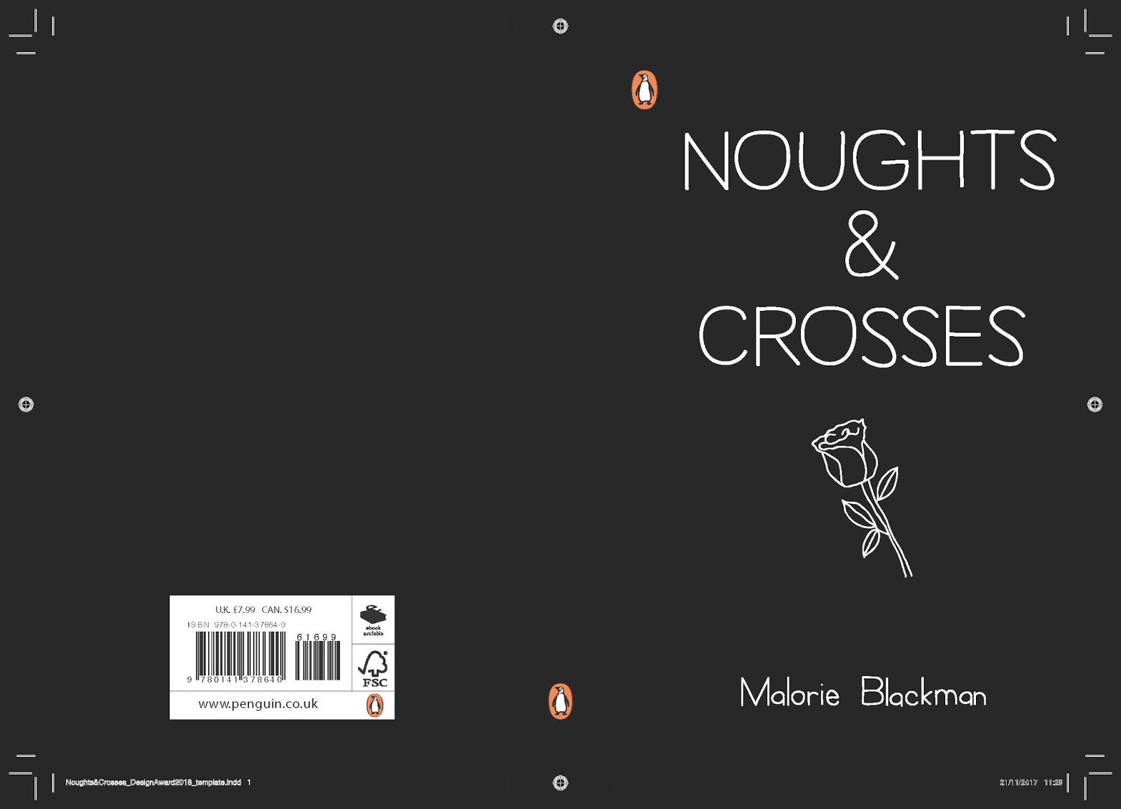
The book I chose to create a cover for is Noughts & Crosses by Malorie Blackman. Although this could be an obvious choice and therefore chosen by a number of other entries, it is a book that I have not read and can therefore add a fresh approach to the production.
From completing the competition last year I think that it is important to read the book and produce a response that is informed by the story. As a first time reader of this book, I will be able to identify key moments from the book that will stand out to the reader.
Initial Sketches:
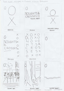
After completing the sketches, it was evident that there are a number of 'obvious' responses to be made. These are likely to be themes that are to be seen in large numbers in the submission of the competition and are therefore something I wish to avoid. It is also important to ensure that the design is unique and has not been seen before.
Friday, 3 November 2017
Noughts & Crosses - Background Understanding/Reading
First published in 2001 Noughts & Crosses deals with racism, terrorism, the class system and the artificial divides we always seem to put between ourselves and others. It is as relevant now as it was then.
Previous Covers:


Each of the designs has an element of the noughts and crosses shape. Although this works effectively with the typography, it is an overused design and does not reflect the greater meaning in the story.

The above front covers have been taken from the leading book seller Waterstones. Each book is categorised as being for teenage/young adult readers. Although each cover has it's individual appearance, they each have strong elements of illustration that work in unison with the typography. This corresponds with the requirements of the brief - 'be competently executed with strong use of typography'.
Monday, 23 October 2017
Final Outcome + Evaluation
This live brief for a client has developed my skills in communication in terms of design terminology and feedback. Working with an individual who has a certain level of creativity has held its challenges as well as positives. Although the design chosen by the client is not one that I feel is the most visually effective, it has taught me to respect the clients wishes. From a personal point of view, the KS initial design is not well executed and was completed from the direction of the client. Using a photograph on the business cards reflects the style and genre of the photographer however can present issues if the style of the photographer were to vary. However, for the event that the business cards were produced for, including this image is relevant at this time.
Overall the collaboration with the client was successful and has built my confidence in being passionate about the work I produce. It has also taught me the importance of being able to listen to constructive comments and being able to make the appropriate adjustments. With this brief I felt that my own creative direction was overpowered by the wants of the client due to the high level of creative input that they had within the design process.
The final outcome was selected by the client to ensure that the design reflected their aspirations for the design. The stock chosen by the client was a 300gsm recycled paper. This reflects their environmental considerations in their work however meant there was a lack of colour in the outcome.


A secondary outcome has been presented in response to the design that I feel suits the purpose of the client more effectively. The clean layout is appropriate for the busy scenario of Paris Photo which is the event the outcome was produced for.

Ordering Print
Having not previously used a company to print designs, this was a new process to go through. The company provided no requirements to the file type that the design should be sent in and it was therefore decided to package the InDesign file. This allows for a range of file types to be presented to the company. This also required a level of professionalism when corresponding with the company to ensure that the correct information about the design was present.
Thursday, 19 October 2017
Penguin Random House Studen Competition
The Penguin Random House student competition is relevant to my practice as I have an interest in book jacket design. This interest has stemmed from starting to read from a young age and has continued on in my creative practice.
Having previously entered the competition, I am now more aware of what makes a successful entry and the time that is needed to complete the brief.
The Brief - 'You are invited to design a cover look for Noughts & Crosses to bring this original and unforgettable book to a new generation of readers. The design should ensure that this important book remains a must-read for every teenager.'
Time Scale - 1 Month Research, 2 Week Production
Although the time scale for research outways the production, this allows for sufficient time to gather primary and secondary research. As part of the completion of this brief, I am going to read the chosen book to gain a better understanding of the story. This will therefore provide a more informed approach to the outcome.
- 'We are looking for a striking cover design that is well executed, has an imaginative concept and clearly places the book for its market. The cover should encourage children to pick up the book and buy it for themselves and should also engage adults to want to buy it for them.' This element to the brief gives a clear direction for the initial starting point to the brief. Research will be carried out into current book jacket designs as well as those that have been completed for the book previously.
Wednesday, 18 October 2017
Final Outcome Development


To overcome the technical issue of having the 'DOCUMENTARY TYPE' reading the wrong way, I spoke to the technicians who were able to assist me in discovering a way to alter the text so that it would read from left to right.
Through a discussion with Kris over the border on the front of the design, we experimented with the yellow (f5e187) colour swatch from the photograph and white. The yellow adds a burst of colour and works cohesively with the photograph however Kris felt that it made the design 'too happy and playful' which does not reflect the genre of photography. The white border makes the design appear washed out and takes too much focus away from the photograph. It was therefore decided to remove the border all together and have a tighter version on the back of the card.


Friday, 13 October 2017
How to write a lab report
Guide To Writing Research Reports, University of Essex
https://www1.essex.ac.uk/psychology/documents/current/lab-reports.pdf
1. Title
- A single line description of the study, mentioning the independent and dependent variables
2. Abstract
- A short summary of the report
- Description of the rationale and of the method, results and discussions section
- 100 to 120 words
3. Introduction
- Why you did it
- This should be appropriate for someone who is not an expert
- Define the area that you wish to study
4. Method
- How you did it
- Participants, Apparatus, Materials, Design, Procudure
Results
- What you found
- Descriptive statistics
- Inferential statistics
Discussion
- What you think it means
- Relate results to hypothesis
- How confident can we be in the results?
- Suggest constructive ways to improve your study (if appropriate)
- Implications of findings
References
- Bibligraphy
Presenting the findings in a report format would relate back to the original research intentions. However, from the research carried out and analysing this, the research proposal format lacks engagement with the audience and understanding the information can be a lengthy process. This format would be presented in an alternative way to make it more engaging for the reader.
Thursday, 12 October 2017
Colour psychology and clothing
Further research has been carried out on the subject of colour psychology and clothing. This will inform correlations to look out for in the primary research as well as indicate any other varying aspects.
Effects of color on emotions.
By Valdez, Patricia,Mehrabian, Albert
Journal of Experimental Psychology: General, Vol 123(4), Dec 1994, 394-409
Abstract
Emotional reactions to color hue, saturation, and brightness (Munsell color system and color chips) were investigated using the Pleasure-Arousal-Dominance emotion model. Saturation (S) and brightness (B) evidenced strong and consistent effects on emotions. Blue, blue-green, green, red-purple, purple, and purple-blue were the most pleasant hues, whereas yellow and green-yellow were the least pleasant. Green-yellow, blue-green, and green were the most arousing, whereas purple-blue and yellow-red were the least arousing. Green-yellow induced greater dominance than red-purple. (PsycINFO Database Record (c) 2016 APA, all rights reserved)
Dan Thomas, Image Doctor.Although the level of authenticity to this information is unclear, interesting suggestions are made which could be applied to the primary research.
- Dark colours are perceived as more formal, dominant and authoritative
- Light colours make the wearer appear more friendly and approachable
- Some bright colours convey confidence and energy
- Muted colours are conservative and less threatening
- Contrasting colours can also send a certain message. The higher the degree of contrast such as wearing a black suit and white shirt or a navy suit and white shirt can create a very powerful image.
An exploratory study: Relationships between trying on clothing, mood, emotion, personality and clothing preference. Wendy Mood (The University of Manchester, UK)
Abstract
This study sets out to explore the application of psychological research methods (as yet not applied) in the fashion arena. The aim of this project is to quantify, formalise and explore the causal relationships between clothing style, preference, personality factors, emotions and mood with a view to a better understanding of the psychological profile of the fashion consumer. This study is a developed version of the primary research to be carried out.
Design/Methodology
- Uniformly composed samples of females, similar age, occupation and dress size (participant variables). Such variables must be consistent to ensure the true source of the change to the dependant variables.
- Quantitative research
- 2 Questionnaires, aim: examine emotion, mood and personality before trying on a set of eight garments categorized according to style. Afterwards, to examine emotion and mood while wearing each outfit. Questionnaires are an unbiased way for the researcher to gather information. However, there are issues with the respondents feeling as though they should answer the questions with what they believe the researcher to want.
- Photograph of participants were taken wearing each of the outfits
- Participants ranked the outfits in order of preference
- SPSS analysis identified relationships and preference indicators
Findings
- The results indicated strong relationships between mood and significant relationships between three out of five personality factors and clothing style preference; mood was a significant predictor of preference, whilst personality was moderate
- When trying on unfamiliar clothing (e.g. whilst shopping), clothing is used as an appearance and mood management tool by reflecting or managing positive or negative mood.
- The results showed the varying levels of emotion an outfit can generate and the power of clothing on individual emotions

Limitations
- Methodology required lengthy time commitments and therefore limited sample size, making generalization difficult
Clothes Can Change/Affect Mood:
- University of Queensland interviewed people and observed their clothing choices to find out whether clothing reflected the individual's mood or whether they were wearing the clothing to change their mood. The results found that we typically dress how we'd like to feel or how we'd like others to think we feel.
- Social Psychological and Personalist Science found that certain people wearing formal business attire feel more powerful and in control of things than those in under-dressed clothing. The same study also found that those in formal clothing were found to think faster on their feet and had more creative ideas.
- Athletes in red clothing won more events in the 2004 Olympic games than their competitors in blue. Following this a study, published in the Journal of Sport and Exercise Psychology, found that people who exercised in red could lift heavier weights and had higher average heart rates, indicating they were working harder than those wearing blue, even though both groups reported similar rates of exertion.
Although the above information is in relation to different types of clothing, they could be variables that influence the mood of the participant in a study - it could be the type of clothing that influences the mood and not the colour.
Wednesday, 11 October 2017
Psychology of colour in design
The Psychology of Colour in Marketing and Branding
Gregory Ciotti, Marketing Strategist
April 13, 2016
'The psychology of color as it relates to persuasion is one of the most interesting--and most controversial - aspects of marketing.'
In this article, the question as to why colour psychology is backed with so little factual data is answered in terms of their being so many varying factors that can influence the effect colour can have on an individual. Elements such as personal preference, experiences, upbringing, cultural differences, context, etc. When investigating colour, it is perhaps key in controlling as many extraneous variables as possible to ensure that the conclusion drawn is not lowered in validity.
The article also states that 'color is too dependent on personal experience to be universally translated to specific feelings.' Is this subjective to the investigation?
'In an appropriately titled study called Impact of Color in Marketing, researchers found that up to 90% of snap judgments made about products can be based on color alone (depending on the product).' This would suggest that colour does have an affect on a persons response and therefore is a key area to explore in design. This is further supported by research that concludes that the brain responds better to name brands (Radiological Society of North America, 2006). It is therefore important for new brands to use colours that differentiate from their competitors in order to stand out. However, does this go against the use of colour if consumers are more likely to go with what they recognise?
Development
Following on from the discussions had over the research conducted, I experimented with a range of different typographic forms. Through Kris's comments, she highlighted that the preferred typeface would be sans-serif. This reflects her modern day approach to photography as well as appearing professional and slyck.


Through experimenting with type on a different photograph, it is clear that bold colours are needed to allow for the text to stand out.
After completing the above designs, feedback was gained from peers as well as from Kristina.
Feedback:
- The circle designs draw attention to the logo without imposing on the photograph
- The text around the outside of circle adds the relevant information but I'm not sure it reads correctly
- The border around the outside defines the shape and fits well with the photograph
- The rectangle design is harsher than the circle due to the sharp edges
Taking on board the comments made, further experimentation is going to be carried out. Adjusting the 'DOCUMENTARY PHOTOGRAPHY' text to read correctly is something that is proving difficult to navigate with in Illustrator.
Going back to the notes made in the research discussion, the following experiments involved using handwritten type. This can be seen to add personality to a design and therefore enhancing the personality that is being displayed.
Through each stage of development for the business cards, Kris's feedback is essential in the progression of the design. To ensure that this is received, the document with each design on is shared with her and the request for feedback is made.


Feedback From Kristina:
- In a meeting with Kris held over the front design of the cards, we discussed the differences between the handwritten and sans-serif type. Although the handwritten type adds personality to the design, we both felt that it lacked professionalism.
- 'The 4th design reflects my easy going personality however this does not represent the serious issues that I photograph. I feel this design is not appropriate for the themes that I am exploring through my work.'
- 'The 5th design is strong, the way the letter are formed suggests a strong name/brand. The documentary photography works well but it might be better to read the correct way. I like the positioning of the full image.'


Feedback from Kristina:
- 'I am drawn to the design with the border as it adds definition to the design and flows well with the front of the card. Some of the other designs have too much white space.
Subscribe to:
Comments (Atom)