To prepare the document for print, the photographs were all edited using the knowledge learnt in the workshops provided. This ensured that they were of the appropriate resolution(300dpi) and colour mode (CMYK) for print. If the handbook were to be commercially printed the photographs would already be prepared for the print method and would be printed to a high professional quality. The colours used throughout the handbook in terms of the text and illustrations are that of the correct mode for the laser printer. This has ensured that the colours that were being viewed on screen were as close to the colours presented in print. This also meant that spot colours were able to be used therefore again, reducing production costs as a combination of inks is not used.
The handbook has been printed using 300gsm uncoated paper for the front and back cover and 90gsm recycled stock for the content pages. The choice for using a different stock for the front and back cover was directed by feedback comments which suggested that a thicker stock was important to improve the durability of the handbook. The recycled paper was chosen due to its low cost as well as its connection to many of the other free publications that were researched. For the production for the brief the handbook was printed on A3 stock which was printed using crop marks. This meant that the full bleed images did not have to be resized. If the piece were to be commercially produced this would not be an efficient stock size to use as there is a lot of paper waste. The design would therefore be slightly adjusted so that the full bleed images are resized to fit an A4 paper stock.
The saddle stitch binding method was informed by the free publication research as well as feedback comments. Using this method of binding is quick and low cost therefore keeps the production cost of the handbook minimal if it were to be commercially produced. The staple also works with the thin stock which is the main advantage over using this method rather than perfect binding.
Friday, 28 October 2016
Thursday, 27 October 2016
Context Research
This direction of research focuses on gaining an understanding of the context that the book will be in and the other books that it will be presented alongside in a book shop environment.
Genre - True Crime


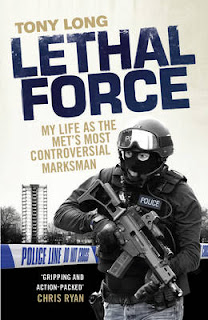
Something that stands out straight away from looking at these covers as a whole is that the colour schemes are similar as well as the use of photography and illustration being used. This is something that I experienced when visiting Waterstones. The covers that stood out the most were those that had qualities that were different to the others that they were presented beside. For example; block colouring, minimalist design as well as the more ambiguous approaches (not being able to tell what the story is about from the cover). Each of the designs have a dark colour factor in the design with a brighter, more stand out colour.
Genre - Crime


To look into more general research I extended the search to Crime. This is a similar genre area that the book may be in the same context with. Again there are similarities with the books that I found in this section of the bookstore. Above are the covers that stood out as being more individual. Traits that they have are using ambiguous imagery as well as text that stands out but works in conjunction with the design.
Genre - True Crime


Something that stands out straight away from looking at these covers as a whole is that the colour schemes are similar as well as the use of photography and illustration being used. This is something that I experienced when visiting Waterstones. The covers that stood out the most were those that had qualities that were different to the others that they were presented beside. For example; block colouring, minimalist design as well as the more ambiguous approaches (not being able to tell what the story is about from the cover). Each of the designs have a dark colour factor in the design with a brighter, more stand out colour.
Genre - Crime


To look into more general research I extended the search to Crime. This is a similar genre area that the book may be in the same context with. Again there are similarities with the books that I found in this section of the bookstore. Above are the covers that stood out as being more individual. Traits that they have are using ambiguous imagery as well as text that stands out but works in conjunction with the design.
Monday, 24 October 2016
Front Cover Design - Feedback


Something that was important to look at from the last feedback session is the illustration on the front and back cover of the handbook. Through suggestions, the illustration was developed by adding detail to the piece (pavement and wayfinding). Although the suggestions were taken on board, the original design was voiced as preferred. This is due to the simplicity of the design being lost with the adding of detail to the illustration and that although the front cover is simple, students felt as though they were still drawn to it and would want to pick up the handbook.
Print Workshop 3
- The design of the book digitally needs to be informed by the binding method that is going to be used when printed. This is due to the margin size that is needed to ensure that no content is lost from the page when binding.
- The binding method can also be selected when specifying the printing options so that the pages are printed correctly. This can be useful when using more intricate binding methods such as perfect binding and Japanese stitch.
- If printing A5 page booklet with a 3mm bleed, A3 paper is needed so that the print is successful with full bleed images. If there is no bleed then the book will be able to be printed on A4 paper.
- Photographs must be at 300ppi to ensure a high quality print
- Check resolution of photographs > check scale size > in photoshop, open photograph and adjust image size to suit the scale percentage of the photograph in the inDesign file > save
Friday, 21 October 2016
Test print 2 Evaluation and Feedback
Evaluation of 2nd test print:


Questions:
1. Do you think the overall design of the page is consistent throughout? Why?
- Yes, until you reach the double page with the full bleed image although each of these pages are consistent with each other
- Yes, the content reads well and has a continuous flow making it easy to read
- The positioning of the text on each page is consistent which enhances the flow of the book when reading quickly - your eyes know where to look on each page before you're there
- Try experimenting with the grid used on the individual pages on the double page with the full bleed image. The images on the right hand page are not positioned in the same place as the others creating an inconsistency
- Yes, the eye is drawn to the same place on each page making the content easy to read
2. Is the size of the handbook appropriate to the purpose? Why?
- Yes, as a handbook it needs to be easy to hold (which it is) without being so small you can't read or view the content properly
- It may be nice as a smaller publication although this would mean the full bleed images wouldn't have as great effect
- Yes, it is easily to hold and would fit into coat pocket/bag
- Yes, typical size you would expect for a handbook/guide book
3. If you saw the handbook in the student union area, would you want to pick it up and look at it?
- Yes, although the design is simple my eye is drawn to the piece through the subtle colours and simplistic design
- No, I'm not keen on guide books therefore this wouldn't interest me
- Not sure, it is somewhere I don't know of therefore not sure whether I would be interested in the content - although this is a valid comment, I disagree with what is said as the handbook is there to inform the person of the town therefore no prior knowledge is needed
Through a further feedback discussion with a member of the target audience of the handbook who is also aware of the town, alternative suggestions were made. These suggestions are of high importance due to their existing knowledge of the town. Comments such as adding the landmarks to the map would be beneficial to the audience as it gives them a wider selection of information. In other words, having more information available to the reader will enhance their knowledge of the town therefore further encouraging them to visit the town.
This test print was printed on A4 and then trimmed down rather than A3. This caused an issue with the full bleed images as they were scaled down to fit the page and also meant that the handbook was overall a smaller size. The change in size meant that when the booklet was then folded and stapled the images were not always correctly positioned. This test was completed as if the handbook were to be commercially printed, it would be more cost effective to print using A4 paper rather than A3. However, due to these issues being present, the design would need to be adjusted so that these printing errors do not occur. This would simply involve having no bleed on the images therefore there would be some white space around the edge of the image.
Having made subtle adjustments such as the inside margin to suit the binding method and the change of the type size, there are a few areas that still need changing. This is simply due to not being able to see the detail on the computer screen and is therefore only present in print. This has highlighted the importance of doing one or more test prints before the final production. Having noticed these adjustments before the final print they are able to be amended so that the final design is to printed to the highest quality.


Through a feedback discussion with a number of different students, the overall main comment on the front cover design was that it needed more colour. Although the illustration was described as visually pleasing and interesting to the eye, the lack of colour meant that they felt they would not be drawn to it in a social, busy environment. This is something that is important for the handbook design to achieve as it will be placed among other free publications to pick up. It was suggested that adding more detail to the piece would enhance the design. These comments will inform the development of the illustration for the final print. One way that has been suggested by a tutor to enhance the 'wow' factor to the design is adding a small element of foiling to the wayfinding design element of the front cover. This is something to experiment with however when thinking of the publication commercially, this process would take more time and money to produce the piece.


Questions:
1. Do you think the overall design of the page is consistent throughout? Why?
- Yes, until you reach the double page with the full bleed image although each of these pages are consistent with each other
- Yes, the content reads well and has a continuous flow making it easy to read
- The positioning of the text on each page is consistent which enhances the flow of the book when reading quickly - your eyes know where to look on each page before you're there
- Try experimenting with the grid used on the individual pages on the double page with the full bleed image. The images on the right hand page are not positioned in the same place as the others creating an inconsistency
- Yes, the eye is drawn to the same place on each page making the content easy to read
2. Is the size of the handbook appropriate to the purpose? Why?
- Yes, as a handbook it needs to be easy to hold (which it is) without being so small you can't read or view the content properly
- It may be nice as a smaller publication although this would mean the full bleed images wouldn't have as great effect
- Yes, it is easily to hold and would fit into coat pocket/bag
- Yes, typical size you would expect for a handbook/guide book
3. If you saw the handbook in the student union area, would you want to pick it up and look at it?
- Yes, although the design is simple my eye is drawn to the piece through the subtle colours and simplistic design
- No, I'm not keen on guide books therefore this wouldn't interest me
- Not sure, it is somewhere I don't know of therefore not sure whether I would be interested in the content - although this is a valid comment, I disagree with what is said as the handbook is there to inform the person of the town therefore no prior knowledge is needed
Through a further feedback discussion with a member of the target audience of the handbook who is also aware of the town, alternative suggestions were made. These suggestions are of high importance due to their existing knowledge of the town. Comments such as adding the landmarks to the map would be beneficial to the audience as it gives them a wider selection of information. In other words, having more information available to the reader will enhance their knowledge of the town therefore further encouraging them to visit the town.
This test print was printed on A4 and then trimmed down rather than A3. This caused an issue with the full bleed images as they were scaled down to fit the page and also meant that the handbook was overall a smaller size. The change in size meant that when the booklet was then folded and stapled the images were not always correctly positioned. This test was completed as if the handbook were to be commercially printed, it would be more cost effective to print using A4 paper rather than A3. However, due to these issues being present, the design would need to be adjusted so that these printing errors do not occur. This would simply involve having no bleed on the images therefore there would be some white space around the edge of the image.
Having made subtle adjustments such as the inside margin to suit the binding method and the change of the type size, there are a few areas that still need changing. This is simply due to not being able to see the detail on the computer screen and is therefore only present in print. This has highlighted the importance of doing one or more test prints before the final production. Having noticed these adjustments before the final print they are able to be amended so that the final design is to printed to the highest quality.
The Judges
Although I disagree with producing a piece of work for a competition for the sole purpose of appealing to the judges preferences, the judges for the Penguin Random House competition have a connection to the company therefore have background knowledge of Penguin. This will hopefully mean that their judgements are made on what is the most appropriate design for the book rather than their personal preference.
John Hamilton
- Specialised in illustration at Glasgow School of Art
- After graduating he became a junior book designer and has continued in this field of work
- Joined Penguin in 1997 and is responsible for dropping the orange spines from the fiction book designs
- For Penguin's Seventieth Birthday Campaign he invited (along with Jim Stoddart) seventy designers, artists and illustrators to create one cover each, designed within seven days. This shows that he has an interest in a number of different medias and therefore will hopefully not favour particular design styles.
- Responsible for art directing Penguin's hardback imprints; Viking, Hamish Hamilton, Michael Joseph, Fig Tree and Penguin Ireland
Joanna Prior, (10 minutes with: Joanna Prior, managing director of Penguin General, theguardian.com)
This article is an interview with Prior where she is asked her opinion on the rise of e-books and how this has affected their methods, as well as going into detail about the #readwomen2014 campaign
- 'Putting the right cover on a book is something that takes a lot of care and attention and, in my experience'
- ' I don't think we would tolerate a cover that marginalised a writer's work.'
Jim Stoddart
- From graduating Jim worked at a studio designing record and CD covers
- He then went on to working for Penguin as a cover designer
- Oversaw the redesign and rebranding of Penguin Classics/Modern Classics and Pelican books
Thursday, 20 October 2016
D&AD and YCN
To get an understanding of D&AD and YCN, I looked at various annuals that are produced yearly showcasing the professional and student work for the briefs set. A summary of the feels, impressions and response to these annuals are listed and explained below.
D&AD:
- Corporate
- Clean - the thick satin stock along with the crystal white of the page reflects the pristine appearance to the design of many of the annuals. This reflects the corporate and business like impression that is given off from the annuals
- Structured
- Celebrates commercial paid work - this is reflected through the large amount of content in the annuals that is produced by proffessionals. Although D&AD say that they 'aim to reach young creatives from as far and wide as possible to offer inspiration, learning and genuine breaks on the way into industry.' this is not reflected in their annuals as there is a minimum amount of page space reserved to showcase students work that has been produced in response to the briefs set. This commercial aspect is reflected in the briefs that are set. It feels as though there is a limit to the level of experimentation that you can take on with a brief as they are looking for an outcome that can be produced and would work in the commercial environment
- Intimidating - the expressiveness of the annuals give off the impression that D&AD think that they are the best that they can be
YCN
- Inspiring
- Expressive
- Celebration of both professional and student work - although in this case students are given less page space to showcase their work, the attitude between both sections of the annual are consistent and equally motivating
- Motivating tone of voice - although this tone of voice is motivating it is also kept to an equal level. Therefore the text does not make you feel little of big in your shoes. The content is clear and easy to understand for all levels of ability
- The briefs have more of a social purpose rather than commercial. This gives them more direction for experimentation. The most successful outcomes take this on as an advantage to their concept behind their idea and focus on informed social research behind their outcome.
What makes a successful outcome:
- Campaign - a design that works digitally and printed. It is able to be successfully transferred to any appropriate media. An example of this is the Nike campaign 'Just Do It'. This has been used digitally for advertising as well as printed on Nike products such as t-shirts. This demonstrates the applicability of the slogan and how the design can work with a range of medias.
- Nothing should be left to interpretation - The work itself should clearly demonstrate what you are trying to say. This should then be supported by a short description that clearly states the aims and reasons behind the design
- The overall presentation of the final outcome - This is what will be judged or seen by others therefore is highly important in reflecting the hard work that has been put into the outcome. If a highly finished outcome has been produced then it should be photographed and documented in the same way. This is something to remember when completing any piece of work whether it be for a degree brief or a competition.
- Simplicity - This is a key element that was picked up on in the successful designs that were presented in the competition annuals. Those who have the most visually appealing, appropriate and informed responses to a brief have come from a very simple idea that has been demonstrated through the outcome. This is another element that is important.
In Cold Blood
In Cold Blood: A True Account of a Multiple Murder and It's Consequences, Truman Capote
Breakdown of the brief:
- A cover design that breaks the boundaries but still celebrates the literary merit and chilling storyline
- Imaginative concept
- Appropriate design for the book market
- Needs to be effective on its own as well as eye-catching enough to stand out in a bookshop setting
- Needs to be able to work onscreen
- According to the brief the winning design will need to:
- Penguin branding and other additional elements such as the bar code need to be included
About the Book
- Originally published in four parts in The New Yorker
- Published as a novel in 1965
- Murder of the Clutter family in November 1959
- Holocomb, Kansas
- Dick Hickock and Perry Smith
- Capote read about the crime in The New York Times after the murders and before the killers were caught.
Breakdown of the brief:
- A cover design that breaks the boundaries but still celebrates the literary merit and chilling storyline
- Imaginative concept
- Appropriate design for the book market
- Needs to be effective on its own as well as eye-catching enough to stand out in a bookshop setting
- Needs to be able to work onscreen
- According to the brief the winning design will need to:
- 1. have an imaginative concept and original interpretation of the brief
- 2. be competently executed with strong use of typography
- 3. appeal to a contemporary readership
- 4. show a good understanding of the marketplace
- 5. have a point of difference from the many other book covers it is competing against
- Penguin branding and other additional elements such as the bar code need to be included
About the Book
- Originally published in four parts in The New Yorker
- Published as a novel in 1965
- Murder of the Clutter family in November 1959
- Holocomb, Kansas
- Dick Hickock and Perry Smith
- Capote read about the crime in The New York Times after the murders and before the killers were caught.
Penguin Student Design Award
Who are Penguin?
- Publishers from 1935
- 17,000 copies of every tittle needed to be sold to raise a profit
- There are two formats for the original books: A 181x111mm B 198x129mm
- Depending on the book series, there is an appropriate format to be used
- The first Illustrative published cover by Penguin was in 1938
- Jan Tschichold redesigned the grid system for Penguin so that there was a consistancy throughout all the books (Marber Grid)
- Abram Games cover experiments in 1957-8. These experiments were to see what effect full colours would have on the sales of the published books. This was a tactic taken on by Penguin to compete with other competitors at the time however was stopped by Allen Lane due to the cost of printing full colour
The Competition
- Unlike D&AD and other student design awards, this competition is free to enter.
- The first-prize winner of each of the three categories will be offered a four-week work placement in the Penguin Random House Design Studios and a cash prize of £1,000.
Front Cover Design - Experiments
Throughout the research, something that has been highlighted is the use of illustration for the front cover design. This is also something that was significantly mentioned throughout the initial feedback sessions. From this, the below experiments are one consideration for the front cover design. As the handbook content is all based on the same street, the vector buildings are of those on the street. This links the design with the content as well as adding a colourful, fun design to the front cover to encourage students to interact with the book. The development of the design has come from and will continue to come from feedback discussions with the target audience - students.


It was discussed that adding more block colour to the design would draw more attention to the piece and make it more of an eye catching design. Although it is difficult to demonstrate in digital form, the designs were presented to the students in a test print format, demonstrating how the vector illustration of the street would wrap round the front and back cover of the handbook. To see this design in context, it will be printed with the next test print.
Wednesday, 19 October 2016
Patrick Oltean
Patrick Oltean is a German graphic designer who creates distinctively designed books with a three-dimensional element.
'A self-combusting book and more from graphic designer Patrick Oltean' Lucy Bourton, Tuesday 18 October 2016, Its Nice That
An example of a piece that he has created is the 'Live for nothing, die for something, your call'. This self combusting book is a representation of ''victims of oppression, exploitation and discrimination, who were facing unbearable situations". Although only readable online, this book demonstrates the creative level that Oltean works with within his book production. I find this highly inspirational as it demonstrates that there are no limits when it comes to an idea for a design. Although going that extra step may not be practical in a sense that the book cannot be physically read, it is still a book that can be viewed, read and appreciated with an online presence.
As well as designing books that have an influential effect on the reader, Oltean also produces piece for a practical purpose. He designed a flyer for a class trip to rome which was produced with low cost materials however fulfilled the aim of "capturing the soul of the individual performances into snapshots and bringing these unusual exhibitions back to life".
Tuesday, 18 October 2016
Irma Boom
Irma Boom is a highly inspiring book maker. Her process of booking making is unique and although she hates to see her books as a piece of art, they are part of the Museum of Modern Art, NYC. For every book that Boom designs, she puts together a 3D handcrafted model so that she can visualise the final result, 'I build the design in the book, not on the computer screen.'
Eye Magazine, Irma Boom, Reputations
'Boom searches for a uniquely specific editorial starting-point to translate to exceptional form. And with each new publication she seems to reinvent the book.'
IB: It is an intuitive decision if I take on a job. It’s all about trust. If there is no trust, it becomes really difficult. When I lived in New York and I showed my work there, people asked: ‘Why are there are no images on the cover? You need an image on the cover otherwise it won’t sell.’ And I told them that we don’t have that problem in the Netherlands.
- This snippet from the interview with Boom demonstrates the confidence and passion she has with her work. It also demonstrates the alternative rules that she is working with in graphic design, for example not using images on the front cover and embracing the typographic element. Although this goes against what is seen to be a selling element for a book, it is also a selling element that there is a book on the shelf that is something different than the rest. This is something to consider when designing the front cover of the handbook. Having something that is appropriate to the handbook is important as it tells the story of the publication to the reader before they open the first page. It also needs to be interesting enough to make them want to choose the handbook over anything else on offer.
Monday, 17 October 2016
Test print 1
Following the feedback discussion and the initial design of the handbook, the publication was test printed. This has highlighted design areas that need adjusting, print elements that need adjusting, as well as improving the fold, binding and trimming techniques.
From this print it has highlighted that printer can sometimes take more than one sheet in at a time, that can result in a misprint. Although this meant that the handbook was unsuccessfully printed, it provided content that was then able to be used to test the fold, binding and trimming method. However when it came to the successful print, the trimming of the pages was unsuccessful, therefore they do not line up and it has removed some of the design element.
Analyse of design from print:


Through gaining feedback on the design and content of the test print, this has led to a list of improvements to be made as well as areas to experiment with:
- In the discussion with a tutor, it was suggested that the margin of each page should be increased so that there is a clear definition to each page, taking into consideration the binding. This adjustment is important as it is key to ensuring that the readability and the overall visual appearance of the book is as clear as it can be.
- There was also a clear favouritism towards the 10pt type over the 12pt. The 10pt adds an element of class to the design as it doesn't overcrowd that page and makes use of the importance of white space.
- Although many have said that the stock is too thin, it is representative of newspaper which reflects the low production cost of the handbook and ensures that the cost is kept to a minimum. It has been suggested that a thicker more textured stock may work well as the front and back cover to add protection and improve the durability of the handbook. These are important elements to consider when thinking of the large distribution (it will be displayed with a number of other handbooks, leaflets and other informative pieces in locations such as student unions) of the piece as well as the multiple handlings that the handbook will have.This is something to consider when continuing with the design process.
Front Cover Design - Research
The Skinny:


These illustration pieces are featured in the most recent print of the Skinny. The illustrations are produced by Louise Lockhart who is an independent illustrator who has developed her own business, The Printed Peanut. Louise creates her designs by drawing, printing, cutting and using collage materials which are then applied to household products, books, toys and games. She also produces work on commission as well as for the fun of creating!
The colour in the illustration make it eye catching and fun. The layout of the street relates to the 'Venue' section of the handbook as well as adding a fun, visual element to the publication section. These visual factors are similar to that of the front cover design of the Skinny. Using bright colours in an illustrative form is a common technique used to attract a student audience. This is also something that I have picked up on from talking to a wide range of students. They are attracted to read a publication that uses bright and fun designs as it reflects their interests.
The Independent Leeds, Little Black Book:


Although this illustration front cover design is in black and white, it reflects the quality and class of the Independent Leeds. The vector shapes that form the background to the front cover design range from a mix of buildings that are unique to Leeds as well as cocktails glasses and burgers. This illustrative piece reflects the content of the book therefore subtly informing the reader on first interaction with the book. As well as the front cover design, there is also an illustration on the context page. This is a more condensed view of the city, produced in freehand outline illustration style.
Feast Magazine:


FEAST Magazine covers content on the forever changing culinary scene. The magazine informs the reader of the latest restaurants, cooking skills, gadgets and kitchen decor. As the magazine releases a new issue each month, the front cover designs are continuously changing, depending on the content. This is a common technique used by magazines to ensure a fresh interface each time an issue is released. Looking specifically at August 16's issue, the illustration design is eye catching and stands alone against the other issues which take on a more photographic cover. This demonstrates how producing something that has a different appearance to what else is out there is something that can play to an advantage of attracting the audience. Although the colours used in the illustration are all different tonal variations this creates a theme that is used throughout the magazine.
Artful Living:


This front cover design for Artful Living was designed by Justina Blakeney, an L.A based designer, artist and blogger. The piece is described as being 'the perfect inspiration for the season ahead' (Artful Living, page25). The designs stands out due to the bright pop of colour that is created against the black background. Although the piece is a photograph, the art composition behind the design gives it an unusual element that stands out against other photograph front covers.
Print Workshop 2
Photoshop - How to work with images for print
Notes:
- When converting a photograph from RGB to CMYK, double check the gamut warning so that the relevant adjustments can be made to the hue and saturation so that there will be no colour changes when printing
- Colour range > out of gamut > hue and saturation (the selection will mean that you only adjust the areas that need to be changed for CMYK printing)
- Turning on proof colours will ensure that everything that you see on screen will be how the image will be converted/printed in CMYK
- Any adjustments that are made should be minor (levels, curves, hue/saturation)
- If working with a limited colour pallet for print, you can determine the 'Duetone Options' so that a photograph is printed with specific colours
Sunday, 16 October 2016
Design and Content
Taking into consideration the feedback comments on the layout and the research into similar publications, the design continued to developed. The design has taken on a minimalist yet structured grid layout so that the content is clear and easy to navigate. This is important when considering the audience as students tend to read things whilst on the go therefore the content needs to be clearly displayed to maximise their information intake.
A grid that was used as a background guide for the pages was the Marber Grid. This grid was originally used for the book covers for Penguin and was created with the high intention of allowing the illustration to be the main focus of attention. When researching the grid, this was something that highly relates to the handbook due to the high focus of the photographs. The grid clearly allows the photograph to work with white space created by the positioning of the text therefore resulting in an eye catching design to the page.
Experimenting with two different layouts together was something that was suggested in the feedback session. It was said that this would keep the reader engaged rather than having the same design throughout. This is something that will be important to reflect on once the design has been printed.
Adding a wayfinding element to the design was something that was influenced by researching and looking at the street through Google Maps. This 'pin point' like shape is highly recognised due to its simplicity and transferability through a number of different medias. This shape will also provide the reader with the nature of the handbook without having to use the wording 'guide book' as it has been outlined by the target audience that they would be put off reading something that titled itself as a 'guide book'.


Further Research - Page Design
The Independent Leeds - Little Black Book


Although difficult to see in this image, the background of the front cover consists of a range of different vector shapes of buildings in leeds, as well as various shapes relating to the content inside the book. This adds interest to the front cover design rather than it just being typography. The effect of this is that it attracts the target audience of those in Leeds who are interested in the more independent, unique shops in the city.

The modern clean design of each page adds value to the book as well as making the piece more desirable. This results in the book being highly sort after as a piece of art, as well as to inform the reader of the independent places to visit in leeds. The use of red to the otherwise simple black and white colour scheme keeps the reader interested as it highlights key areas on the page as well as adding definition to the points of reference. Another element that stands out on the page is the illustration piece. This relates to the content of the book as well as the city it is based on. It adds an element of visual fun to the page as well as showcasing local artists.


Looking specifically at the 'Food & Drink' section of the book, each location is separated page by page. This works with the clean consistent layout throughout the spread. The colour red is once again used to highlight the key features such as the name of the place being advertised on the page as well as the phone number and an added fact about the restaurant/bar. The descriptions go into detail on the atmosphere and what to expect on a visit. As a reader this help you to determine whether this is the place for you/somewhere you would like to visit.
In a discussion about how much text to include in the handbook, it was mentioned that providing minimal information would intrigue the audience to want to find out more about the bar/restaurant by visiting the location. On the other hand, it was also said by a number of students that they would not want to visit a place that they were unsure whether it is the type of place for them. Therefore, it is about finding the right balance between giving enough information to encourage the audience to visit the town, without fully informing them of the experience or not providing enough information that they lose interest.

Every so often throughout the book there are double page spreads featuring adverts from the businesses featured in the book. Some of these are advertising regular events that are held and others are just advertising what they have to offer on a daily basis. This adds an extra element of interest for the businesses as well as providing an income for the production of the book as these businesses will pay to have these pages of advertisement.
Saturday, 15 October 2016
Commercial Considerations
If the handbook were to be commercially produced the process and content would be different to what it would be to the one off production using the college facilities. This is because due to the large distribution of the handbook, the book requires funding to be produced. From this the following considerations have been made:
Adverts - containing adverts in the handbook would provide an income for the design and production of the handbook. This would be relevant to the audience as the adverts would be directed at the students, such as NUS Extra. Another option is that the businesses featured in the handbook could have their own adverts in the publication to further encourage the audience to visit the town or to advertise events/offers that they are offering.
Company involvement - Through the research and discussions with others, this has lead to the knowledge that the businesses featured in the Independent Leeds 'Little Black Book' pay a commission to the company to be featured in the book. This provides funding to produce the book on such a vast scale, as well as to support the cause of the book. This is another option that could be undertaken if the handbook were to be commercially produced.
Vouchers/Offers - Adding a voucher or offer within the handbook would encourage the audience to pick up the publication rather than other pieces that may be on show alongside the handbook. The vouchers would feature on the inside page of the back cover so that they were easily accessible. The accessibility is important as students require things to be quick and easy to get to otherwise they loose interest and the voucher won't be used.
Distribution - As the handbook content is focused on a specific area in the North East, it would only be relevant to students in the immediate area. The handbook would therefore be available in the student union areas of Newcastle University and Northumbria University. As this is only a small area, the publication would also be available as a free handout in the train/metro stations. This is due to the popularity of the transport system which is also a popular method to use when visiting the town. Another area of distribution would be student halls of residents. Where appropriate, the handbook can be displayed for the students to freely browse the content or even take home to read. Having the handbook in a number of different places maximises the chances of students recognising the content and visiting the popular seaside town.
Friday, 14 October 2016
Feedback on Design, Layout and Stock
In the feedback session a range of different layouts were presented to the group as well as two different map designs. The page designs included different orientations of the images and text as well as the overall page structure. The initial map designs were also shown to gather feedback.


Before the crit discussion I outlined a few areas that I wanted to cover within the feedback session:
1. Which design do you find most visually appealing and why?
2. Which map design do you prefer and why?
3. Which font size do you think is the most appropriate? 10,12,14pt
4. Are there any improvements you could suggest?
5. Perfect bound or saddle stitch?
6. Which stock do you think it's most appropriate?
7. Front cover?
1. Which design do you find most visually appealing?
- 2. the eye naturally flows with this design as we read from left to right
- 2 but this would be tedious to look at page after page. Mixing this design with the full bleed image which would make it more interesting and engaging to look at page to page
2. The overall discussion favoured the map design that featured the landmark areas as it gives the audience a point of reference as well as showing what else the town has to offer. It was also discussed that adding the metro stop and bus stops would also enhance the reader's experience as they would be able to plan their route/visit. It was also suggested to correspond the numbers of the locations with the way you would approach them from the street.
3. The overall discussion concluded that continuing experimenting with the font size and the design will ensure that they both work together.
5. Perfect bound works and looks overall of a higher quality than saddle stitch. However, considering the large quantity of the target audience and the large distribution numbers, a saddle stitch would be more appropriate and cost effective. The thinner stock would also not be successful if used with perfect binding as it is too thin.
6. This was an interesting discussion as many of the comments made were appropriate yet there was an element of disagreement with what was being said. The majority preferred the thicker more off white stock over the 90gsm recycled paper. This was mainly because of the colour and the thickness of the paper. However, a downside to using this stock is that one side of the paper has a matte finish and the other has more of a gloss finish. When putting this with a book, which I have experimented with with the perfect bound book, the paper type alternates from the left to the right of the double page.
7. Something that I have been struggling to visualise is the front cover of the handbook. It was discussed that an typography approach would be suitable however it was decided that we have this opinion due to our background. Considering other students, a more illustrative, colourful approach would be more appealing to the eye and therefore encouraging the target audience to pick up the handbook.
Thursday, 13 October 2016
Layout Tests
To begin considering the design of the handbook, I have sketched and then reproduced some layout plans in InDesign. This is a starting point to the design aspect of the handbook. Although each of the designs are minimalist, this is a starting position for the handbook design. The continuation of this process will be informed by the feedback comments and discussions with peers and the audience of the handbook.
Design elements that have been considered for the initial layout designs are:
- photograph position
- text position
- photograph size
- text size
- page orientation


Design elements that have been considered for the initial layout designs are:
- photograph position
- text position
- photograph size
- text size
- page orientation


Subscribe to:
Comments (Atom)