Saturday 10 December 2016

Advertising the new website

You can currently subscribe to the magazine through the Hearst website. To do this you need to create an account with Hearst through a verified email address. This is the email address that you would need to create an account for the online version on the Country Living Magazine website page. The subscription page that can be seen below would be where the website would be advertised. A mock up this is also shown below. 


As well as advertising the 'exclusive' access to the web version of the magazine on the Hearst website, there would also be a print campaign to promote subscribers to interact with the website. This campaign would feature in the printed magazines and would simply inform the audience of the new web version of the magazine.


Friday 9 December 2016

Website Navigation

Putting each of the designed pages together demonstrates the consistent use of the background colour #9ea583 which is then coupled with white and black text and the navigational features in grey/white. Having a minimal colour scheme that relates to the current website and magazine demonstrates to the audience that this is a authentic website that has been produced alongside the services that are already available from Country Living (UK). This colour scheme also allows for the website to be clearly understood and functional on laptop/desktop screens as well as a tablet. This is something that was tested against the audience personas and with members of the target audience. 

The navigation and usage of the website is demonstrated through this video. The drop down menu button is available from login and allows the user to navigate back to the main pages (Issues and Scrapbook) as well as being able to log out at any point of visiting the website. This is a feature that has been picked up on through the research that took place. 

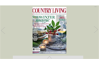
Moving on to the magazine content itself, the movement of the pages is something that was greatly experimented with. This was due to there being a mixed response through the various feedback discussions. However, once producing the content for screen, it became clear that the movement of the pages from left to right through scrolling would further provide issues with the legibility of the text. This is due to there being more space on screen needed for the continuous thread of the pages. This is why the motion of the page turning is more appropriate. Taken from ISSUU, this movement is something that is familiar to the user from reading a physical magazine. This motion can be completed either by clicking the arrows (as demonstrated) or by dragging the corner of the page with your finger/mouse. The content of the magazine is also interactive, with the options of being able to save images to the scrapbook and skip to the desired article through the use of the interactive contents pages. This is also a feature that can be done by opening the bar at the bottom of the webpage. Another feature that demonstrates how a magazine can benefit from having a digitalised version is the option to add video and links that are relevant to the content. Although this has not been demonstrated in the video, it is a feature that many have commented on through discussions and is something that the website would withhold. 


Website Navigation - Video

Navigation video from kathryn brown on Vimeo.

Thursday 8 December 2016

Website Pages

To design and produce a consistent appearance and navigation each of the pages have been designed to a 960x560 RGB 72ppi format, with the use of a 12 column grid system. This grid meant that there could be a separation between the individual pages however still maintaining certain features in a fixed position. Each of these format decisions have been made with the consideration of designing for screen and the research into this that has been made. 

Taking into consideration the feedback comments made by the target audience and through a discussion with peers, it was chosen that using the wording 'MENU' for the drop down menu would be the most appropriate choice for the website, rather than using the hamburger symbol. To summarize the conversation, many of the comments were based around the older generation being less likely to know the purpose of the icon. However by clearly stating that it is a menu through wording, this would overcome the issue. Some were concerned that this would add a more 'dated feel to the website' however through researching design studios for PPP2, I have picked up on a number of website designs that use a worded icon rather than a symbol. An example of this is Catalogue. 

Through feedback discussions with the target audience and peers it was decided that using an icon would be most appropriate for the first page of contact after logging in. This format keeps the page simple and clear to understand with only two options of where to navigate to next. The introduction of the line underneath the title also adds an element of separation to the page which was lacking previously. This is a feature that many websites have in the form of a menu bar at the top, however with the limited aspects that the website would have this is more appropriate in the form of a singular line that works with the title and the menu bar to the right. The menu icons are also larger than you would typically see on a website. This decision was informed by the older average age of the readers of the magazine. Without looking oversized, this icon is made to be clear and obvious to the target audience. 


Although each design of the magazine pages will be different, 4 examples have been designed to demonstrate how the magazine will work through being shown on the website.


As you can see between the two contents pages, subtle adjustments to colour have been made throughout the design process through suggestions and feedback made from members of the target audience and through referring back to the research.


A coloured background was selected so that there would be some distinction between the magazine pages and the white space around it. Through small feedback discussions that were had throughout the design process, it was also mentioned that having all white on a screen can mean that the user experience is not as positive due to the glare of the screen. From this comment experiments were made with variations around #9ea583 as this is a colour scale used by ISSUU. However, this moved away from the colour palette selected and from feedback from the target audience, was said to be 'disengaging' and 'dull'. Using the #444444 provides a flow of colour throughout the website and the Country Living brand as well as being a neutral background for the magazine to be viewed against.  


The above two images demonstrate how the interactive text changes colour when the mouse is hovered over it. This shows that there is a link behind the text and that if you click on it it will take you to the appropriate page. This is a feature that enhances the user experience and explores the abilities of reading a magazine through screen. 

Experimentation of the menu drop down was also important as this is a feature that needs to be clearly read on a range of devices due to the website being adjustable from laptop to tablet screen size. Although the other text on the website is in white, it became obvious that using white text for this feature would not be appropriate due to the reduced legibility. If the text were to be bigger this would be less of an issue however due to the nature of the menu, having overly large text would not be appropriate. 


Wednesday 7 December 2016

Hamburger icon

BBC News. 2015. Hamburger icon: How these three lines mystify most people
Avaliable at: http://www.bbc.co.uk/news/magazine-31602745

The hamburger icon is one of which has appeared in many of the researched websites. The three lines are an icon that many now associate with a menu across internet pages and apps. Through reading the article on BBC news, I came across some research conducted by James Foster, 'a web developer based in New Zealand'. This research focused on the differences with the icon and how the changes in the design affected the level of interactivity.

'Adding the word "menu" underneath the three lines increases the button's use by 7.2%'
'Putting the hamburger inside a box, so it looks like a button, increases use by 22.4%'
'Switching the lines for the word "menu" makes 20% more people click"

Taking these percentages into consideration, the most appropriate choice for a menu icon would be a burger inside a box:


The second most appropriate would be:


Other variations of the menu are:


Although using the design that increases the button's use would be appropriate, it is also appropriate to look at what the target audience would be most familiar with using, as well as gaining their opinion on each of the designs. Looking at the personas, 2 out of 3 use their screen device to browse social media. Websites such as Facebook and Pinterest the below icons on a tablet device. This would suggest that they would recognise the typical hamburger icon. This is also the design that is used on the Country Living website.

To gain direct feedback from the target audience of the website, I contacted members of the audience who have been assisting me throughout the design process. A mock up page of the website was used to demonstrate the three icons to them. The comments received were:

- The most appealing icon that I understand the most is the 'MENU' wording. On the image that you showed me, this shape stood out to me the most when viewing it on screen. It also clearly demonstrates its purpose. As an older lady who only uses a tablet to read the news and check emails, the other icons are more unknown to me although I have seen them before - Country Living website. 

- The classic hamburger shape is one that I am aware brings up a menu type bar. This recognition is through seeing the shape on apps on my iphone. Seeing the mock up images you sent, the three dots works effectively as it is subtle but still stands out enough for me to know it's there. 

These comments are from two members of the target audience of an age of 73 and 48. From the data collected at the Country Living fair and that recorded by the event holders, the average age of those who interact with Country Living is 56. As a designer it is important to consider all members of the target audience and to find a solution that is most appropriate for the majority/all of the members of the audience. Further experimentation will be taken into which design is the most successful, viewing the icons on the fully designed webpages. 

Content for the Digital Design of the Magazine

To begin this design process, the pages of the chosen magazine issue were scanned in to provide a template/digital visual of the magazine pages on screen. Through the wireframe sketches, only the appropriate pages were scanned. 


As I do not have access to the digital version of the printed magazine, these scanned images allow as a template to recreate the design. Considerations have been taken into the design of the magazine as it is working on a different platform to what it has been designed for. Suitable yet minimal adjustments will be made so that the design works for screen. 


On the left is the scanned in copy of the magazine page and on the right is the adjusted version for screen. When experimenting with the font size it became clear that using anything smaller than 10pt became difficult to read on the screen size that would be used for a website. Increasing the type size and leading improves the legibility and readability of the text. These adjustments would need to be made to each page of the magazine so that it was consistent. 


Tuesday 6 December 2016

Typeface

Typeface:

Through creating the mood board I was able to identify the characteristics of the typefaces that Country Living use. For the headings and subheadings of the website, a thin serif font is used and for the body copy of the articles a thin sans serif font is used. These characteristics are ones that I have taken into consideration when choosing the typefaces to use for the website as the same typefaces were unable to be identified. If the website were to be produced commercially, the same fonts would be used so that it was fitting with the Country Living website.


From identifying these characteristics, the following typefaces were chosen:

Baskerville Regular - Headings, subheadings and smaller areas of text


Avenir Light - More condensed areas of text/body copy

Through research carried out on the typefaces, Baskerville is not categorized as a web safe font. However, if the website were to be commercially produced then the brand guidelines of Country Living would be available and therefore the same typefaces that are used on the Country Living website would be used.

Having a serif and sans serif typeface separates the purposes of the text that they are used for. This is a feature that was picked up through the analysis of the CL magazine and therefore is an appearance/purpose that the audience would already be aware of. This further relates to keeping features familiar to the audience so that a positive experience is received. 


Digital Designs

Using the wireframing images and the sitemaps as guidance, the digital production of the website has begun to take shape. Using the mood board I have been able to experiment with typeface and colour options within the designs, relating to the research carried out on the Country Living website and magazine, as well as using ISSUU as a big influence towards the design layout of the pages featuring the magazine. The typeface exploration can be seen on the next post. 

The login page:
As he website is only for users who are subscribers to the magazine, the first page that you view on entering the website. The email address you add when you create an account must already be related to the subscription to the magazine (through the Hearst website) otherwise it will not let you proceed in making an account. After making the account you will then be taken to the second page of the website. 


Through discussions with peers and the target audience it has been made very clear that the navigation and appearance of the website must be simple to adhere to the target audience. This is also something that would relate to the personas of the target audience. Considering these profiles, above are the two different designs that could be used. This is something that requires feedback and conversations with the target audience to direct which design is the most appropriate (physical images or icons).


Issues - the next page that you would be taken to on clicking the 'issue' icon is the issue page. This page will hold the page links to 'Saved Issues' and the current issue, as well as the previous two months. The design decision to only store the past three issues is in reference to the personas of the target audience and comments from members of the target audience. If there were many issues to choose from this would overcomplicate the page as well as lengthen the time of selecting the magazine issue that you wish to read. Having the initial navigation pages quick and easy to use improves the users experience as the time it takes to reach the desired page is made smaller. If the user does wish to access previous issues, they must save these so that they are accessible after they have been live for 3 months. 


Taking inspiration from ISSUU, the way in which the navigation of the magazine would work is the left and right navigation of each page by clicking the arrows or on a handheld device such as a tablet, you would be able to swipe left or right. This navigation is an aspect that has undergone various testing with the target audience and peers and details of this can be seen previously. 

The Scrapbook:


The Scrapbook element of the website is an area that has received a lot of feedback in the group and individual sessions. This is a feature that many believe will enhance the user experience of interacting with the magazine through screen, as well as being able to save articles/images that they would typically do if the magazine were printed. It was discussed whether the social media elements were needed in this section of the website. However, relating back to the three personas of the target audience, this is a feature that would be used. Although this is not a feature that would be relevant to all members of the target audience, it is something that would be used if the audience wished to.


Analysis of Good House Keeping - website

Good Housekeeping is a competitor that is listed alongside Country Living. This is an important aspect of the research as it will ensure that the solution is in keeping with the competitive market. The Good Housekeeping (UK) magazine is also produced by Hearst and has its own website with varying content to the magazine. 

In terms of navigation, there are subheadings at the top of the page that are displayed through the use of a coloured banner. This gives the wording a fixed location on the page that remains when you begin to scroll down the page. Each of the subheadings also have their own colour that they are related to. This adds an elements of recognition to the website and therefore aids the reader on their visit.
 Like a typical website, you navigate the page by scrolling up and down. Another element of navigation is clicking left and right to view different images on the page. This demonstrates that it is a movement that the audience are familiar with and therefore would understand the navigation of a whole website if it were to feature in this way. 


Monday 5 December 2016

Wireframe Designs

Wireframe:


The use of wireframing the pages before creating them digitally is to ensure that there is nothing that is overlooked. It also provides a template to work from when transferring the designs on screen. As the brief does not require the design of each page to be made, I have selected the designs that are different from each other to produce digitally. Although the content of each magazine will change this is something that is already determined and therefore will not affect the overall design of the page. The inclusion of the digital based experiences will still be the same throughout each issue. To further display the designs and how the navigation of the website will work, a mockup is going to be produced in After Effects to demonstrate this. 

Dirty Bottles - User Experience

Dirty Bottles is a Tap Room and Smokehouse in Alnwick, Northumberland. Specifically, this restaurant offers a unique method of ordering food. If seated at a booth, you have the option to order your food via an ipad. This device offers a clearly labeled menu with defined sections of choices depending on what you are looking for. You can also order your drinks through the device. If in a larger group, this allows you to order and pay for you meal individually therefore there is no issue of having to split the bill. This device also means that there are no interruptions from a waiter and you can order at your own leisure. Overall, this leads to a positive user experience due to the ease of ordering your own food when ready, as well as being able to pay for your meal/drinks through the device. 

Sunday 4 December 2016

Kinfolk Website

As well as looking at competitors of Country Living, it is also important to look at the wider field of magazines. Kinfolk is an independent magazine that publishes certain articles from the printed issue to the website. The design of the website is very minimalist and therefore reflective of the magazine. The home page presents a stream of articles that are organised in a 12 column grid. This grid allows for a layout out an equal 2,3,4 and 6 main column layout which varies through moving down the page. This grid layout leads to a slick design that has enough consistancy to create flow but enough of a difference between each section to keep the reader's attention. 


Website analysis:

- A mix of serif and serif typefaces are used to separate the body copy from the headings of the articles. This is consistent throughout the article and allows the eye to identify the main section of text from the 'title'. 

- Variations in the chosen fonts are also used to separate different sections of text. For example, quotes in a paragraph of text are in italics 

- A white background and black text throughout each page of the website maintains a consistent clean design that allows the content to take focus. However, when reading a large section of text, the glare from the white on screen makes this difficult. This is overcome by lowering the brightness of the screen however then the clarity and sharpness of the photographs is lost. This is an area of experimentation that is important to test with the target audience as if this is something that they pick up on then it could affect the quality of their user experience. 

- When on a article page, there are tabe to the left and right of the page presenting the option to move to the previous or next story. This is a simple way to display the navigation options between each story however when viewing the wording against the body of text on the current page, it diverts the eyes attention due to the angle of the wording. When the mouse is hovered over the wording, a pop out appears with an image and the title of the next or previous story. Again, this could divert attention from the current page being viewed, however provides a quick and easy option to move on to the ntext story.

- The hamburger icon is used for the menu pullout. This is a shape that is familiar with users of screen based devices as it is a universal shape used by many digital designers.

Apple Mac Pro - Website analysis

This is a website that was introduced in a discussion about the brief. When talking about the different motions of navigation that had been considered and mentioned in the feedback, I was pointed towards the Apple (UK) Mac Pro webpage. This page gives an indepth breakdown of the piece of technology, however rather than simply scrolling through the information, the diagram of the object is animated and moves to the appropriate section depending on which direction you scroll on a track pad. The transition from one section to another is very smooth with a clean flow. Overall, this led to a positive user experience due to the enjoyability of the movements made to view the different information. However this was difficult to navigate in terms of wanting to go back to the top of the page as there is a series you have to complete to get here. This is achievable by clicking the small button to the right however this is not made clear enough to be a go to area if this is the action you wish to complete. 


From analysing this website it has been made clear that the user experience is vastly effected through the use of ease of the website. If the user becomes quickly frustrated with the website then they are most likely to exit. This is not something that you want as it will discourage them from visiting the site again. More of a positive user experience would be the website being straightforward to navigate and be able to get to any page from the current page you are on.   


Issuu - Digital Publishing Platform

This is a website that was introduced through the one to one feedback session.This is a digital publishing platform that uses a consistent layout for each of the magazines that there are on the website. The navigation of the magazine when open on the webpage explores feelings and the methods that are used with a physical magazine. For example, to turn the page you can either click the arrows to the left or right, or you can drag the page with the mouse so that it folds. This is an interesting method as depending on the way you drag the page across the screen. This is something that is very familiar to the reader of a magazine and would be interesting to experiment with in the design of the solution for this brief. It is also a method that would need to be tested on the target audience so that the method that is most appealing/easy for them to use is used in the design. 

The dark background behind the magazine pages emphasizes the focus on the content of the magazine. This dark background intensifies the white of the magazine page and therefore makes reading the larger paragraphs of text more difficult. This is a comment that I received through the individual in the feedback session who introduced me to the website. We then went on to discuss how the background colour of the website is something that is key to explore to ensure that the same issue does not occur.