BHS Riding and Road Safety
Message:
Driving with caution on the roads is essential to ensure you as a driver are safe as well as keeping those around you safe. In this case it involves driving with care around horses, remembering to follow the rules that are explained and demonstrated in this video.
Key Facts:
Rules
- always leave room between you and the horse
- Don't rev your engine
- Don't sound your horn
- Always wait till you can pass wide and slow
Tone of Voice:
Instructive tone of voice, informing the audience of the road safety rules when approaching horses on a road
Audience:
Drivers mainly in the countryside or those who live in an area where there are horses. The age range varies which is why the subject driving the car is not made visible to the audience watching the video. This highlights the importance of the car and the horse in the video which directs the message and ensures that the simple rules are easily understood with no distracting factors
Monday 14 December 2015
Friday 11 December 2015
Wayfinding/Map Design
After completing more direct research on areas I would like to explore with the redesign, I walked round the college and photographed areas that I thought would be suitable for the new wayfidning, as well as gathering research on the layout of the building.
Potential wayfidning areas:


Building research:


This floor plan provided the outline of the layers of the building which I will be able to use in the map design. This will ensure that the design is accurate therefore improving the usability of the wayfinding.
Research Influence:

Building outlines:

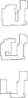


As this was a change in design direction, I completed the full set of each floor including the corridors.This was something that was missing after starting the simpler designs. However, having the continuous corridor included in the design over complicates the shape and reduces the legibility of the design. Therefore, I have made the design decision to continue with the simpler design shape of just the outline on the floor.
Following the inspiration of the map design I completed the below designs. The grey and white colour scheme is taken from the Brand Guidelines to ensure that there is consistency throughout the building as well as maintaining the wayfinding colour identity that currently exists.
Through feedback comments on the designs below, it was evident that the idea of the corridor to provide direction and location was needed however to keep the simplicity of the design it needs to be displayed in a different way. Therefore, I am going to remove the corridor outline and experiment with different ways to add more detail to the design to ensure that the audience is informed to a point where they are able to find where they wish to be.


Feedback:
Q: Is it clear which floor is which or is it clearer to understand with the levels incorporated into the design?
A: - Having the numbered floor levels makes it much easier to understand! As it is very unclear in the prior design.
Q: Would this design help you to locate areas of the building? Why?
A:
- It would allow me to located what floor the rooms are on but I don't see how I would then find the specific area in which the room is located. This could be very difficult for visitors that have never been to the building before.
R: To develop the design further I would like to experiment with having the floor in which the design is on in a larger scale than the other floors. This would highlight to the audience which floor they are on, with a more detailed map of the direction of the rooms. This would be successful in a way that it would guide the audience when they are on the specific floor however, may remove some of the simplicity that the design currently withholds therefore making it more difficult to understand.
Q: Is the colour scheme appropriate to the design and LCA?
A:
- The colour is subtle but would stand out on a white background, it also links nicely with LCA's current colour scheme, I feel this colour wouldn't look out of place, it also wouldn't over power the area.
-Yes as it wouldn’t clash with the already colourful college interior while remaining sleek, modern and highly legible.
R: As the colour is taken from the Brand Identity Guide of the college it is consistent with the theme that is used throughout the branding.
Q: Are you able to understand the layout of the design?
A:
- I feel that the deconstructing of each floor and displaying them separately as visuals and as text allows the viewer to find both course and room numbers. As people never spend too long looking at these signs I feel this is appropriate.
R:

From the comments made I have made adaptations to the design taking into consideration what was said. From the feedback I was influenced to make the scale bigger of the floor that the design is on. This would be useful in terms of if you are on that floor then you are mainly going to be looking for a room on that floor. Having the floor design at a larger scale highlights this visually as well as still including the information of other floors. After making these changes I am going to gather another set of feedback to continue directing the map design.
Feedback 7/12/15
Q: Would it be beneficial to have symbols included in the design? Why?
A:
- Experiment with symbols to show were specific areas are on each floor without over complicating the design
- Symbols could clutter the design as there is already a lot of writing. However adding a stairs and exit symbol would be beneficial and are markers to use to navigate
- I think adding symbols will make it easier for people to find certain rooms. Perhaps incorporating a symbol for the individual courses or allocate each course group with a colour
- Yes, adding simple symbols would be good as it would make departments even easier to find
- Adding symbols could be done on key areas within the building. Maybe for individual courses and the facilities like print room and photography studios.
Q: Would it be beneficial to have a more detailed map of the floor you're on? Why?
A:
- No, I like that it is simplistic as long as there is some distinction between the floors
- Could have a referencing point for each floor/point of interest
- Could design a key that is independent to the main map - a list of departments with arrows/symbols to make it clear where you would go once on that floor
- Keeping it as simple as possible is a good idea as the building is already overly complicated, so keep it simple to not confuse people
- Try and keep it simple. There is already a lot on the floor shown through type so the addition of a detailed map might over complicate the design
R: After the comments I have discussed a number of design ideas to develop the map. We discussed a number of ways to add more detail to the map to aid the audience in finding the specific room without over complicating the design. As I had previously experimented with having the main corridor in the design, It was agreed upon that this would clutter the and would remove the simplicity of the design. Alternatively, we discussed having pinpoint/key areas on each corridor so that directions were clearer (this could be in the form of colour or a symbol).
From the feedback I have made adaptations to the design taking into consideration what was said. Firstly, I have removed the room numbers from the floors which the design will not be on. This has maintained the simplicity of the design as well as improving the legibility of the text.

The second change that I made to the design from the comments focused on symbols. To do this I designed a symbol for each of the department areas that were specific to a course. Below are the symbols for the individual department areas that could be incorporated into the map design.


After viewing the map with the symbols and gaining feedback once again, it has been highlighted that the symbols over complicate the design in a way that it is harder to read as there is three different pieces of information on one line of text. Although some commented on the appropriateness of the symbols, they would not be effective standing alone without the text therefore although the symbol provides a visual to locate the department, you still end up reading the line of text to locate the room number, therefore the symbols become unnecessary. If the design were to be displayed in a bigger area therefore in a larger format, having a symbol for each area may be more appropriate as there would be more space for it to work with, as well as being clearer to the audience.
I therefore removed the symbols from the design and completed a full set of what the individual maps would look like for each floor.


At this stage of the design I decided to standardise the typeface that would be used for the wayfinding. As I have previously looked into the typefaces that are currently used, I chose a style that was similar to the existing font choices as well as a legible and appropriate style. The typeface Avenir has also been used for the vinyl wording.


The use of this wayfinding form would solve the issue of the map not giving a specific location of the department. Having this signage would direct the audience after viewing the map on the staircase as it would be displayed on the wall opposite each of the doors that open onto the staircase. Therefore a complete set of signage for room directions would be completed to reinforce consistency in the wayfinding design.
Potential wayfidning areas:


Building research:


This floor plan provided the outline of the layers of the building which I will be able to use in the map design. This will ensure that the design is accurate therefore improving the usability of the wayfinding.
Research Influence:

Building outlines:

Sketch

Illustrator
I started with creating an outline of the individual floors of the building firstly in sketch form and then on illustrator using the pen tool. It quickly became apparent to me that the designs is very simplistic compared to the complicated layout structure of each floor therefore loosing some of the essential information of the building that will help the audience locate where they need to be through the use of the map. To continue with this design I would like to experiment with incorporating the main corridors to see if this improves the experience of the wayfinding.

Sketch

Illustrator
As this was a change in design direction, I completed the full set of each floor including the corridors.This was something that was missing after starting the simpler designs. However, having the continuous corridor included in the design over complicates the shape and reduces the legibility of the design. Therefore, I have made the design decision to continue with the simpler design shape of just the outline on the floor.
Following the inspiration of the map design I completed the below designs. The grey and white colour scheme is taken from the Brand Guidelines to ensure that there is consistency throughout the building as well as maintaining the wayfinding colour identity that currently exists.
Through feedback comments on the designs below, it was evident that the idea of the corridor to provide direction and location was needed however to keep the simplicity of the design it needs to be displayed in a different way. Therefore, I am going to remove the corridor outline and experiment with different ways to add more detail to the design to ensure that the audience is informed to a point where they are able to find where they wish to be.


Feedback:
Q: Is it clear which floor is which or is it clearer to understand with the levels incorporated into the design?
A: - Having the numbered floor levels makes it much easier to understand! As it is very unclear in the prior design.
- Floors go from basement at the top of the map to floor 3 at the bottom, I think this should be reversed.
- Having the numbers/letter of the floor on the diagram helps illustrate which floor is which and having it in chronological order assists with readability.
- Splitting the floors simply is a very easy way of making sense of a complicated floor plan. However it would make sense to have the top floor at the top for logical reasons.
- I think it is clear enough, I’d only reverse the order. Maybe using different colours for different floors can also help to identify them.
- Have the floors starting from basement to the bottom as naturally you would walk up to the top floor.
R: To continue with the map of the building I am going to take into consideration the comments made to make adjustments to the design. The feedback has given me the perspective of the audience who will be viewing and using the map therefore making these adjustments such as the reorganisation of the floors, is important in ensuring that the design is successful.
R: To continue with the map of the building I am going to take into consideration the comments made to make adjustments to the design. The feedback has given me the perspective of the audience who will be viewing and using the map therefore making these adjustments such as the reorganisation of the floors, is important in ensuring that the design is successful.
Q: Would this design help you to locate areas of the building? Why?
A:
- It would allow me to located what floor the rooms are on but I don't see how I would then find the specific area in which the room is located. This could be very difficult for visitors that have never been to the building before.
- Having the rooms listed in chronological order means rooms can be easily located within each floor.
- Yes, all the information is laid out easily in a list order so it would be easy to pinpoint on the floorplan and having the room numbers is also useful
- It would give me a general idea of the whereabouts at glance. However most likely I would know the room number I needed to find, so I feel it would function well
- Like said before, it would help me to know what is on each floor but not where is a particular room in a floor. Maybe if you create blocks that represent the rooms and just put a number or symbol in it it would be more effective.
- It is helpful when finding what subject area is on what floor as the current wayfinding is very difficult to navigate round due to overcomplicated signs. The simple colour scheme makes it easier to read. Perhaps make a floor plan for the individual floor (once you’ve reached that floor) to show where the room numbers are.
R: To develop the design further I would like to experiment with having the floor in which the design is on in a larger scale than the other floors. This would highlight to the audience which floor they are on, with a more detailed map of the direction of the rooms. This would be successful in a way that it would guide the audience when they are on the specific floor however, may remove some of the simplicity that the design currently withholds therefore making it more difficult to understand.
Q: Is the colour scheme appropriate to the design and LCA?
A:
- The colour is subtle but would stand out on a white background, it also links nicely with LCA's current colour scheme, I feel this colour wouldn't look out of place, it also wouldn't over power the area.
-Modern and sleek mean it’s neutral and wouldn’t need replacing for a while.
-Yes as it wouldn’t clash with the already colourful college interior while remaining sleek, modern and highly legible.
- Definitely the off grey colour is modern and mature. Giving an educational and friendly feel whilst connecting with the young population that will be struggling to find their way round (freshers).
- It is, but make sure it is one of the colours used in the colour scheme of the college branding system. The colour helps to create contrast with the white, so it’s very easy for the eye to read and recognise shapes
- The contrast makes the text clearer and stand out but not too in your face. Have you considered the colours that the uni use?
R: As the colour is taken from the Brand Identity Guide of the college it is consistent with the theme that is used throughout the branding.
Q: Are you able to understand the layout of the design?
A:
-Yes, the floor plans with what rooms are on each side of that floor with the rooms in chronological order make the layout fairly easy to understand.
-Yes it is very easy to understand and the layout is done in the same style in order of layout of the building.
- I feel that the deconstructing of each floor and displaying them separately as visuals and as text allows the viewer to find both course and room numbers. As people never spend too long looking at these signs I feel this is appropriate.
- I know straight away it’s a map divided by floors, but it takes me some time to understand what is going on. The system is very clear but it’s missing the position of the rooms within each floor. If it is just to know what is on each floor, then it works. I would also try to rearrange it and put the top floor on the top of the document, makes more sense to me at least.
- The use of all the floors work well together as you can see quickly what floor you need to go to (people don’t like to look at a sign/map for too long) but when looking for a specific room, may be a little difficult. Could try having a separate floor plan on the selected floor to show the room layout.
R:

From the comments made I have made adaptations to the design taking into consideration what was said. From the feedback I was influenced to make the scale bigger of the floor that the design is on. This would be useful in terms of if you are on that floor then you are mainly going to be looking for a room on that floor. Having the floor design at a larger scale highlights this visually as well as still including the information of other floors. After making these changes I am going to gather another set of feedback to continue directing the map design.
Feedback 7/12/15
Q: Would it be beneficial to have symbols included in the design? Why?
A:
- Experiment with symbols to show were specific areas are on each floor without over complicating the design
- Symbols could clutter the design as there is already a lot of writing. However adding a stairs and exit symbol would be beneficial and are markers to use to navigate
- I think adding symbols will make it easier for people to find certain rooms. Perhaps incorporating a symbol for the individual courses or allocate each course group with a colour
- Yes, adding simple symbols would be good as it would make departments even easier to find
- Adding symbols could be done on key areas within the building. Maybe for individual courses and the facilities like print room and photography studios.
Q: Would it be beneficial to have a more detailed map of the floor you're on? Why?
A:
- No, I like that it is simplistic as long as there is some distinction between the floors
- Could have a referencing point for each floor/point of interest
- Could design a key that is independent to the main map - a list of departments with arrows/symbols to make it clear where you would go once on that floor
- Keeping it as simple as possible is a good idea as the building is already overly complicated, so keep it simple to not confuse people
- Try and keep it simple. There is already a lot on the floor shown through type so the addition of a detailed map might over complicate the design
R: After the comments I have discussed a number of design ideas to develop the map. We discussed a number of ways to add more detail to the map to aid the audience in finding the specific room without over complicating the design. As I had previously experimented with having the main corridor in the design, It was agreed upon that this would clutter the and would remove the simplicity of the design. Alternatively, we discussed having pinpoint/key areas on each corridor so that directions were clearer (this could be in the form of colour or a symbol).
From the feedback I have made adaptations to the design taking into consideration what was said. Firstly, I have removed the room numbers from the floors which the design will not be on. This has maintained the simplicity of the design as well as improving the legibility of the text.

The second change that I made to the design from the comments focused on symbols. To do this I designed a symbol for each of the department areas that were specific to a course. Below are the symbols for the individual department areas that could be incorporated into the map design.


After viewing the map with the symbols and gaining feedback once again, it has been highlighted that the symbols over complicate the design in a way that it is harder to read as there is three different pieces of information on one line of text. Although some commented on the appropriateness of the symbols, they would not be effective standing alone without the text therefore although the symbol provides a visual to locate the department, you still end up reading the line of text to locate the room number, therefore the symbols become unnecessary. If the design were to be displayed in a bigger area therefore in a larger format, having a symbol for each area may be more appropriate as there would be more space for it to work with, as well as being clearer to the audience.
I therefore removed the symbols from the design and completed a full set of what the individual maps would look like for each floor.


The third question of feedback focused on the detail of the design. It was discussed that having a reference point in the design to aid the audience in finding where they wished to be. However, after previously experimenting with adding the corridor in in the original sketches of the individual floors, I have taken the design in an alternative route by producing signage that will be displayed after leaving the staircase, to direct the audience left or right depending on the area they wish to be in.
At this stage of the design I decided to standardise the typeface that would be used for the wayfinding. As I have previously looked into the typefaces that are currently used, I chose a style that was similar to the existing font choices as well as a legible and appropriate style. The typeface Avenir has also been used for the vinyl wording.


The use of this wayfinding form would solve the issue of the map not giving a specific location of the department. Having this signage would direct the audience after viewing the map on the staircase as it would be displayed on the wall opposite each of the doors that open onto the staircase. Therefore a complete set of signage for room directions would be completed to reinforce consistency in the wayfinding design.
Thursday 10 December 2015
Vinyl Design
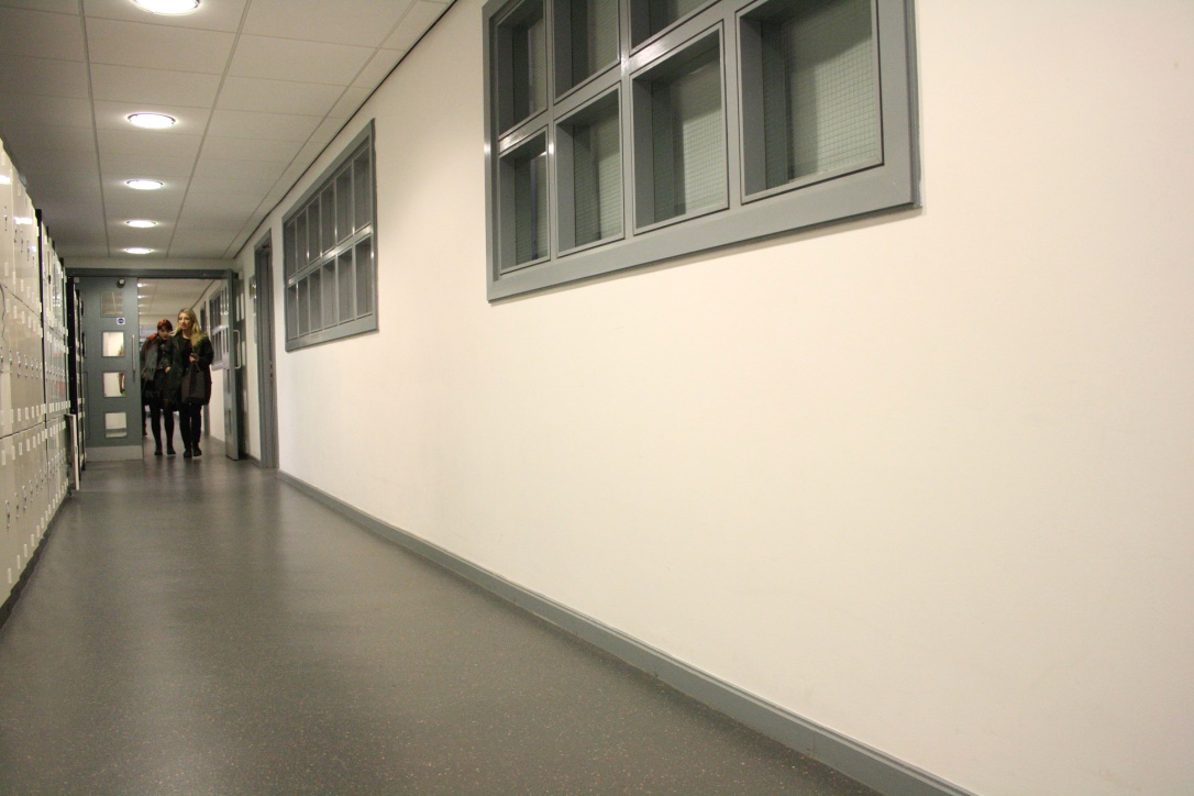
After completing the vinyl research and I have wrote a plan to continue with this idea. From walking round the building certain areas have been highlighted to me as being potential areas where the design would be most effective and suitable. This will be important in the design of the type as it will effect the scale and typeface used for the lettering.
Plan:

Photography:


Although I had planned on having a photograph of each department area, I was unable to find Fine Art, Animation and Visual Communication. This is due to the poor existing wayfinding which further highlights how a new design needs to be in place so that students and visitors are able to find the departments without having to ask a number of people or resorting to making their way back to reception to ask for directions. The departments are also hard to distinguish between one another with Illustration and Photography being the only areas that clearly display the deportment name on the wall of the corridor.


As I have the potential areas where the vinyl wording will be displayed, I have gone back to my research on vinyl cutting. The main points that are important when deciding on a typeface to use with vinyl is to have a simple design that the machine will be able to easily produce as well as having an uncomplicated sticker that is not too fiddly to apply to the wall area.
Vinyl Research:
What typefaces do the college use currently?
- A2 Grot, for text
- Bureau Grot, for headlines
- Cheltenham, for large quotes
- Elementa, for captions
 The Brand Guidelines do not have designated font for wayfinding therefore I am going to explore other possibilities that could be set in place with these existing guideline typefaces.

Left - Berthold BE Regular Right - Avenir Roman
Although there is only a subtle difference between the two typefaces, it will be beneficial to see which is the most successful in terms of legibility when placed on the wall. Before creating mock-ups with the department names I am going to look into having the wording in colour. This was something that I addressed previously in a feedback session however there was no distinct response to whether colour would be effective or not therefore it is an area that would benefit from being experimented with.
What colour scheme does the college currently use?
- the existing wayfinding is in a medium grey with white text
- below are the colours that have been highlighted by the Brand Guidelines of Leeds College of Art

Department names:
Berthold Akzidenz Grotesk BE Regular

Reflection:
- The use of colour is effective in a way that it separates the departments and gives them their own identity. However, it may be seen as an inconsistency with the design as the identity would be unknown to visitors therefore the varied colour scheme pay be more confusing. This is not something that can be singularly decided therefore I am going to gather the feedback of others to see whether one colour would be more appropriate or a 9 colour scheme.
Feedback:
- The colour reduces the formality of the text, making it appear to be attracting a younger audience
- The colour is effective in a way that it provides and identity to the individual departments, however on a larger scale this may not be as visually pleasing therefore ineffective
- I can see that you have taken the colour from the brand guides however I don't think that the wording and the colour together are as effective as hoped
To continue with this design I have created a number of mock ups using the typeface Berthold Regular and Avenir Roman. These choices are based on the existing typefaces that are stated in the brand guidelines. I wanted to have a typeface that worked with the existing typefaces so that this typeface could be added to the guidelines and stated that it must be used for all wayfinding for the college.
Mock ups, Berthold Akzidenz Grotesk BE Regular:


Plan:

Photography:


As I have the potential areas where the vinyl wording will be displayed, I have gone back to my research on vinyl cutting. The main points that are important when deciding on a typeface to use with vinyl is to have a simple design that the machine will be able to easily produce as well as having an uncomplicated sticker that is not too fiddly to apply to the wall area.
Vinyl Research:
What typefaces do the college use currently?
- A2 Grot, for text
- Bureau Grot, for headlines
- Cheltenham, for large quotes
- Elementa, for captions


Left - Berthold BE Regular Right - Avenir Roman
Although there is only a subtle difference between the two typefaces, it will be beneficial to see which is the most successful in terms of legibility when placed on the wall. Before creating mock-ups with the department names I am going to look into having the wording in colour. This was something that I addressed previously in a feedback session however there was no distinct response to whether colour would be effective or not therefore it is an area that would benefit from being experimented with.
What colour scheme does the college currently use?
- the existing wayfinding is in a medium grey with white text
- below are the colours that have been highlighted by the Brand Guidelines of Leeds College of Art

Department names:
Berthold Akzidenz Grotesk BE Regular

Reflection:
- The use of colour is effective in a way that it separates the departments and gives them their own identity. However, it may be seen as an inconsistency with the design as the identity would be unknown to visitors therefore the varied colour scheme pay be more confusing. This is not something that can be singularly decided therefore I am going to gather the feedback of others to see whether one colour would be more appropriate or a 9 colour scheme.
Feedback:
- The colour reduces the formality of the text, making it appear to be attracting a younger audience
- The colour is effective in a way that it provides and identity to the individual departments, however on a larger scale this may not be as visually pleasing therefore ineffective
- I can see that you have taken the colour from the brand guides however I don't think that the wording and the colour together are as effective as hoped
To continue with this design I have created a number of mock ups using the typeface Berthold Regular and Avenir Roman. These choices are based on the existing typefaces that are stated in the brand guidelines. I wanted to have a typeface that worked with the existing typefaces so that this typeface could be added to the guidelines and stated that it must be used for all wayfinding for the college.
Mock ups, Berthold Akzidenz Grotesk BE Regular:


Mock Up, Avenir:


Final Critique:
1. Do you think that the vinyl wording is successful in highlighting the areas of the building and giving the departments an identity?
- It gives the departments and identity in terms of their name being displayed however experimenting with colour could be a way to broaden the identity term
- I think that the scale and colour is appropriate to demonstrate the course area you are in in the building without distracting away from other areas of the corridor
- Would've been nice to see colour experimentations although the chosen colour is appropriate
2. Do you think that the wording clutters the blank corridor space or is it a subtle design?
- It is large scale therefore recognisable however maybe 'too in your face'?
- The colour allows for the wording to be subtle without overpowering the space that it is displayed in
Response:
I think that a downfall with this outcome is that I didn't do enough experimentation with size and colour. If i were to complete this brief again I would widen my experimentation so that there was a more informed response to why the final outcome is appropriate. However, the final resolution for the vinyl wording would still be appropriate as the colour is consistent through each department. This is something that was lacking in the current wayfinding, therefore this would provide a solution to the issue.
Subscribe to:
Posts (Atom)