I first of all gathered stock images that I then went on to edit. It was important to make areas of the image dark so that the text would still stand out against the background. From feedback comments from the group it was said that the wording choice is appropriate and links to the image. These are words that I have taken from the video to ensure that there is consistancy throughout the exhibition.
Images:


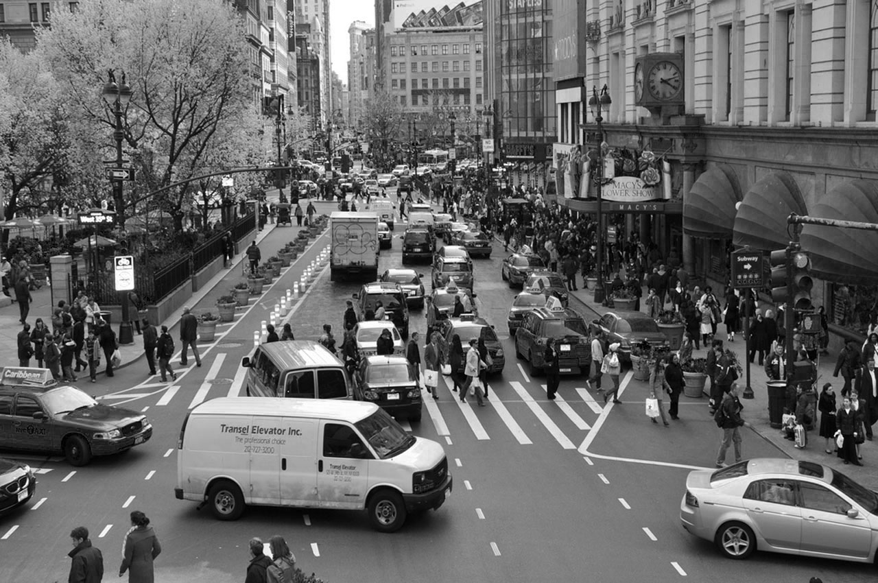


The following images have been taken by Hilda Quick. This is a photography student that I have collaborated with in the past therefore I was aware of some of the images she had. I decided to get into contact with her so that we could move away from the use of stock imagery. This will also benefit Hilda in her professionalism.
I have then gone on to edit the images myself. Although we had discussed using black and white imagery, I think that some of the photographs would work more effectively in colour. I will mock both designs up and gain feedback from the rest of the group to determine which designs will be the final ones.


Designs:


No comments:
Post a Comment