To start off experimentations I have taken inspiration from The Hepworth Wakefield logo. I like the way that they have taken the simple shape of the building and used the block white colour to give the shape a recognisable symbol for the gallery.

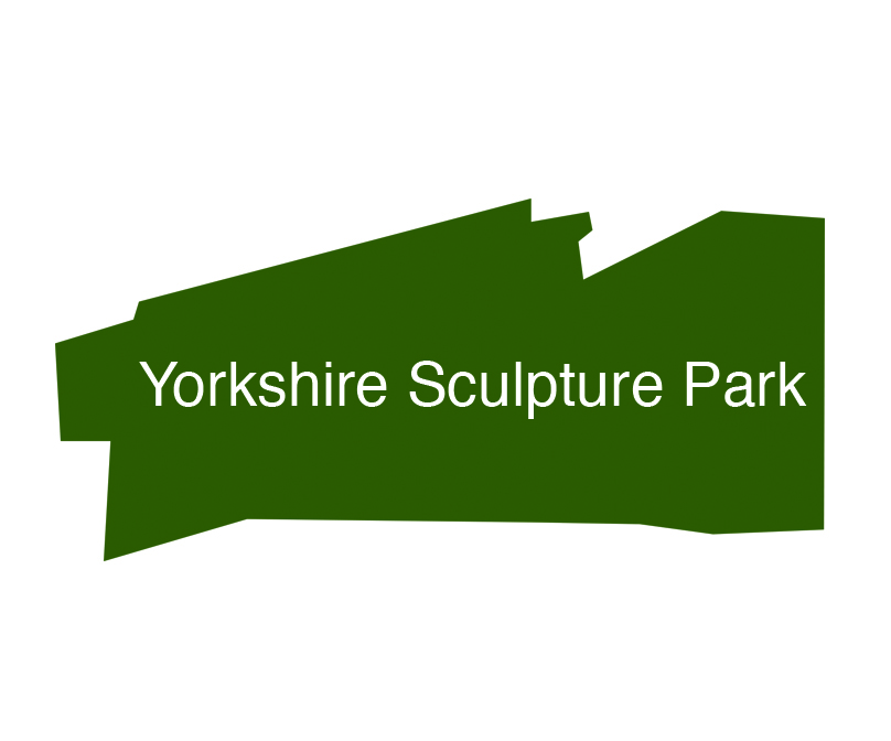
The main building of the Yorkshire Sculpture Park (YSP) as well as the Underground Gallery and other buildings on the site have been designed by the architect company Feilden Clegg Bradley Studios. The interesting angles and shapes of the Visitors Centre inspired me to create a similar logo as the one above for YSP.


I chose the #3b5721 colour as it represents the colours of the landscape background that forms round each sculpture. I experimented with block colour as well as an outline as I felt there was details to be explored within the building. This is why I looked at two angles of the building, one approaching the entrance of the building from the left side and the other straight on. As the logo will feautre in large and small forms, I think that the block colour would work best, although the detail is lost.
To follow a different line of experimentation I wanted to focus on the landscape that forms the natural background for each sculpture.

I wanted to keep the design simple so that it would work in different medias and sizes. However, there are two ways that these designs can be interpreted; two lines that interact with each other or as a silhouette of the yorkshire moors.
I decided to take this design further to incorporate the idea of a sculpture into the hill.

The first design above doesn't represent a hill clearly enough for the direction I wanted the logo to take. To develop this further I took the outline of the sculpture by Jayme Plensa and incorporated it into the first landscape forms that I created. I still wasn't happy with the design as I feel that the two don't represent YSP strongly enough. To take this in a new direction I went back to my research on the landscape and I was inspired by the skyline of trees that surround the scenery. From this I had the idea of adjusting the positioning of the face to create a leaf shape.


To come to a conclusion with this project I have taken the two designs that I think have been the most successful and presented them below. I think that the leaf design is effective, however it is difficult to see that the shapes are made from the side of a face therefore the message is not as clear to read. On the other hand the block shape of the visitors centre would be recognisable to those who have already visited the centre and to those who were looking to visit.

I have chosen the shape of the visitors centre as the final logo design for the Yorkshire Sculpture Park. As the brief states that the logo must work with type and on its own, I went back to my inspiration of the design (The Hepwork Wakefield) and decided to place the type inside of the logo.
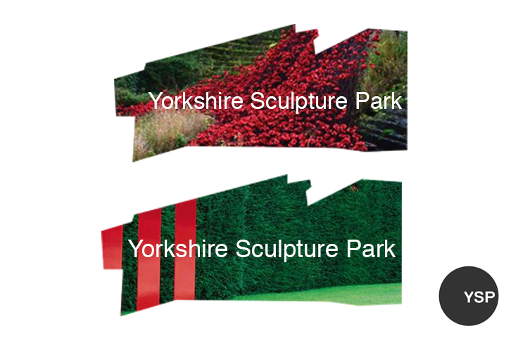
I wanted to experiment more with the final design. I went back to the YSP website and took inspiration from their current logo which you can see on the right side of the below image. This shape is used on its own as well as the image showing showing through the type. I wanted to create a similar effect with my design which is what i have experimented with below. This demonstrates that the symbol can work alone, with type, and with relatable imagery.
No comments:
Post a Comment