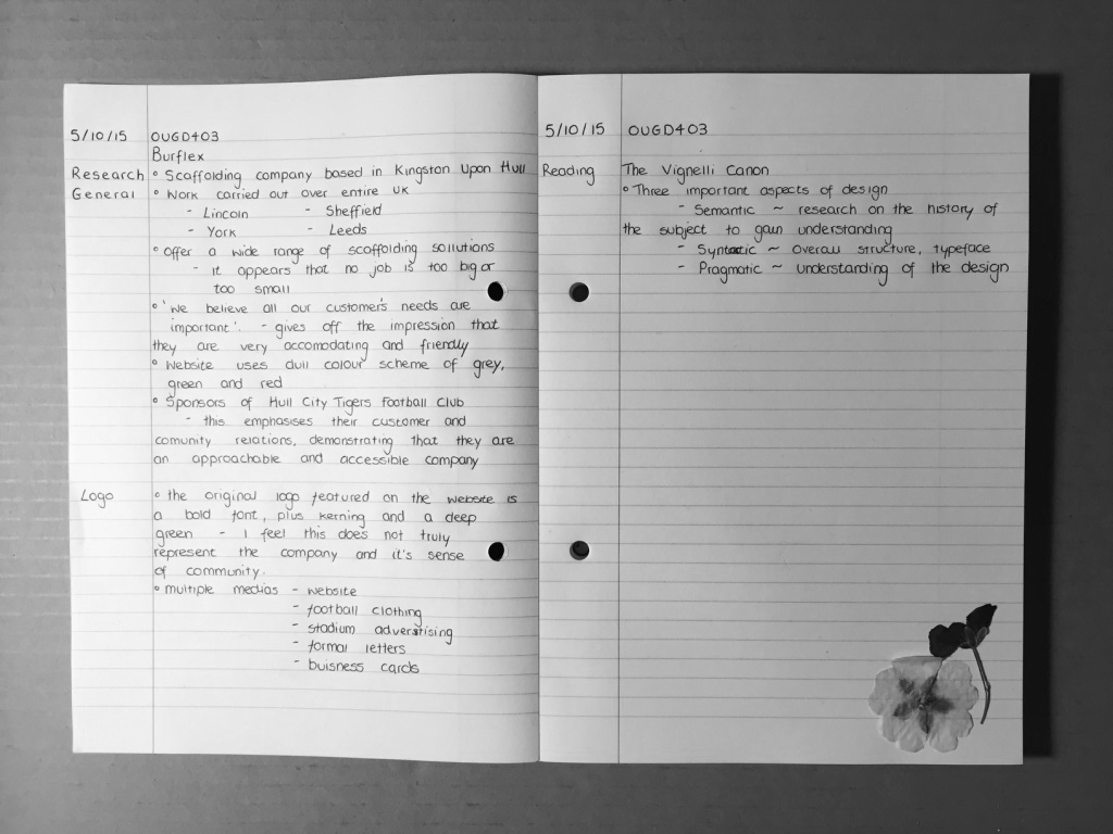
Once in our group, we quickly decided that it is important to define the key ingredients of a company when designing/manipulating an appropriate typeface to represent the brand. This involves focused research on our given brand which is a scaffolding company called Burflex. This research involves what they specialise in, who their audience are and where the logo will appear. This information is demonstrated in note form in my notebook, where I have also begun to make notes from the book, The Vignelli Cannon - Vignelli, M.


After gaining a clear understanding of the company and the multiple medias that the logo was going to be featured in/on, we decided to begin experimentation with the six typefaces outlined by Vignelli. We have decided as a group to individually experiment with each of the six fonts, including, uppercase, lowercase and kerning. We will then come together in the studio and discuss which font represents the brand the most successfully and why, using the terminology and knowledge that we gained from the Anatomy of Type and Typographic Terminology lecture.
No comments:
Post a Comment