


Above is the standard way finding around the college. It is used to direct students and visitors around the building, informing them of which departments are on which floor, as well as using arrows to directly guide the audience. I think that these are successful examples as they have a minimalist colour schemes as well as being easy to follow. The use of the wall features to direct you to the different departments is an appropriate way to highlight the specific areas as the vinyl on the wall is unmissable and stands out on the corridor. This would benefit the everyday audience as well as the visitors as it is a universal design that is versatile and direct.
However, LCA also has another set of wayfinders that are more sparsely located around the building.


Unlike the previous images, this sinage doesn't follow the same design criteria, highlighting an inconsistency. However, they do provide the direction to specific departments in the building. This is something that would benefit from being standardised across the wayfinding of the college as it is more instructive therefore is clearer to the audience on where the department is.
Trinity Centre


As Trinity accommodates for a wide target audience of shoppers in Leeds, the wayfinding must be suitable for all to read and navigate. Each floor has a designated colour which is used as the background colour of the wayfinding. This helps the audience create an association with the colour and the specific areas of the shopping hall. The simple use of arrows are also used to guide the customers in the direction in which the signage is addressing. This is effective as it is a clear instruction that is easy to follow through the use of a universal pictogram.
Leeds City Museum
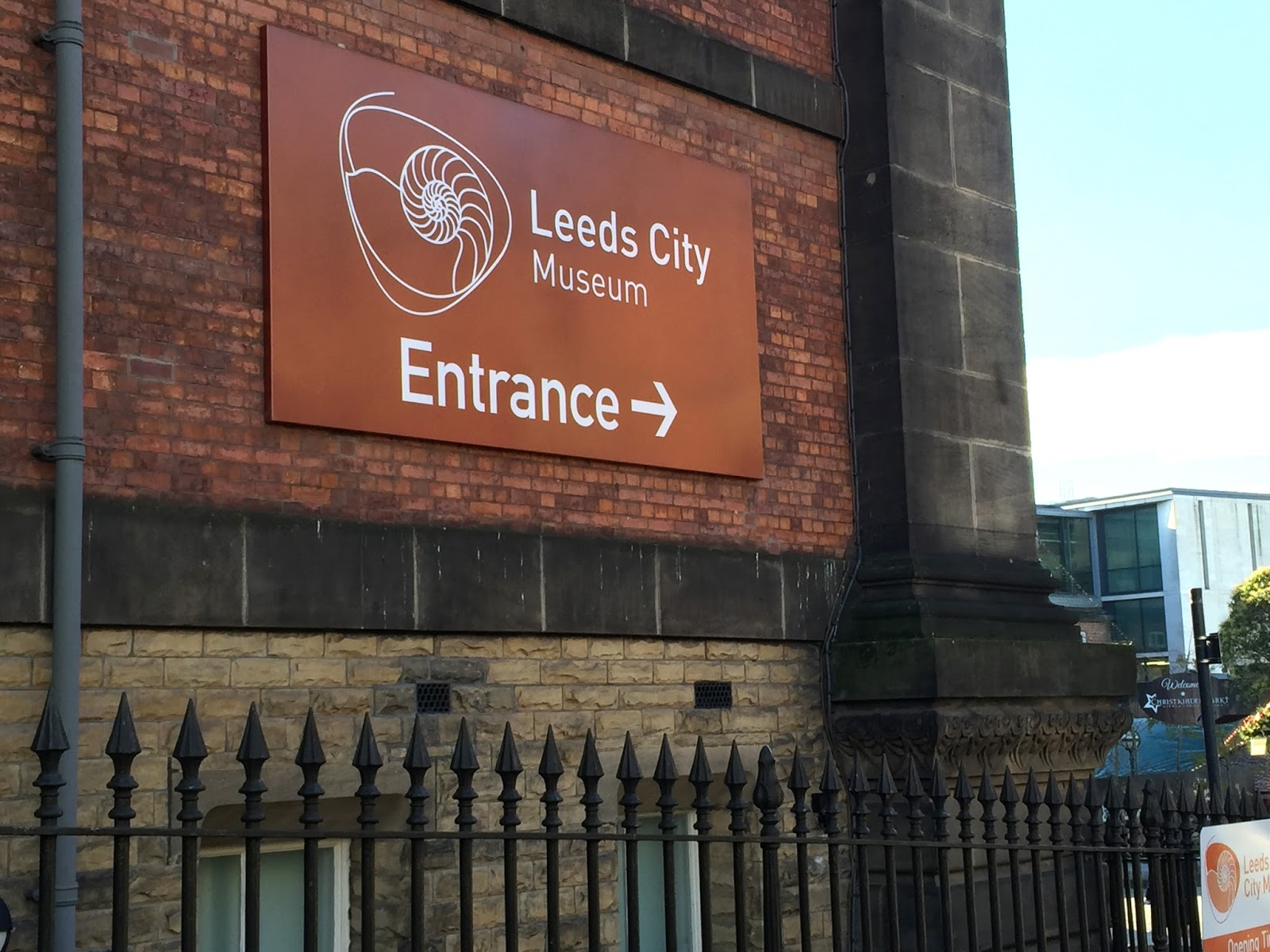


A white and grey colour palette is also used for the wayfidning for the City Gallery. This represents a classic look that has a neutral appearance to the varied target audience. However, there is an inconsistency with the stroke size of the arrows, as well as having a complicated design for some of the sinage (image two). This could be solved by reducing the size of the arrows or changing the layout of the composition.
The Henry Moore Institute


Similar to the City Museum, a two colour scheme palette has been used throughout the different methods of wayfinding. The first image is a creative way of displaying the function of each floor as it is a simple yet artistic way of displaying the information, rather than just having the simple rectangle shapes. As this is a small gallery there is a limited amount of information about the layout of the building which is something that could be introduced to help direct the audience. This could be in the form of a small wayfinding map to highlight the exhibition areas which I have seen from other examples.
Leeds Art Gallery


Once again the above examples of wayfinding have used arrows to direct the audience around the building and through the different exhibition spaces. The colour from the floor map could be incorporated into the other designs of the wayfinding to have a more consistent design that is easier to navigate with. This would improve the audiences experience of the building as the exhibition areas would be clearly separated, rather than the different media areas merging into one which is something that I experienced when walking round the gallery.
No comments:
Post a Comment