The brief is to create a bespoke typeface, which should effectively communicate your given adjective, which is Powerful. As I am unsure on which of Müeller-Brockmanns 9 classic and lead typefaces to choose from, I am going to do some research into the nine typefaces as well as gaining a better understanding of the word 'powerful'.
The nine typefaces are: Garamond, Caslon, Baskerville, Bodoni, Clarendon, Berthold, Times, Helvetica, Univers
Powerful Research
- having great power, force, potency or effort
- extremely effective or efficient in action
- large or great
- extremely
Powerful Definition
To me powerful is not just having great power or force, it is having an in influence and effect on something. This is why I want to design a font that is powerful in a sense that it can be used to guide and influence a person.
Garamond
- Roman design published in 1530
- Serif typeface
- Known for it's readability, elegance and character
- Used by authors, publishers and individuals for the printing of their work
Caslon
- Serif typeface
- Short ascenders and descenders
- Six varieties of the typeface
- Adobe Caslon was released in 1990
- Used for body text in The New Yorker
Baskerville
- Serif typeface
- Transitional typeface designed in 1757
- Contrast between thick and thin strokes
- Popular in book design
Bodoni
- Serif typeface
- Title fonts, logos, magazine printing
Clarendon
- Slab-serif typeface(thick block-like serifs)
- Created by Robert Besley for Thorowgood and Besley (a letter foundry)
- Published in 1845
- Commonly associated with wanted posters and the American Old West
Berthold
- Sans typeface
- 1858
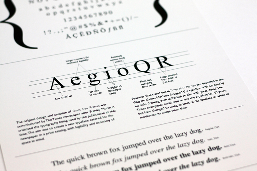
Times
- Serif typeface
- Released in 1931
- Commissioned by The Times
- No longer used by the British newspaper but is alternatively used in book typography
Helvetica
- Sans-serif typeface
- Released in 1957 by Max Miedinger
- A neutral typeface that is used in a wide variety of sinage, originating in America
Univers
- Sans-serif typeface
- Released in 1976 by Adrian Frutiger
- The first typeface to fulfil the idea of a family of consistent similar designs


From viewing the typefaces as a group, I am going to continue by taking the Times and Univers typefaces to begin sketching. I wanted to choose a serif and sans serif typeface to begin experimenting with as I didn't want to limit my ideas to one style.


Times Roman
Before I begin sketching I wanted to gather more research on the specific typefaces as well as looking at examples where the typeface has influenced the audience. I have found some examples of where the typeface has been displayed so that I can better my understanding of the background to the designs.


From this I have been able to see the effect that the typefaces have on the audience and the composition of the piece. Each typeface has a clean design that have very different purposes. Times is popular for book typography where as Universe is more commonly seen in advertising as it is a clean design.
I decided to look at Obama's campaign poster as well as a poster from WW2 as they are both examples of influential posters. Something that has been highlighted to me is that powerful compositions use uppercase lettering. This demonstrates the message of the poster in a clear way as well as being bold and eye catching.
Seeing the typefaces presented in uppercase has led me to the design decision that I am going to begin designing the individual letters of the alphabet in uppercase. I think that this is an important direction as it relates to how the typeface will be used as well as providing a focus for the brief.


Univers

Times Roman
Before I begin sketching I wanted to gather more research on the specific typefaces as well as looking at examples where the typeface has influenced the audience. I have found some examples of where the typeface has been displayed so that I can better my understanding of the background to the designs.


From this I have been able to see the effect that the typefaces have on the audience and the composition of the piece. Each typeface has a clean design that have very different purposes. Times is popular for book typography where as Universe is more commonly seen in advertising as it is a clean design.
I decided to look at Obama's campaign poster as well as a poster from WW2 as they are both examples of influential posters. Something that has been highlighted to me is that powerful compositions use uppercase lettering. This demonstrates the message of the poster in a clear way as well as being bold and eye catching.
Seeing the typefaces presented in uppercase has led me to the design decision that I am going to begin designing the individual letters of the alphabet in uppercase. I think that this is an important direction as it relates to how the typeface will be used as well as providing a focus for the brief.
To begin sketching ideas I created a grid system to follow so that I had precise designs. However, I struggled with this process as I found it difficult to freehand sketch as I am not a confident sketcher.

To overcome this I printed out the above pages of the alphabet in both typefaces and traced each individual letter. From this I experimented with changing each typeface to create a 'Powerful' alphabet. Below are the sketches that I completed to demonstrate my idea to gain feedback on.

To overcome this I printed out the above pages of the alphabet in both typefaces and traced each individual letter. From this I experimented with changing each typeface to create a 'Powerful' alphabet. Below are the sketches that I completed to demonstrate my idea to gain feedback on.

Univers

Times

3 lines down - Univers, lines 4&5 Times
- I like the simplicity of the sans serif but for a powerful font I think a bolder design would work better
- The thickness of the serif works well and looks classy, almost wealth looking which signifies power
- The sans feels more powerful as the edges are blocked and angular - this reminds me of power however I think it could be bolder
- Bolder would be more appropriate for 'powerful'
- I like the serif font because it looks more domination and commanding
- The sans serif would need to be bolder to stand out
- I think Universe works better for the overall 'powerful' theme, perhaps even more so if it were bolder
- I think times is outdated and doesn't give off a powerful feel
- I feel like the serif font looks more playful and it reminds me of the ABC in primary school - this is due to the large serifs
From this feedback I am going to continue experimenting with the Times (serif) font although many of the more positive comments were made about the Universe design. This is because I think that Times has more room for experimentation rather than the simple design of Univers.
I am going to take the feedback I received and used this constructively towards the next stage of my development. I am going to experiment with making the serifs more square and prominent as this was something that made the sans serif font appear more powerful.


As I had spend a good amount of time on this design I wanted to gain some feedback to see whether I was going in the right direction.
Some of the feedback I received was:
- I think that the letters ‘a, e,h, i, k, l, m, n’ maintain the correct stroke thickness and contrast perhaps try implementing this into other letters.
- The perfect shape of the 'O' doesn't suit the style that you are trying to achieve, maybe try reintroducing the contrast of stroke thickness
From receiving this feedback I have decided to go back to the individual letters and ensure that the serif sizes are consistent, as well as reintroducing the contrast of stroke thickness in some of the letters where I changed this.


The above images are of the complete alphabet in the 'Powerful' typeface. To show the typeface in different forms I wanted to see whether the letters worked well in a sentence.

Seeing the letters in a sentence has highlighted some areas where I have missed off the serif as well as in some cases having a slight inconsistency of the stroke thickness.

As you can see above, I was able to fix these areas that stood out to me as being anomalies from the rest of the design.

After completing the alphabet A-Z in the Powerful typeface I wanted to stretch my abilities further and look at numbers. To do this I started from the original Times typeface and adjusted the serifs as I did with the letters.

For the number design I followed the same technique that I performed for the letters. This involved removing the curves of the serifs and straightening the points so that they were all of the same angle. I also ensured that the thickness of the serifs were the same as those in the letters to ensure that the consistency of the design was maintained.

I decided to create a type specimen poster to present my design. I chose the black and yellow colour scheme as this colour palette was highlighted to me in study task two as being a powerful colour composition. It is used for alerting the public either through police tape, bus stop road typography or fluorescent clothing, informing people of the location of something or simply a warning sign. This is something that I thought related to my typeface as it would mostly be used in a powerful form which is the message that this colour palette is used for.
Final Crit Feedback:
Do you think that my typeface illustrates the word powerful? Why?
- The weight of the letterforms shows a powerful nature due to the thick stems and bowls
- Yes, the uppercase, strong serif and bold characteristics connote power
- Yes, bold weight is sticking and the use of uppercase letters make the typeface stand tall
Do you think there is a consistency throughout the design? If not, why/where?
- I don't feel it is consistent, the thickness of the strokes vary too much
- The heights and weights of the letterforms are all very well considered
- The serifs are all of equal height, it is clear you've created a set for the design
Do you think that I have fulfilled my aim and why?
- I can see the typeface being used in in a newspaper title or on screen, it is very diverse
- Yes I can see it standing out on posters as it is a unique design with a powerful appearance
Although some of the comments focus on inconsistencies throughout the design, I think that the varied stroke sizes makes the typeface unique without the individual letters standing out alone (there is a set size of strokes used throughout). The comments also make me confident that I have fulfilled my aim of designing a font that is powerful in a sense that it can be used to guide or influence a person on screen and in print.
Wikipedia, Garamond 28.10.15
Wikipedia, Baskerville 28.10.15
Fonts.com Bodni, 28.10.15 http://www.fonts.com/font/linotype/bodoni
Wikipedia, Clarendon (typeface) 28.10.15 https://en.wikipedia.org/wiki/Clarendon_(typeface)
No comments:
Post a Comment