Plan:

Photography:


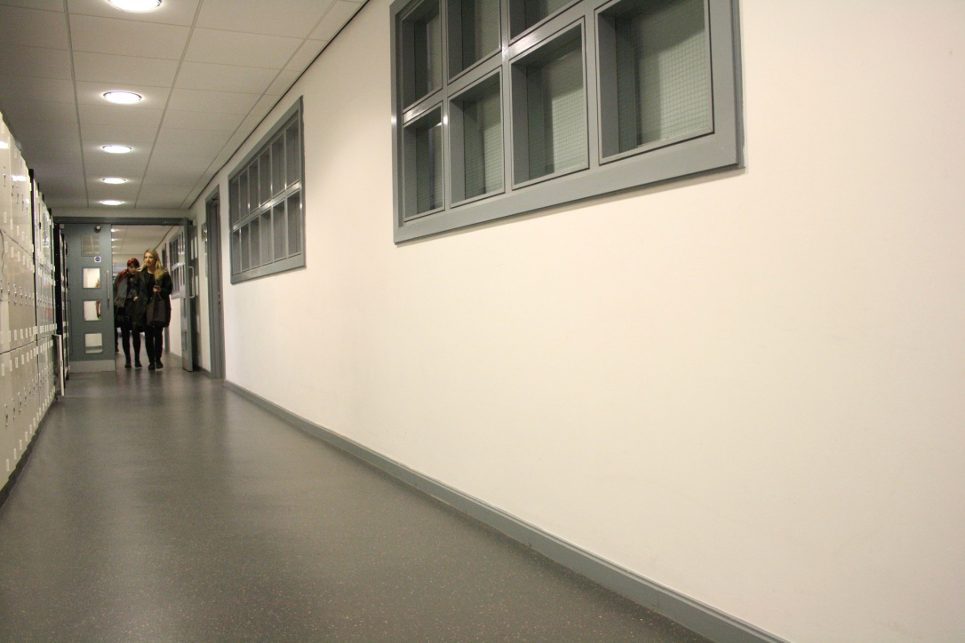


As I have the potential areas where the vinyl wording will be displayed, I have gone back to my research on vinyl cutting. The main points that are important when deciding on a typeface to use with vinyl is to have a simple design that the machine will be able to easily produce as well as having an uncomplicated sticker that is not too fiddly to apply to the wall area.
Vinyl Research:
What typefaces do the college use currently?
- A2 Grot, for text
- Bureau Grot, for headlines
- Cheltenham, for large quotes
- Elementa, for captions


Left - Berthold BE Regular Right - Avenir Roman
Although there is only a subtle difference between the two typefaces, it will be beneficial to see which is the most successful in terms of legibility when placed on the wall. Before creating mock-ups with the department names I am going to look into having the wording in colour. This was something that I addressed previously in a feedback session however there was no distinct response to whether colour would be effective or not therefore it is an area that would benefit from being experimented with.
What colour scheme does the college currently use?
- the existing wayfinding is in a medium grey with white text
- below are the colours that have been highlighted by the Brand Guidelines of Leeds College of Art

Department names:
Berthold Akzidenz Grotesk BE Regular

Reflection:
- The use of colour is effective in a way that it separates the departments and gives them their own identity. However, it may be seen as an inconsistency with the design as the identity would be unknown to visitors therefore the varied colour scheme pay be more confusing. This is not something that can be singularly decided therefore I am going to gather the feedback of others to see whether one colour would be more appropriate or a 9 colour scheme.
Feedback:
- The colour reduces the formality of the text, making it appear to be attracting a younger audience
- The colour is effective in a way that it provides and identity to the individual departments, however on a larger scale this may not be as visually pleasing therefore ineffective
- I can see that you have taken the colour from the brand guides however I don't think that the wording and the colour together are as effective as hoped
To continue with this design I have created a number of mock ups using the typeface Berthold Regular and Avenir Roman. These choices are based on the existing typefaces that are stated in the brand guidelines. I wanted to have a typeface that worked with the existing typefaces so that this typeface could be added to the guidelines and stated that it must be used for all wayfinding for the college.
Mock ups, Berthold Akzidenz Grotesk BE Regular:


Mock Up, Avenir:


Final Critique:
1. Do you think that the vinyl wording is successful in highlighting the areas of the building and giving the departments an identity?
- It gives the departments and identity in terms of their name being displayed however experimenting with colour could be a way to broaden the identity term
- I think that the scale and colour is appropriate to demonstrate the course area you are in in the building without distracting away from other areas of the corridor
- Would've been nice to see colour experimentations although the chosen colour is appropriate
2. Do you think that the wording clutters the blank corridor space or is it a subtle design?
- It is large scale therefore recognisable however maybe 'too in your face'?
- The colour allows for the wording to be subtle without overpowering the space that it is displayed in
Response:
I think that a downfall with this outcome is that I didn't do enough experimentation with size and colour. If i were to complete this brief again I would widen my experimentation so that there was a more informed response to why the final outcome is appropriate. However, the final resolution for the vinyl wording would still be appropriate as the colour is consistent through each department. This is something that was lacking in the current wayfinding, therefore this would provide a solution to the issue.
No comments:
Post a Comment