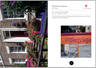
Taking into consideration the feedback comments on the layout and the research into similar publications, the design continued to developed. The design has taken on a minimalist yet structured grid layout so that the content is clear and easy to navigate. This is important when considering the audience as students tend to read things whilst on the go therefore the content needs to be clearly displayed to maximise their information intake.
A grid that was used as a background guide for the pages was the Marber Grid. This grid was originally used for the book covers for Penguin and was created with the high intention of allowing the illustration to be the main focus of attention. When researching the grid, this was something that highly relates to the handbook due to the high focus of the photographs. The grid clearly allows the photograph to work with white space created by the positioning of the text therefore resulting in an eye catching design to the page.
Experimenting with two different layouts together was something that was suggested in the feedback session. It was said that this would keep the reader engaged rather than having the same design throughout. This is something that will be important to reflect on once the design has been printed.
Adding a wayfinding element to the design was something that was influenced by researching and looking at the street through Google Maps. This 'pin point' like shape is highly recognised due to its simplicity and transferability through a number of different medias. This shape will also provide the reader with the nature of the handbook without having to use the wording 'guide book' as it has been outlined by the target audience that they would be put off reading something that titled itself as a 'guide book'.


No comments:
Post a Comment