Wednesday, 28 March 2018

Development

Development, following feedback:


Boards to client:


Feedback:
- The red design is more eye catching
- The white outline adds structure and allows the design to stand out more
- 3rd design is favourited. Having the address underneath the tractor brings it all together. In the other designs there is a lot of text and it is hard to differentiate between the information.   

Tuesday, 27 March 2018

Development & Feedback

Logo Development. The designs and colour palette have been inspired by the explored research and existing identity features of the farm. 


Business Cards experiments. 
The following boards were sent to the client to receive feedback. Presenting a brief to a client in this way is something that I have learned through freelancing at LeedsBID. 


Feedback:
- I can see the reference of the plaque in the first design and think that this would helping the farm update itself. It is identifiable with the plaque outside of farm gate and would help people who were collecting their order from the farm.
- The business cards do need to be double sided
- Logo 1 on the front of business card design 2
- Logo 5 would be more appropriate to use of the letterheads of invoices and formal letters
- Add Morpeth and the postcode to the business card e.g 'Glororum Farm, Morpeth' 
- The red adds colour to the design, can we try the block colour with logo 1?
- 'Add something that says or shows that it is for horses.' In a discussion with the client about this comment, I addressed that many of the people who they are handing the business cards to/the places that they are being displayed would be horse owners/where horse owners shop for produce. The client went on to say that when sales are being discussed through Facebook, many ask whether it is suitable for horses. Adding 'suitable for horses' on the business card would simply overcome this. 
- Delivery is available further afield for a fee. The 'local delivery' could need rewording to make this clear to the customer
- 'Is a website possible?' Through a discussion with the client, I outlined the basic cost of having a website. Due to the size of the business, the cost potentially out-ways the level of trafficking to the site. This is something that could be developed when the business grows. Instead, a Facebook business page would be more appropriate. Such features through the social media site are already used by the client and have been successful. 

Front and back designs were initially experimented with using two different typefaces. Having two choices for the client is important as overcomplicating the design options would not be appropriate. The serif typeface reflects the type used in the plaque 

Egg Box Label.


Feedback:
- We have plain brown egg boxes so the lighter grey works well. 
- Simple design is appropriate as all who receive the eggs already know the background behind the chickens
- It is possible that we will expand this and the design would need to be changed 


Advertising, Fruit Stall.


This is an outcome that has been added on to the brief to further show how the branding can be applied to varying aspects, appropriate to the business. Through background understanding of the business, the fruit and vegetable stall is a seasonal element that can gain a lot of attraction from passers by. This cliental could be extended if the stall were advertised in local noticeboards.


Monday, 26 March 2018

Research, Invoice

Due to the nature of the business, monthly invoices are sent out. Through a discussion with the client, this process is typically done via email, with a printed copy needed for filing. The client uses Microsoft Office Word to update each individual invoice each month and therefore the redesign must be functional on this programme. 

Research was carried out to gain an understanding of the information typically present on an invoice. An invoice was also received from the client to gain an understanding of how the current invoice works. This is important in ensuring the redesign is understood by the customers. The annotation of designs allows for identification of features that work in a design and those that are less successful. 


Research, Identity

Research board. 


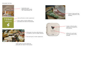
Using the famous Gloucester Service website, a number of business identities have been explored using the Farm Shop suppliers list. This provided an insight into existing brand identities. Extended research gathered imagery of identities for agricultural based businesses. 


This research has helped identify features of local and national competitors/businesses of a similar nature. It is important for the logo to stand out from the other branding that it will be situated with but also be appropriate for its genre. 


The Brief


Live Brief.

The Brief: Produce an identity for a family run business. The primary focus must be to advertise and promote certain produce for the farm. 

Research: Farm identities/rebrands for the modern audience. Businesses of a similar nature, farm shops/commercial brands

Audience: Existing customers, potential customers the agricultural field

Further Details:
- Family business
- Sheep and crop based business 
- Business cards will be used to advertise the sale of hay, haylage and straw in local businesses and through word of mouth
- A Facebook group to advertise sales and communicate with potential clients
- A consistency in design is needed throughout the advertising and stationary of the business
- Further advertising required for smaller aspects of the business, e.g fruit & veg stall
- Client would like to maintain a traditional appearance of the farm however appeal to the modern audience. 

Friday, 23 March 2018

Exhibition Space

Having identified that the Brunswick was our ideal location for the exhibition, persistent contact was made with the pub. The Brunswick is a space that I have attended to view previous exhibition. The clean empty room offers the perfect space to exhibit a range of different pieces, with natural light being prominent through a wall of windows. This space, unlike others we have viewed, reflects the atmosphere that we would like our exhibition to have.

Having not previously received a reply through email, I called the pub to ask for a more direct line of enquiry. This is when I was informed that the exhibition space is not being run by a separate team. The following emails are of the main correspondence with Chris who is the event organiser. 


This brief has helped develop my professional communication and retaining my personality in the tone. It has also highlighted the importance of persisting to achieve a goal.


Tuesday, 20 March 2018

Submission

The brief required two submission boards that outlined the research and development of the game.  The following requirements have been taken from the project pack and have been followed for the submission.  


To start this process I wrote text for each of the elements we highlighted to be shown. Through tutor feedback this was then condensed to ensure the text reflected the overall nature of the game and allowed for focus on the imagery. 


Pitch Presentation


For the presenting of the pitch we separated the speaking between the four members of the group. This meant that we all contributed to the pitch as well ensuring that it flowed throughout. There were issues encountered during the presentation, mainly the slow movement of the presentation from one side to the other. Once we were aware of this issue we were able to adjust our speaking to ensure that there were no overly long pauses. 

Monday, 19 March 2018

Final Outcome

I arranged for product photographs to be taken by Charlotte Igoe. Charlotte is a third year photography student, expanding her skills with studio photography. This was a great opportunity to provide a product to photograph and receive high quality image of the final outcome. 


Thursday, 15 March 2018

Feedback

Presentation, send March 14th:


Feedback:


As a group, we found it difficult to communicate with Daniel via email at this time. This has highlighted the limitations of discussions through email. Suggestions can be misunderstood which can cause confusion. 


The following day we spoke with Daniel in person and resolved the queries that we had over time constraints and producing new imagery. His comments towards the imagery we had already produced were much more positive and discussions were had over how to strengthen this. In this meeting, Emma and Georgina presented the posters that they had been working on following the feedback.


Discussion:
- Is there a way of presenting the original image to show more depth behind the the abstract imagery?
- Finding a medium between the harsh white shape and the colour overlay will produce a strong design with a cohesive level of depth
- If the strapline feels too forced then leave it out