
Showing posts with label Brief 10. Show all posts
Showing posts with label Brief 10. Show all posts
Wednesday, 21 March 2018
Tuesday, 20 March 2018
Pitch Presentation


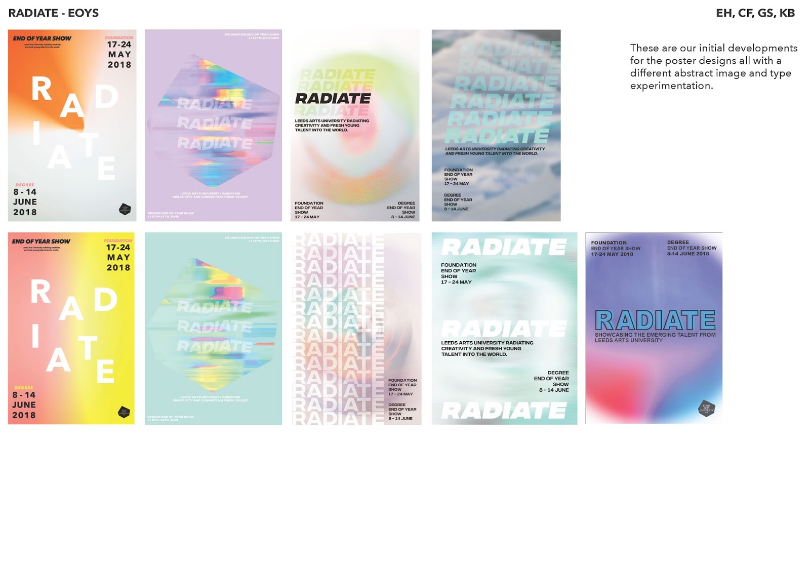
Thursday, 15 March 2018
Feedback
Presentation, send March 14th:


Feedback:


As a group, we found it difficult to communicate with Daniel via email at this time. This has highlighted the limitations of discussions through email. Suggestions can be misunderstood which can cause confusion.
The following day we spoke with Daniel in person and resolved the queries that we had over time constraints and producing new imagery. His comments towards the imagery we had already produced were much more positive and discussions were had over how to strengthen this. In this meeting, Emma and Georgina presented the posters that they had been working on following the feedback.


- Is there a way of presenting the original image to show more depth behind the the abstract imagery?
- Finding a medium between the harsh white shape and the colour overlay will produce a strong design with a cohesive level of depth
- If the strapline feels too forced then leave it out
Thursday, 8 March 2018
Further imagery/type experiments
Taking onboard the feedback, I completed the following developments with one/two colour photographs and type. This is an experimentation completed by all members of the group.


Wednesday, 7 March 2018
Feedback, Daniel Lancaster
Email Feedback from Daniel Lancaster, Peter&Paul. Email layout has been adjusted to organise the information coherently.
Hi Courtney, Kathryn, Emma and Georgina,
Hi Courtney, Kathryn, Emma and Georgina,
Imagery: This is heading in the right direction but lets get it bright again. I feel you’ve lost the bold colours and the simplicity of your first presentation.
First of all colour - the images that you have chosen to blur contain many colours and when blurred create a backdrop that’s too muted.
The orange one works well, I’d go more in the direction of photographing brightly coloured objects/work with one/two colours maximum.
If you got a series of four images (all from different courses on the uni) showing bright colours and abstracted these then you would end up with something stronger.
On reflection, this is a comment that we all agreed with and chose to retake photographs of work and edit them without losing the vibrancy.
Starting with - Our concept Radiate…
Page 2 is about the strapline -
Once the above is written the It needs to be encapsulated into one digestible sentence that introduces the end of year show.
This page should have at least 10 different ways to write this.. For example - Radiate - On display , Leeds Arts University end of year show…
Page 3 is about photography & image -
The visual element of your poster needs work. I want to see objects photographed and the blurred version next to them.
Try and get as many as you can. Remember 1-2 bright colour will work best.
Page 4 is about type -
Lay just the headline over some of the best images from the previous page. Try a few typefaces but keep the playful nature of the positioning, that works well. I think that the visual will be strong enough to move the type to fit the image.
Page 5 is about bringing it all together -
First of all colour - the images that you have chosen to blur contain many colours and when blurred create a backdrop that’s too muted.
The orange one works well, I’d go more in the direction of photographing brightly coloured objects/work with one/two colours maximum.
If you got a series of four images (all from different courses on the uni) showing bright colours and abstracted these then you would end up with something stronger.
On reflection, this is a comment that we all agreed with and chose to retake photographs of work and edit them without losing the vibrancy.
The type experiments are nice and the motion stuff shows how it could work, but lets park that for the minute and nail the static before moving onto this.
The strapline isn’t working for me. It’s too long and wordy and repeats the name. Also avoid fresh. Every university uses it.
Try and be concise as possible. I’ll have a think myself.
The supporting type seems to be all over the place, it’s best to bunch it all together like in the middle bottom version. Let the title do the work, like the type on the left hand versions, but think it could go bigger and also have more character.
I’ve created a presentation template for you to fill in over the next few days to keep you on track and to make you make some important decisions about the project.
Page 1 is about your idea -
Try to sum up your approach in a couple of sentences. It’s a useful way to check your work against the main goal of the idea.The strapline isn’t working for me. It’s too long and wordy and repeats the name. Also avoid fresh. Every university uses it.
Try and be concise as possible. I’ll have a think myself.
The supporting type seems to be all over the place, it’s best to bunch it all together like in the middle bottom version. Let the title do the work, like the type on the left hand versions, but think it could go bigger and also have more character.
I’ve created a presentation template for you to fill in over the next few days to keep you on track and to make you make some important decisions about the project.
Page 1 is about your idea -
Starting with - Our concept Radiate…
Page 2 is about the strapline -
Once the above is written the It needs to be encapsulated into one digestible sentence that introduces the end of year show.
This page should have at least 10 different ways to write this.. For example - Radiate - On display , Leeds Arts University end of year show…
Page 3 is about photography & image -
The visual element of your poster needs work. I want to see objects photographed and the blurred version next to them.
Try and get as many as you can. Remember 1-2 bright colour will work best.
Page 4 is about type -
Lay just the headline over some of the best images from the previous page. Try a few typefaces but keep the playful nature of the positioning, that works well. I think that the visual will be strong enough to move the type to fit the image.
Page 5 is about bringing it all together -
Add in the strapline and other information neatly in a corner. Try looking at both landscape and portrait formats as this will need to work across many different sizes and shapes.
Monday, 5 March 2018
The brief, so far
Presentation put together to show Daniel our thinking and doing since his initial feedback on the 27th Feb. Photographs, manipulation and text experiments were completed by all members of the group, with feedback being given to each other throughout the stages.


Copy Text
In the feedback from Daniel, he suggested that we have some copy text to describe and add context to the name of the show. As a group we discussed the following ideas:
Words from the brief:
-Experimental
- Radical
- Responsive
- Risk Taking
- Beautiful
- Ambitious
- Professional
- Innovative
- Multidisciplinary
Research:
Leeds Beckett, EOYS:
DO...is a verb.
Our Experiments:
Leeds Arts University radiating creativity and fresh young talent into the world.
Leeds Arts University emanating creativity and fresh talent into the world.
RADIATE, Showcasing the emerging talent from Leeds Arts University.
RADIATE, emanating creativity and fresh talent from Leeds Arts University.
Words from the brief:
-Experimental
- Radical
- Responsive
- Risk Taking
- Beautiful
- Ambitious
- Professional
- Innovative
- Multidisciplinary
Research:
Leeds Beckett, EOYS:
DO...is a verb.
Our students make things happen. They are doers. People that act as well as talk, discuss, debate, collaborate, wonder and think. At Leeds Beckett University, we are justly proud of their achievements:
they CAN-DO.
Leeds Arts University radiating creativity and fresh young talent into the world.
Leeds Arts University emanating creativity and fresh talent into the world.
RADIATE, Showcasing the emerging talent from Leeds Arts University.
RADIATE, emanating creativity and fresh talent from Leeds Arts University.
Thursday, 1 March 2018
Photographs - Experiments
Taking on board the feedback made, we decided to photograph the university to provide content for the visuals. The building and students work were photographed and then we each individually experimented with various blurring techniques. This abstract imagery represents the concept, in that the colour is radiating from a central point. Using imagery from the university adds context and strengthens the reasoning behind the doing.


The photographs used in the initial abstract imagery experiments.

Tuesday, 27 February 2018
Meeting @ Peter&Paul
The meeting with Daniel from PeterPaul was informative and constructive in the development of our concept pitch. He produced the following slides to help advice us on how to strengthen our concept and ensure that it continues to develop and grow before the pitch to the marketing team.


Notes from meeting:
- There needs to be reasoning by colour choices, represent each course through a colour? photograph work that is going to be in the show and manipulate it to creative a similar merge effect?
- Everything needs referencing behind so that it is clear and makes sense to the marketing team
- Add description copy to explain the title of the show 'RADIATE, showcasing the emerging talent at the...' 'RADIATE, emitting the emerging creativity from Leeds Arts university at the...' This can be a small sentence that flows into the dates of the shows, providing context and explanation to the audience
- Content must be ready to hand over to marketing on day of pitch
- Animation; animated poster
- Consider a social media page for the show. Could profile students to showcase them and provide an insight into the work at the show + for those who may not be able to attennd
Subscribe to:
Posts (Atom)