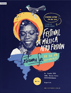
This poster stood out due to the simplicity of the design and the ombre gradient that flows from dark to light, emphasising the nighttime element to the event. Elements of fun and activity are also shown through the brighter orange/pink tones at the bottom of the design, adding a sense of joy to the design. This is therefore a very effective piece of design, with the colour scheme playing a large contribution towards the emotions and appearance of the event.
The overall aesthetic of this poster is reinforced through the use of contrasting colour choices. Using a strong deep colour for the border of the poster adds a second dimension to the design. This is contrasted by the bright background, accompanied by the use of white type. A three colour print keeps the design simple and allows for the illustration aspect to the print to be the main focus. This is also achieved through having certain elements of the illustrations in white, to create a coherence between the creative and type.
Unlike the other analysed poster designs, this one has a central focus. The use of a dark background against the bright colours of the illustration style creates a bold centerpiece to design. The simple hand rendered type shapes express the fun and creativity of the event which is further emphasised through the building of the flat colours in a collage type style. The more scripted handwritten style to the typography also adds personality and creativity to the design, reflecting the presumed atmosphere of the event.
Similar to one of the previous analysed posters, this poster has a definite border to the design. However, this border then goes on to frame and be a part of the central illustrative design. The text is therefore brought in to work with the illustration, creating a cohesive design where text and illustration have informed each other's design placements. This is also an example of how a two colour print can still have bold and creative qualities through the use of adding detail in design, rather than through colour.
Things to consider from analysing posters:
- A colour scheme that reflects the intended emotions/overall message of the poster
- Choices in typeface can also reflect emotions/the overall message of a poster
- Contrasting colours can be effectively used together if not made over complicated


No comments:
Post a Comment