The login page:
As he website is only for users who are subscribers to the magazine, the first page that you view on entering the website. The email address you add when you create an account must already be related to the subscription to the magazine (through the Hearst website) otherwise it will not let you proceed in making an account. After making the account you will then be taken to the second page of the website.
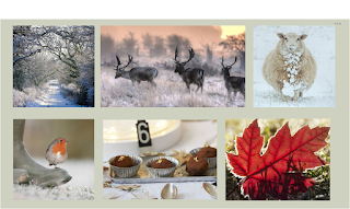
Through discussions with peers and the target audience it has been made very clear that the navigation and appearance of the website must be simple to adhere to the target audience. This is also something that would relate to the personas of the target audience. Considering these profiles, above are the two different designs that could be used. This is something that requires feedback and conversations with the target audience to direct which design is the most appropriate (physical images or icons).
Issues - the next page that you would be taken to on clicking the 'issue' icon is the issue page. This page will hold the page links to 'Saved Issues' and the current issue, as well as the previous two months. The design decision to only store the past three issues is in reference to the personas of the target audience and comments from members of the target audience. If there were many issues to choose from this would overcomplicate the page as well as lengthen the time of selecting the magazine issue that you wish to read. Having the initial navigation pages quick and easy to use improves the users experience as the time it takes to reach the desired page is made smaller. If the user does wish to access previous issues, they must save these so that they are accessible after they have been live for 3 months.
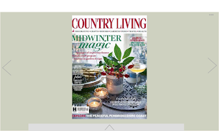
Taking inspiration from ISSUU, the way in which the navigation of the magazine would work is the left and right navigation of each page by clicking the arrows or on a handheld device such as a tablet, you would be able to swipe left or right. This navigation is an aspect that has undergone various testing with the target audience and peers and details of this can be seen previously.
The Scrapbook:
The Scrapbook element of the website is an area that has received a lot of feedback in the group and individual sessions. This is a feature that many believe will enhance the user experience of interacting with the magazine through screen, as well as being able to save articles/images that they would typically do if the magazine were printed. It was discussed whether the social media elements were needed in this section of the website. However, relating back to the three personas of the target audience, this is a feature that would be used. Although this is not a feature that would be relevant to all members of the target audience, it is something that would be used if the audience wished to.


No comments:
Post a Comment