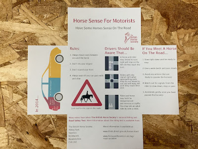
5.
Feedback
- The infographic works really well with the content, making the information
more appealing to read and adds colour to the design
- too much space under the 'have some horse sense on the road', this just needs reorganising
- appropriate tone of voice, straight to the point, quick and easy to read
- caption under the triangle sign could be smaller
- reorganise the layout using tabs to reduce the spacing between the numbers and text
- perhaps experiment with a smaller typeface?
6.
From the feedback on layout 5, I made the suggested changes to the design, changing the typeface size by making it smaller, adjusting the tab spacing and adjusting the line spacing of the text. However the sentences beside the road layout images don't look as expected. The line spacing needs to be standardised or to appear more similar to each other so that the text is consistent to read. I also removed the 'THINK' logo and recreated the road sign myself so that it was of higher quality.
7.
Feedback:
- Experiment with colour in the text to draw the readers attention to the different areas of information. This will also separate the sections more clearly
- Infographic - try putting emphasis on the important aspects of the information such as putting the numbers in bold
- Subtitles would look better with every letter starting with a capital
- Horse symbol is too pixilated (this may be a printing issue)
8.


No comments:
Post a Comment