I experimented with two different stocks so that I could experiment with the durability and the ease of fold of the paper. The first design is sketched on a thin stock therefore would be easily damaged in the post and may rip. On the other hand the second design is on card which has a stronger durability however is difficult to fold. I therefore need a stock that that is between the two styles of paper.
After completing these sketches I attended a feedback session. From this we discussed the various areas of the design, including the content on the piece.
From the discussion I made decisions on the infographic design, the design of the address on the front of the envelope and the type of stock to consider. These decisions have been informed by the comments made about the mockups that I have shown above. I have also set out a fixed plan to complete this brief so that I can organise my time and keep on track with the project.
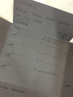
To continue with this brief I have completed a number of layout designs using Indesign and printing on standard paper before choosing an appropriate stock. I adjusted the layouts through highlighted downfalls of the design each time. After the fourth layout design I gained feedback and did self-evaluation on the layouts that I had completed. This will hopefully allow for the design continue in the right direction.
(The numbers of the designs relate to the physical copies that were produced so may not run in numerical order!)
1:
Self Evaluation
- The font size for the centre information is too big and looks as though it has been made this size to fill the space. The text on the right tab is a more appropriate size as it still remains clear but fills the space appropriately.
- The size of the car infographic is suiting of the size of the tab without being overpowering however when colour is introduced the design may not be as appropriate.
Feedback
- A good start to the layout although development is still needed. There is no flow to the information which puts me off reading all the content, maybe think about reorganising the text and imagery.
2:
Self Evaluation
- The smaller font size is much more appropriate for the centre space however the kerning between the lines of text needs adjusting as there is too much of a gap.
- The text on the right tab also needs adjusting as it is oversized for the space, having limited room for a third image. This could be overcome by adjusting the wording of the statement or the font size.
- The infographic needs colour otherwise does not stand out against the other information therefore may be looked over.
Feedback
- The text size is much more appropriate for the space that it is in, although the right tab layout needs worked on as there is too much text for the space that it is in.
For the next two designs, I removed the infographic as I wanted to experiment with completing the design by hand and then scanning the image in. This is to overcome the colour issues that I have been experiencing whilst trying to complete the design.
3:
Self Evaluation
- As a reader my focus is taken away from the central information and to the right where the 'images' are. This is a layout adjustment that needs to be explored so that all of the information is displayed in a way of equal importance.
- The 'for further information' lacks excitement and needs something more to draw the reader in. This could be in the form of engaging text or imagery.
4:
Self Evaluation
- Moving the 'Drivers should be aware that' section has made the overall design flow better, improving the readability of the leaflet
- The change of 'for further information' section makes the information appear more important therefore as a reader I read and take a visual note of the information rather than glossing over the content
Feedback:
- Moving the content around makes the leaflet much more reader friendly as the main body of text has been separated, making it more appealing to read
- The main title of the leaflet looks lost in the space, experiment with changing the size of the text or adding something else into this space


No comments:
Post a Comment