Tuesday, 19 January 2016

Printing Design

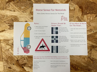
Once the final layout had been decided on, I drew my attention back to the stock that the design would be printed on. As it is something that is going to be posted as well as being directly given to the audience, the type of paper needs to be durable enough to withstand being passed on through numerous locations to reach the receiver. As I was already aware of the GSM to aim for when looking for paper it made limiting the choice of paper easier. From the original experimentations I was aware that card (200gsm) was too thick and standard paper (135gsm) was too thin. This meant that an appropriate paper would be within these two styles of paper. Although I had previously discussed printing on coloured paper within the discussion groups, it became clear as the design developed that this would not be as successful as the coloured background would interfere with the colours of the infographic and smaller images. I therefore chose neutral colours to experiment with in print.

Final Prints:


Cairn Eco White 150GSM


Cairn Eco Craft 170GSM

Evaluation:
Although elements of the design are not lost on this style of paper, the quality and texture makes the leaflet feel as though it is poorly produced. This would instantly put the audience off as they may feel is no effort has been taken to produce the leaflet, then why should they make the effort to read the content. Both papers would also be easily damaged due to their poor durability therefore would not be appropriate for the leaflet. This is because the paper is required to withstand being posted therefore being exposed to all weathers and being left on someone's front door mat or letter box.


The most successful paper is the ColourPlan Bright White 175GSM by GF Smith. The texture of this stock is of a higher quality therefore when the audience receives the leaflet the touch of the paper will be more appealing therefore will be more likely to look inside and pay attention to the information. As the paper is of a higher quality it is also more robust therefore will withhold the hand held and weather damage. As I could not get this paper in A3 I printed a scaled down version on A4 so that the final resolution would still be produced. To show the design in A3 form, I reprinted the design using a similar stock that was A3. If the leaflet were to be produced professionally the Colour Plan, Plain, Bright White stock in A3 form would be used if it were available.

Final Resolution Evaluation:

Is the outer design of the leaflet appropriate? Or could it have benefitted from having a design covering the white space?

- The overall outer appearance of the leaflet lacks information on the content of the leaflet, this could be improved by adding the logo of The British Horse Society however covering the whole space would be over powering at would put me off wanting to open it further

- I don't think that the envelope needs 'branding', as an envelope is typically minimal in information to make the reader open further. The design is therefore suitable in terms of acting like an envelope

- Having the address printed separately is appropriate in your aim to keep the printing cost of the leaflet minimal as producing these stickers in bulk is much more cost effective than altering the design

Response: Although the outer appearance may lack the informing factor, it is suitable in terms of fulfilling the purpose of an envelope. If there was a design on the front the audience may believe the leaflet to be junk mail therefore will not read the content. 

Is the sticker successful? If not, why?

- The sticker is in keeping of the minimal design of the leaflet however is not successful at keeping the tabs closed

- I can see where you were going with the sticker approach to keep the tabs closed but it is not strong enough. It may have been more successful if the top tab was shaped to fit through a slit to keep the leaflet folded

- A stronger sticker is needed to fulfil the aim of keeping the tabs closed therefore it is not that successful 

Response: The sticker is a design fault as it has not been as successful as I would have hoped in keeping the tabs of the leaflet closed. This is something that I will consider in the future and will experiment with alternative routes. 


Is the tone of voice appropriate in term of informing the reader of the importance of the information?

- The tone of voice is very direct and keeps the reader interested and informed without being overwhelming when reading

- The tone of voice is clear and instructive. As a reader I feel as though the information is straight to the point as the voice is kept factual and concise


What are your thoughts on the overall appearance of the inside of the leaflet?

- The design has come a long way from where you started out. Although it has changed in subtle ways the design has come together to produce a successful publication leaflet. The infographic and other images make the information more appealing to read and bring in that contrast of text and imagery when taking in the information 

- Adding the colour to the subheadings has definitely improved the design as it provides a clear separation to the information

- Having certain words and numbers in bold adds emphasis and makes this information stand out which is appropriate to the aim of the design (informing the audience)

Self Evaluation:
For this brief I kept to a very tight schedule as I had felt previously I was working until a few days before the deadline which meant other areas of my work lacked my attention. I am now finding it much easier to balance my commitment to the individual projects and I am surprised by the quality of work that I am producing. Although areas of the leaflet have been highlighted that could be improved, as this is the final feedback I feel that it is important not to make these changes as I am now able to recognise where I have made mistakes and are able to overcome these within future projects.


Set up for Digital Print

This is the final design of the publication that I will take to digital print. Although it cannot be seen in these images, I have used a consistent grid throughout the designing process of the book and can be seen in the previous post. 

Indesign:


Monday, 18 January 2016

Layout Plans

5.


Feedback
- The infographic works really well with the content, making the information 
more appealing to read and adds colour to the design

- too much space under the 'have some horse sense on the road', this just needs reorganising

- appropriate tone of voice, straight to the point, quick and easy to read

- caption under the triangle sign could be smaller

- reorganise the layout using tabs to reduce the spacing between the numbers and text

- perhaps experiment with a smaller typeface?


6.  


From the feedback on layout 5, I made the suggested changes to the design, changing the typeface size by making it smaller, adjusting the tab spacing and adjusting the line spacing of the text. However the sentences beside the road layout images don't look as expected. The line spacing needs to be standardised or to appear more similar to each other so that the text is consistent to read. I also removed the 'THINK' logo and recreated the road sign myself so that it was of higher quality.

7.

Feedback:
- Experiment with colour in the text to draw the readers attention to the different areas of information. This will also separate the sections more clearly

- Infographic - try putting emphasis on the important aspects of the information such as putting the numbers in bold

- Subtitles would look better with every letter starting with a capital

- Horse symbol is too pixilated (this may be a printing issue)


8. 


From the feedback I made the suggested adjustments to the design. Having the main title and subtitles in the colour of The British Horse Society design brings the piece together and highlights the sections of the information to the reader. This draws on the element of their looking there is less text therefore not putting the audience off reading all of the information. To reduce the poor quality of the road design I decided to make a replica in Illustrator. I used a high quality silhouette of the horse and rider so that quality would not be lost when it came to print. 


Thursday, 14 January 2016

Illustration Research

From the research into children's books, It became clear that illustration was of high importance rather than the text being the centre focus. Since the illustrative part of the book is something that I would like to focus on primarily, I have gathered a range of research looking into different artists and photographers.

Illustration styles:


Photography Styles:


InDesign

After gathering the content and experimenting with the front cover physically and digitally, with the help of the technicians I was able to set up the InDesign document for print. Having the physical mock up really helped with this process as I was able to work with that for the layout of the book as well as working with the grid. This will also help when I come to print. I have decided to staple the book when printed as stitching would not suit the style of the book and may take the focus away from the main aim of the book, which is to inform the reader on the beginner concepts of colour and how it works.

Grid:


Content:


Wednesday, 13 January 2016

Infographic

After previously having just the outline of the car in the mock ups of the layout, I wanted to experiment with a different production method as I felt that the design wasn't working as well as I wanted it to. 

First attempt:


Self evaluation
- The colour, style and having the black outline around the shapes makes the design look childish. This is not suiting of the target audience


Sketches:


After sketching the car and placing it in the layout design of the leaflet, I decided that the design was too childish for the 17+ target audience and didn't reflect the importance of the information or the overall tone of the piece. After making the decision that the above design was not appropriate, I went back to gathering research to find an appropriate colour scheme for the design.


Using the colour schemes in the infographic above, I redesigned the car outline, going for a more realistic outline rather than a more playful child's image. To do this I removed the black outline and kept to the colour schemes. 

Illustrator:


Feedback:
- The four colour colour scheme works well but the colours are lacking the eye catching factor
- The pale colours would fade away in the design as they are not strong enough to stand on a white background. This could be solved with printing on coloured stock however may cause an issue with your other designs
- Lacking the wow factor, looks like an ice cream combination


Feedback:
- The design is attracting and makes me want to look at the information (in the context of the leaflet)
- The colours work well together rather than in the previous design where they were clashing
- The colours are strong enough to stand out on the page however will not overpower the other content in the leaflet
- It is a modern design that is kept simple through only using the set colour scheme
- A great improvement from the original design! 

Front Cover Experimentation

Once I had gathered the content for the book and completed the illustration, I then began to think of the front cover of the book. From researching colour books, something that I highlighted was the strong use of repeated colour in the design. 


The above designs are books that stood out to me through the bold placement of colour that takes the focus of the design. The text is used to give the book context however I don't think that this is needed. For my experimentations I am going to look at removing the typography element of the front cover so that the 'imagery' speaks for itself. 

Digital Experiments:


Final Design:


Through a feedback session it was discussed that the title of the book is not needed as the design is bold enough to stand on its own without needing text along side. It was suggested that the title of the book could be placed on the back cover instead. This is something that I am going to experiment with in the design. The final design was chosen as it is not specific to one colour (or four) as it demonstrates the spectrum of CMYK. 

Tuesday, 12 January 2016

Content - Drawing

As this is more of an open brief I wanted to bring in an illustrative style. This is a style that I have not been able to bring into previous briefs therefore would like to experiment with in Design Principles. I chose to illustrate part of the content of the small publication to make it more engaging to read rather than just having a book full of text.


Ideas - What Is A Book?

Brief: A book containing a set, series or sequence of 10 double page layouts that effectively communicate your chosen content.

To start this brief I wrote down a number of ideas for the content of the 10 double page spreads. 


After discussions with my peers and tutors, I decided that I would produce this publication in the form of a children's book, telling the 'Daily Life of a Boarder Terrier'. This decision came from the fact that I have not been able to bring in my illustrative style into the previous briefs and from my English Language A-Level, I have a lot of background knowledge on how children learn to read therefore would like to apply this knowledge to the brief. Designing the publication to be in this genre allows me to produce imagery for the story as well as not getting too caught up in the quantity of text.


To begin my research I have looked at a number of different children's books that have a mix of illustration and text. The layout of the text is important as it is what guides the audience through the book, making them want to continue on to the next page. The book will be aimed at children aged 4-5. I chose this age group as they will not yet be confident readers therefore will be mainly interested in the imagery which is what I would like the main focus of the book on. However the minimalist text will still be present to guide the reader (the parent reading to the child) as well as to encourage the child to join in with reading. 

Monday, 11 January 2016

Layout Plans

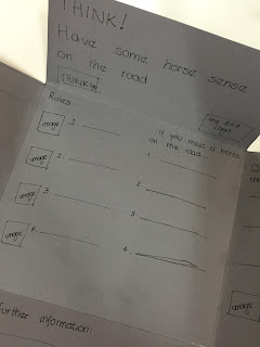
After completing focused research on the information that needs to be included in the publication and the infographic design, I have completed two designs for the layout of the content, following the feedback I have already received.


I experimented with two different stocks so that I could experiment with the durability and the ease of fold of the paper. The first design is sketched on a thin stock therefore would be easily damaged in the post and may rip. On the other hand the second design is on card which has a stronger durability however is difficult to fold. I therefore need a stock that that is between the two styles of paper.

After completing these sketches I attended a feedback session. From this we discussed the various areas of the design, including the content on the piece. 


From the discussion I made decisions on the infographic design, the design of the address on the front of the envelope and the type of stock to consider. These decisions have been informed by the comments made about the mockups that I have shown above. I have also set out a fixed plan to complete this brief so that I can organise my time and keep on track with the project.

To continue with this brief I have completed a number of layout designs using Indesign and printing on standard paper before choosing an appropriate stock. I adjusted the layouts through highlighted downfalls of the design each time. After the fourth layout design I gained feedback and did self-evaluation on the layouts that I had completed. This will hopefully allow for the design continue in the right direction.

(The numbers of the designs relate to the physical copies that were produced so may not run in numerical order!)

1:


Self Evaluation
- The font size for the centre information is too big and looks as though it has been made this size to fill the space. The text on the right tab is a more appropriate size as it still remains clear but fills the space appropriately.
- The size of the car infographic is suiting of the size of the tab without being overpowering however when colour is introduced the design may not be as appropriate. 

Feedback
- A good start to the layout although development is still needed. There is no flow to the information which puts me off reading all the content, maybe think about reorganising the text and imagery.


2:


Self Evaluation
- The smaller font size is much more appropriate for the centre space however the kerning between the lines of text needs adjusting as there is too much of a gap.
- The text on the right tab also needs adjusting as it is oversized for the space, having limited room for a third image. This could be overcome by adjusting the wording of the statement or the font size.
- The infographic needs colour otherwise does not stand out against the other information therefore may be looked over.

Feedback
- The text size is much more appropriate for the space that it is in, although the right tab layout needs worked on as there is too much text for the space that it is in. 


For the next two designs, I removed the infographic as I wanted to experiment with completing the design by hand and then scanning the image in. This is to overcome the colour issues that I have been experiencing whilst trying to complete the design.

3: 


Self Evaluation
- As a reader my focus is taken away from the central information and to the right where the 'images' are. This is a layout adjustment that needs to be explored so that all of the information is displayed in a way of equal importance. 
- The 'for further information' lacks excitement and needs something more to draw the reader in. This could be in the form of engaging text or imagery.


4: 


Self Evaluation
- Moving the 'Drivers should be aware that' section has made the overall design flow better, improving the readability of the leaflet
- The change of 'for further information' section makes the information appear more important therefore as a reader I read and take a visual note of the information rather than glossing over the content

Feedback:
- Moving the content around makes the leaflet much more reader friendly as the main body of text has been separated, making it more appealing to read
- The main title of the leaflet looks lost in the space, experiment with changing the size of the text or adding something else into this space