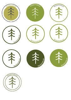
Feedback:
- The most prominent comment made in the feedback group was that the above designs are an obvious response to the brief. They will therefore have a higher chance of being submitted by another artist. However important comments to take forward are; the circle format works in a range of medias (an important feature for this logo to have due to the digital and print placement it will have) and the text is best positioned at the top or bottom of the circle (this ensures clear legibility).
- Limiting design if they use a range of tree materials
- The colours don't reflect the 'muted' colour scheme requested
The feedback on this design was mostly negative. The reoccurring issue was that many individuals were not aware of what the tool is. The design requires understanding of woodcraft and therefore is not appropriate to the large audience of the business. Although the name adds a clue, a logo should be instantly recognisable and understood.
Feedback:
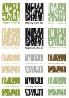
- The text works well at the bottom of the design as the main image would be able to be used with or without the type. Positive comment however, it is a requirement for the name of the brand to be used within the logo and this perhaps would not be sufficient for the client. This could be overcome by having the name positioned through the centre of the square.
Feedback:
- The overall comments were that the circle design reflects the annual rings of a tree however the square format is restricting of the design and appears more harsh due to the sharp edges. This is resolved through the circle format design.


No comments:
Post a Comment