Pj Hoyle - Oxfam Climate Resilience Appeal (Behance)
The design of the leaflet maintains a structured grid that is used throughout each page design. This is followed through by a set colour scheme and design, creating consistency throughout the design. The above leaflet engages its audience through the use of photography and medium length paragraphs of information. The photographs provide the audience with a visual to the information that can be read by the receiver.
The infographic used in this design is another example of an engaging visual used to support the corresponding text. The change in layout also maintains the attention of the audience.
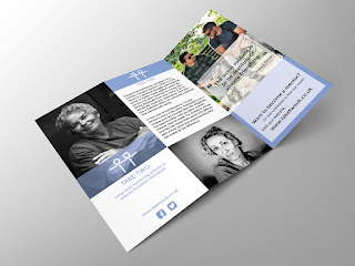
Jennifer Bryant - Take Two (Behance)
This is another example of a leaflet produced in response to the identified problem of the number of individuals who are homeless in London. As shown in the previous example, photography has also been used in this leaflet to engage the audience and provide a visual alongside the text. The simple use of one colour against the black and white text reflects the importance of the information.
Flying Kite, Mind
This is an example of an information leaflet produced by the design studio Flying Kite for Mind charity. The leaflet maintains the colour scheme used by the charity, as well as presenting the use of the same typeface. As seen in the other analysed, there is the use of photography and an infographic. These are therefore identified examples of common features of an information leaflet.


No comments:
Post a Comment